CLICK ON CHART TO ENLARGE
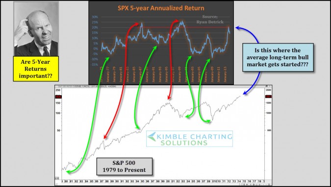
The top chart above was created by Ryan Detrick, which highlights the average 5-year return of the S&P 500 since the 1970’s.
The bottom chart reflects where the S&P 500 was when the 5-year returns were at some extremes. The 5-year average return of late hit 20%. How many long lasting bull markets have started from these levels?
This does NOT mean the market is at a peak right now. Ryan’s awesome chart does point out that few long lasting bull markets have started over the past 35 years when the 5-year returns were at the the 20% level.
–
–


