
CLICK ON CHART TO ENLARGE
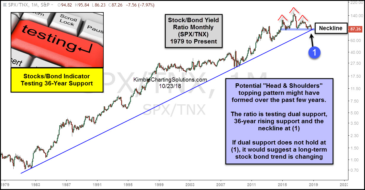
This chart looks at the S&P 500/10-Year Yield ratio over the past 40-years, on a monthly basis. The ratio started creating a series of highs lows in the early 1980’s, reflecting that stocks were moving up faster than yields.
Over the past few years, the ratio has traded sideways, creating a potential “head & shoulders topping pattern!”
The decline of late now has it testing 36-year rising support and the bottom of its trading range at (1). This dual support test is very important for both stocks and bonds over the short and long-term!
If this support would break at (1), it would send a bearish message to stocks and a bullish message to hard-hit bonds. What happens at (1) looks to be very important from a long-term perspective friends!
–
