by Chris Kimble | Sep 8, 2015 | Global Dashboard, Kimble Charting
Around 100 years ago Charles Dow came up with the idea of the Dow Theory. The theory was derived from 255 Wall Street Journal editorials written by Charles H. Dow(1851–1902), journalist, founder and first editor of The Wall Street Journal and co-founder of Dow Jones...

by Chris Kimble | Sep 1, 2015 | Global Dashboard, Kimble Charting
CLICK ON CHART TO ENLARGE Could a price zone that started impacting the Nikkei 30-years ago still impact it again today? Well it looks like it is! The Nikkei found the 21,000 level, line (1), to be support several times between 1987 and 1992. Once this support broke...
by Chris Kimble | Aug 27, 2015 | Global Dashboard, Kimble Charting
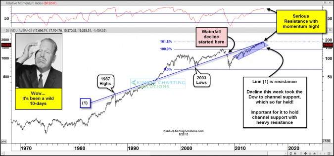
CLICK ON CHART TO ENLARGE If one takes the highs of 1987 and the lows of 2003 and ties them together and then projects a line into the future, you get line (1). The Dow hit line (1) and its Fibonacci 161% level in May and the Dow could make no more upward progress...

by Chris Kimble | Aug 26, 2015 | Global Dashboard, Kimble Charting
The majority of the worlds stocks markets have been in an uptrend the past few years. The global stock market sell off now has the majority of these stock markets testing bull market support channels right now. CLICK ON CHART TO ENLARGE As you can see from the 6-pack...

by Chris Kimble | Aug 19, 2015 | Global Dashboard, Kimble Charting
The broad markets (S&P 500 & NYSE) have been diverging against the Advance/Decline line since May. Why did this start in May? Below looks at the NYSE A/D line, based upon Common stocks only. The line peaked in May and has been diverging since. CLICK ON CHART...

by Chris Kimble | Aug 6, 2015 | Global Dashboard, Kimble Charting
CLICK ON CHART TO ENLARGE Is Crude Oil on its way to much lower prices? A year ago Crude Oil started a bear market, as it broke below multi-year support, taking it below a support line that has been in play for the past 7-years. After a 50% decline, a counter trend...
by Chris Kimble | Jul 14, 2015 | Global Dashboard, Kimble Charting
A Big Picture signal could be coming from products most of use on a daily basis! The 4-pack below looks at Crude Oil, Coffee, Copper and Cattle. CLICK ON CHART TO ENLARGE Crude Oil broke below a support line that had been in place for the past 7-years. Of late it...

by Chris Kimble | Jun 25, 2015 | Global Dashboard, Kimble Charting
CLICK ON CHART TO ENLARGE This chart looks at the Dow over the past 115 years and no doubt the trend has been up since the 2009 lows and remains up! If one takes the 2007 monthly high and the 2009 monthly low and apply Fibonacci extension levels to those key highs and...
