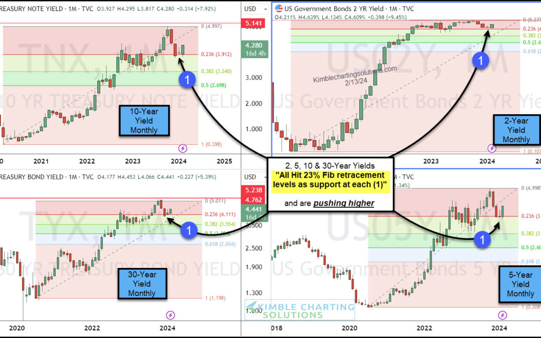
by Chris Kimble | Feb 14, 2024 | Kimble Charting
The past few months have given investors the feeling that the 3 year (monster) rally in treasury bond yields is over. But the lull may be over. And it’s looking like bond yields (interest rates) may be rallying again. Why? Well today’s chart 4-pack looks at treasury...
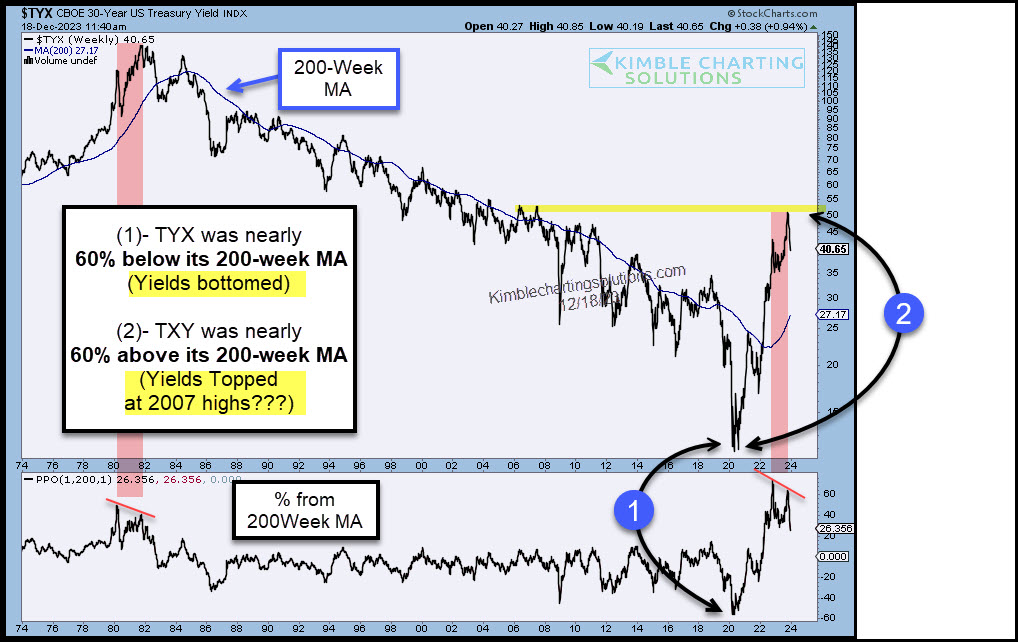
by Chris Kimble | Dec 19, 2023 | Kimble Charting
The past few years have seen interest rates soar. But perhaps it’s a case of too far, too fast. Today we look at interest rates in the form of treasury bond yields. And more specifically, the 30-year treasury bond yield. As you can see, the 30-year bond yield has been...
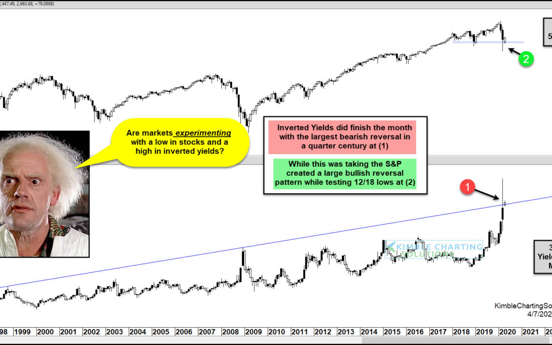
by Chris Kimble | Apr 8, 2020 | Kimble Charting
S&P 500 Index versus “Inverted” 30 Year Yield “monthly” Chart Stocks and treasury bond yields had a wild (and scary) month of March as the financial markets crashed to new lows. In today’s chart, we highlight this by looking at long-term “monthly” chart of the...
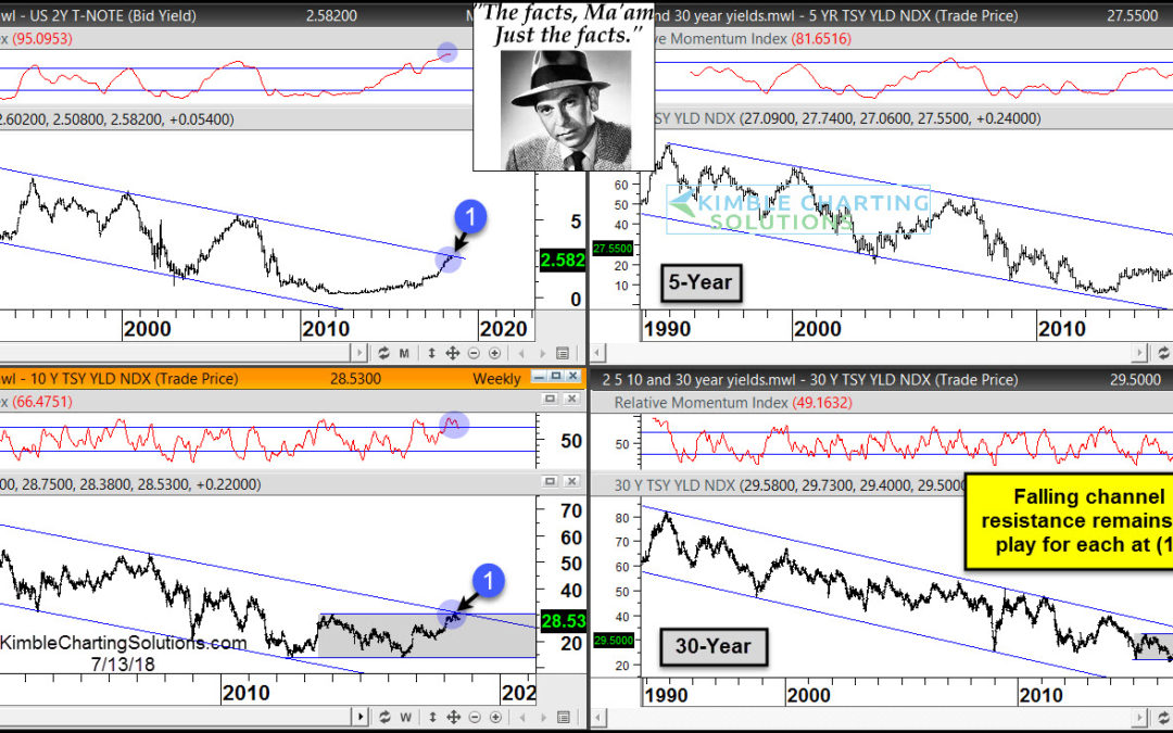
by Chris Kimble | Jul 13, 2018 | Kimble Charting
CLICK ON CHART TO ENLARGE Have interest rates increased over the past couple of years? Yes they have! Have interest rates broken above long-term falling channels? Nope Joe Friday Just The Facts Ma’am- Interest rates (2, 5, 10 & 30-Year yields) are all...
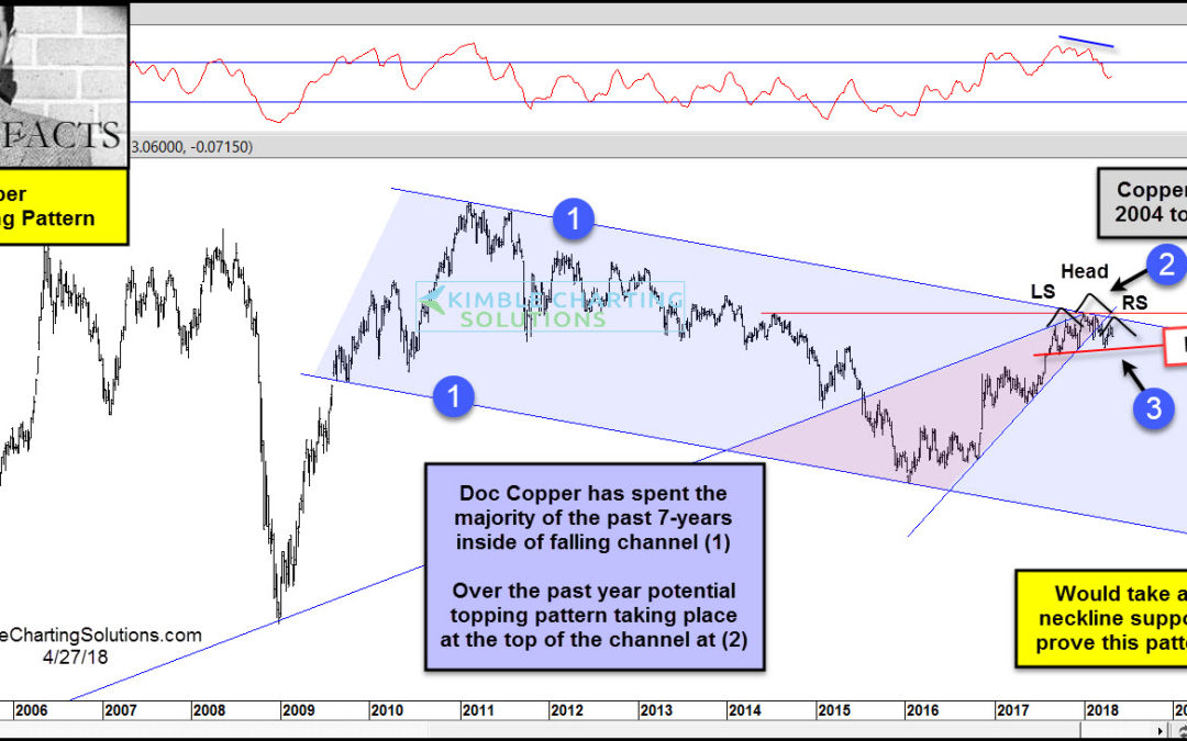
by Chris Kimble | Apr 27, 2018 | Kimble Charting
CLICK ON CHART TO ENLARGE The long-term trend of Doc Copper remains down, as it has created a series of lower highs and lower lows inside of falling channel (1) over the past 7-years. It hit the bottom of the channel in late 2015, where it found support and a rally...

by Chris Kimble | Sep 2, 2014 | Kimble Charting
CLICK ON CHART TO ENLARGE Would you have guessed 8 months ago that the S&P 500 would hit the 2,000 level and Government bond ETF TLT would be up twice as much as the broad market on the year? I can’t help but believe this has surprised a few...
by Chris Kimble | May 28, 2014 | Kimble Charting
CLICK ON CHART TO ENLARGE If an asset rose 50% more than than its seven biggest rallies in 30 years, would you say that is closer to the norm or closer to an aberration? In my humble opinion, it seems closer to an aberration. Almost 6 months ago I shared...

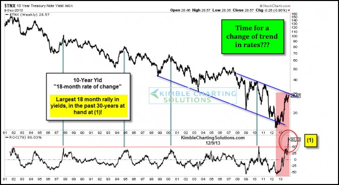
by Chris Kimble | May 1, 2014 | Kimble Charting
CLICK ON CHART TO ENLARGE The no-brainer, can’t-miss trade of 2014 was supposed to be betting on higher interest rates. So how’s that working out for you? Apparently, not so good for Wall Street’s largest bond dealers that have seen their bearish trades...
