
by Chris Kimble | Apr 2, 2012 | Kimble Charting
CLICK ON CHART TO ENLARGE Basic materials is one of the weaker performing sectors over the last year, as IYM is trailing the S&P 500 by almost 20% (FCX by 35%). FCX is on support dating back to its 2009 lows and IYM is in a tight jam, up against falling...

by Chris Kimble | Mar 28, 2012 | Kimble Charting
CLICK ON CHART TO ENLARGE The worlds leading copper producer has underperformed the S&P 500 by more than 40% in the past year and is breaking key support levels at (2). Not only has FCX underperformed against the S&P 500, so has Basic Materials ETF...

by Chris Kimble | Mar 7, 2012 | Kimble Charting
CLICK ON CHART TO ENLARGE My hero and mentor Sir John Marks Templeton used to say…The four most dangerous words in investing are-“Its Different This Time!” Basic Materials ETF (IYM) and High Yield ETF (JNK) have created a series of lower...
by Chris Kimble | Mar 5, 2012 | Kimble Charting
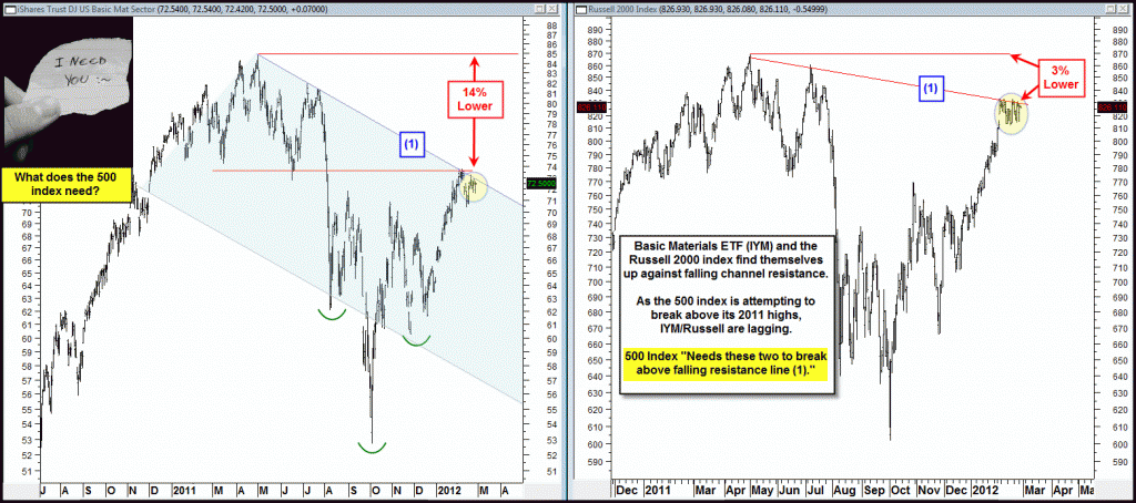
Last week the Power of the Pattern reflected thatBasic Materials were lagging the broad market by a 14% , (since last April highs) and that for the broad market to move higher, the 500 index needed Basic Materials and the Russell 2000 to break resistance in the...

by Chris Kimble | Feb 28, 2012 | Kimble Charting
CLICK ON CHART TO ENLARGE The S&P 500 index is working hard to break above its 2011 highs. What does it need to help push it a good deal higher? It could us a break above resistance by the Basic Materials ETF (IYM) and the Small caps...

by Chris Kimble | Feb 10, 2012 | Kimble Charting
I am of the opinion it can “Pay To Be Picky” when looking at leadership stocks/ETF’s in the Basic Materials arena. The chart below was shared with Premium Members 10 days ago, reflecting that…An Extremely bearish single day pattern had...

by Chris Kimble | Feb 2, 2012 | Kimble Charting
In the movie Groundhog Day, actor Bill Murray plays a weatherman, which finds himself living the same day over and over again. The 3-pack below reflects that many key markets are experiencing the same thing…resistance- CLICK ON CHART TO ENLARGE Prices...

by Chris Kimble | Jan 30, 2012 | Kimble Charting
The chart below reflects the past 60 day returns of the broad market and some very hot sectors. CLICK ON CHART TO ENLARGE Some of these sector ETF’s have doubled to tripled the 500’s performance over the past 60 days. Below is a...
