by Chris Kimble | May 31, 2017 | Kimble Charting
The economy continues to do well, along with the stock market, prompting many to be concerned about inflationary pressures picking up speed. Below looks at the TIP/TLT ratio and the message it is sending about inflationary pressures, or lack of. CLICK ON CHART TO...

by Chris Kimble | Dec 9, 2016 | Kimble Charting
Below looks at the patterns on the S&P 500 and the Yield on the 10-year note (Inverted to look like bond prices), since the late 1980’s. A rare test of support and resistance by stocks and bonds, is in play right now! CLICK ON CHART TO ENLARGE The S&P...

by Chris Kimble | Jul 25, 2014 | Kimble Charting
CLICK ON CHART TO ENLARGE The above chart highlights that yields on the 10-year note & 30-year bond are down on average of 17% this year, to the surprise of many. Would rates falling another 20% surprise a few investors? I suspect so! The Power of the...

by Chris Kimble | Mar 27, 2014 | Kimble Charting
CLICK ON CHART TO ENLARGE 2013 wasn’t kind to the bond market, one of the worst years in a long, long time. The decline in bond prices drove TLT down to its 38% Fibonacci retracement level. Could TLT be forming a bullish inverse head & shoulders...
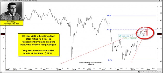
by Chris Kimble | Jan 24, 2014 | Kimble Charting
CLICK ON CHART TO ENLARGE The yield on the 30-year bond has created a multi-year bearish rising wedge and is breaking lower support of this bearish pattern above, after hitting its 61% Fibonacci retracement level. CLICK ON CHART TO ENLARGE The yield on the...

by Chris Kimble | Jan 14, 2014 | Kimble Charting
CLICK ON CHART TO ENLARGE What do the three largest declines in the S&P 500 since 2007 have in common? It doesn’t have to do with the VIX being low! It doesn’t have to do with bullish sentiment being high either? Have any thoughts what these...

by Chris Kimble | Jan 8, 2014 | Global Dashboard, Kimble Charting
The Power of the Pattern suggested interest rates were about to blast off in May of last year (See post here) Since that post the yield on the 10-year note is up 80%! Below is the performance of interest sensitive assets & the S&P 500 since that...
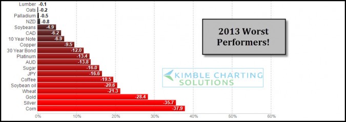
by Chris Kimble | Dec 23, 2013 | Kimble Charting, Sector / Commodity
CLICK ON CHART ENLARGE 2013 has been good for stocks, the above table reflects its not been the best of years for certain assets. These are the worst performers so far YTD. As 2013 is nearing a close I wanted to share these worst performers and apply some Power of the...
