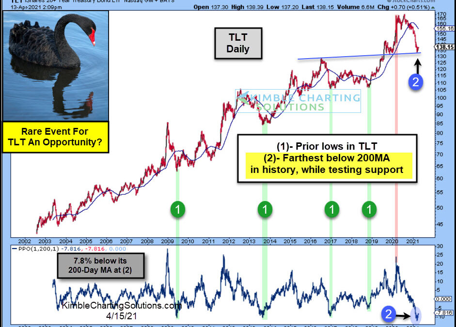
by Chris Kimble | Apr 15, 2021 | Kimble Charting
Long-dated treasury bonds have been crushed over the past year, sending ETFs like TLT (20+ Year US Treasury Bond ETF) spiraling over 20%. Improving economy? Inflation concerns? Perhaps a combination of both… interest rates have risen sharply and thus bond prices have...
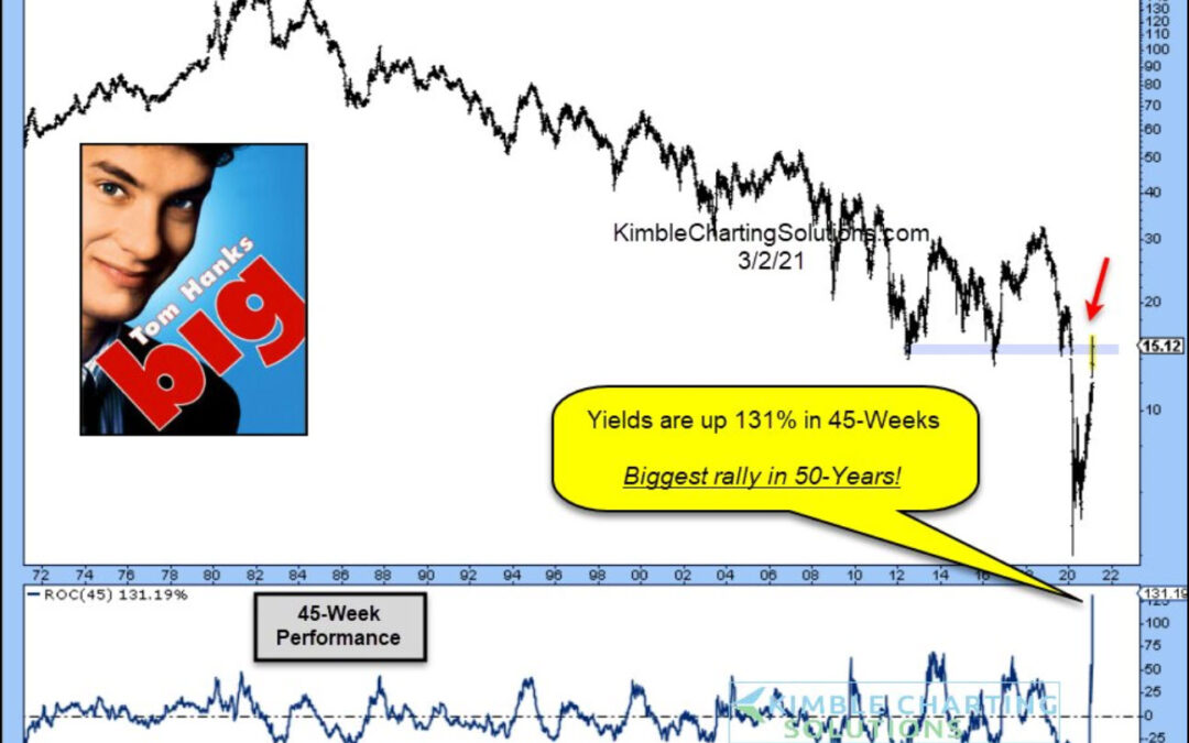
by Chris Kimble | Mar 4, 2021 | Kimble Charting
The waterfall decline of bond yields (and interest rates) has been met with an equally steep rally. In fact, the 10-Year US Treasury bond yield is up 131% in 45 weeks, making it the biggest rally in 50 years! See the chart below. Earlier today we asked if the 40-Year...
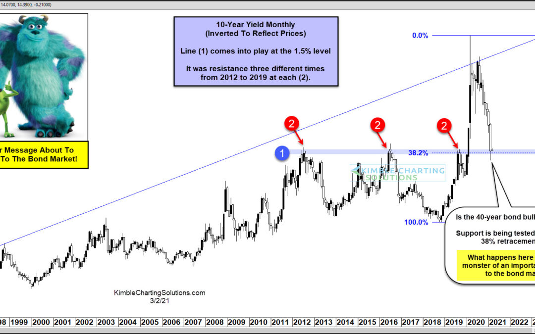
by Chris Kimble | Mar 3, 2021 | Kimble Charting
The bull market in bond prices has steady, durable, and trustworthy. Over the past 40 years, if investors could count on anything, it was rising bonds and falling bond yields (interest rates). But this trend / dynamic may be changing… The post pandemic spike lower in...
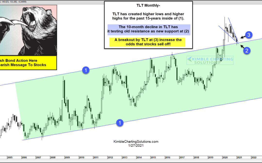
by Chris Kimble | Jan 27, 2021 | Kimble Charting
Bonds have experienced a large percentage decline since the highs of last March. Have bonds fallen enough? If they rally, could they be sending a bearish message to stocks? This chart looks at Govt Bond ETF (TLT) over the past 20-years. TLT has created a series of...
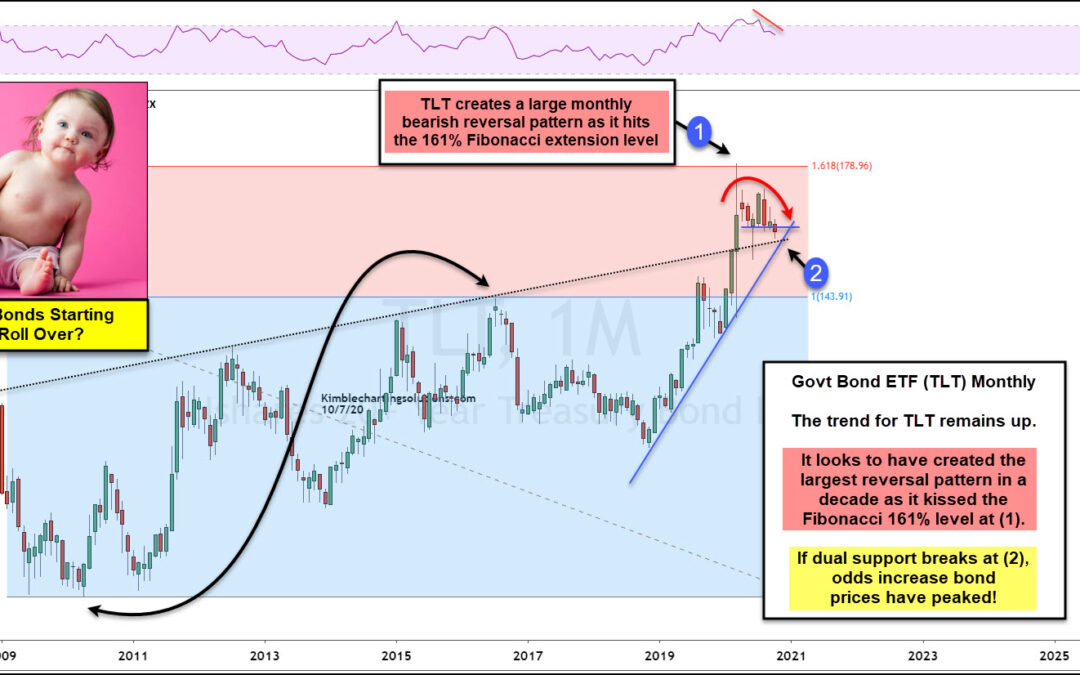
by Chris Kimble | Oct 7, 2020 | Kimble Charting
Are Government bonds creating a peak and starting to roll over? Possible! What happens at the support test (2) will go a long way to answering this question. This chart looks at Government bond ETF (TLT) on a monthly basis, where Fibonacci was applied to the 2010 lows...
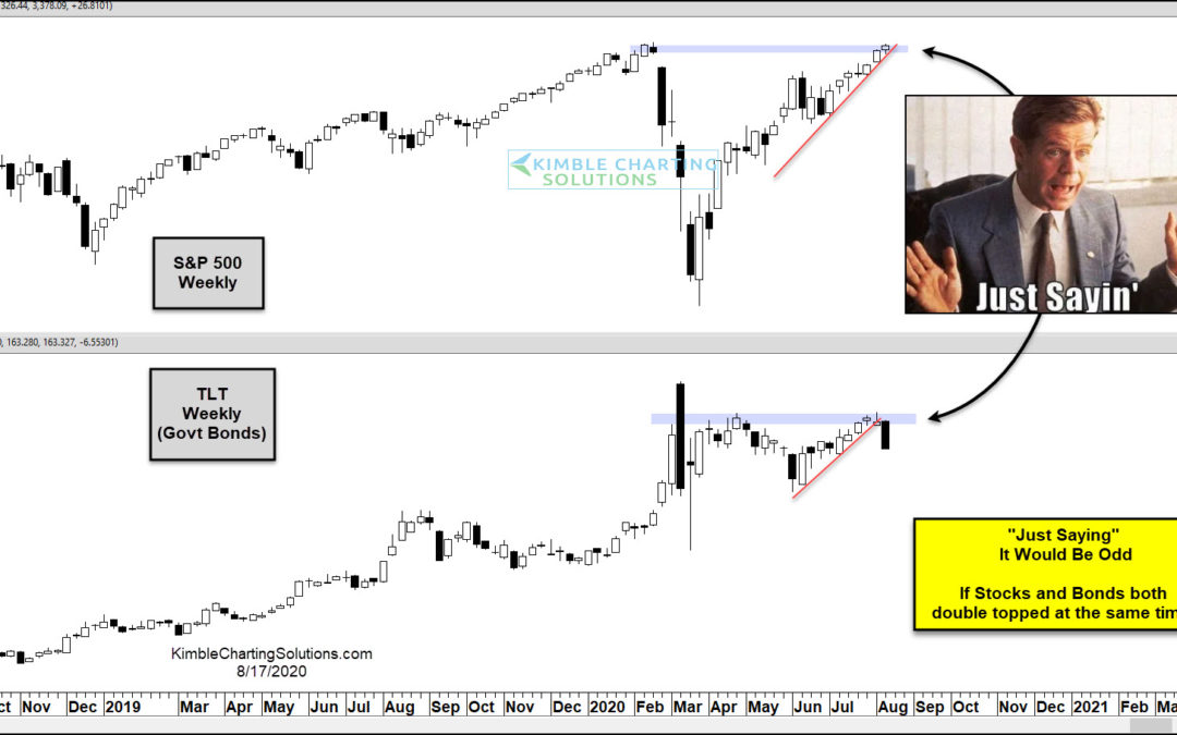
by Chris Kimble | Aug 17, 2020 | Kimble Charting
Its been an interesting year in the financial markets, to say the least. And today’s chart qualifies as “interesting” indeed. When the market crashed in March, bond prices surged as yields fell. And the 20+ Year US Treasury Bond ETF (TLT) hit $179 before reversing...
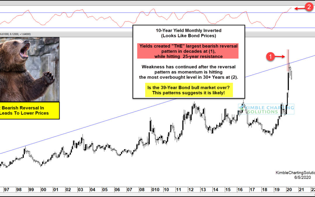
by Chris Kimble | Jun 5, 2020 | Kimble Charting
10 Year US Treasury Bond Yield “inverted” Chart This chart should look familiar, as I’ve shared and updated it a few times to alert clients and readers. It is the 10 Year US Treasury Yield Chart… inverted. As you know, bond yields and price move in opposite...
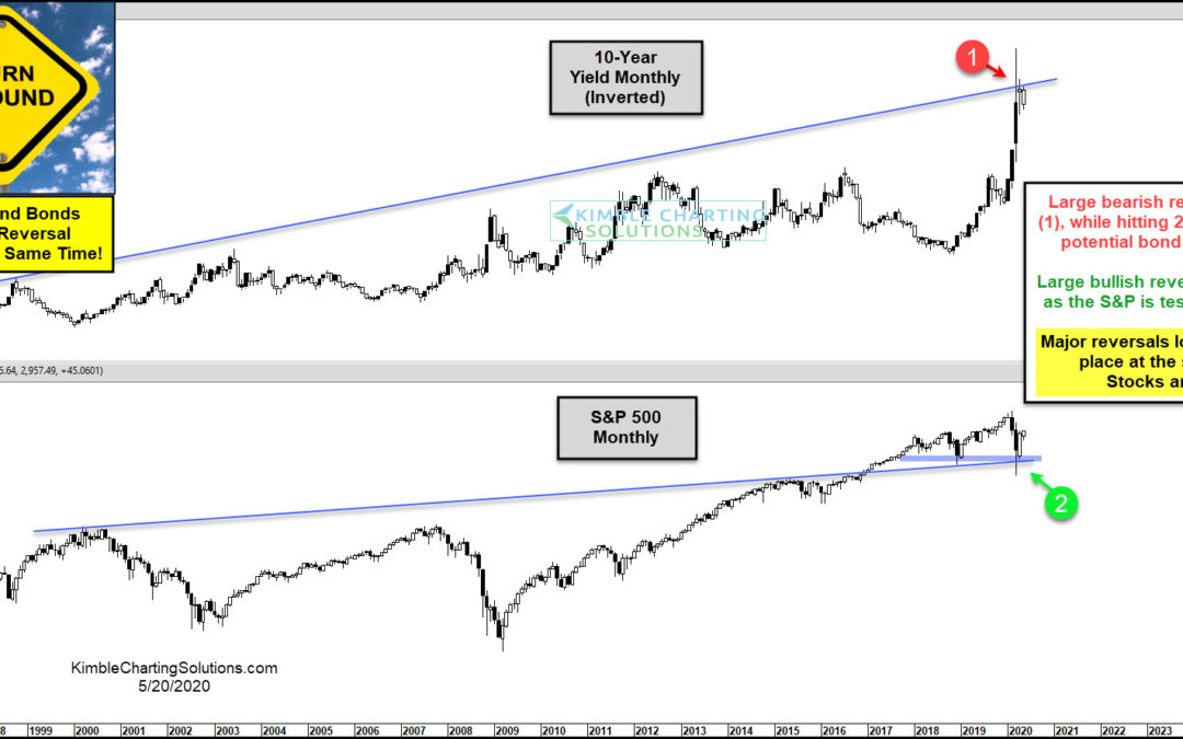
by Chris Kimble | May 20, 2020 | Kimble Charting
The March crash was pretty much an everything crash. But nearly as fast as the market crashed, it’s come back. In today’s chart, we look at two very important asset classes: stocks and bonds. Stocks are represented by the S&P 500 Index and bonds are shown by an...
