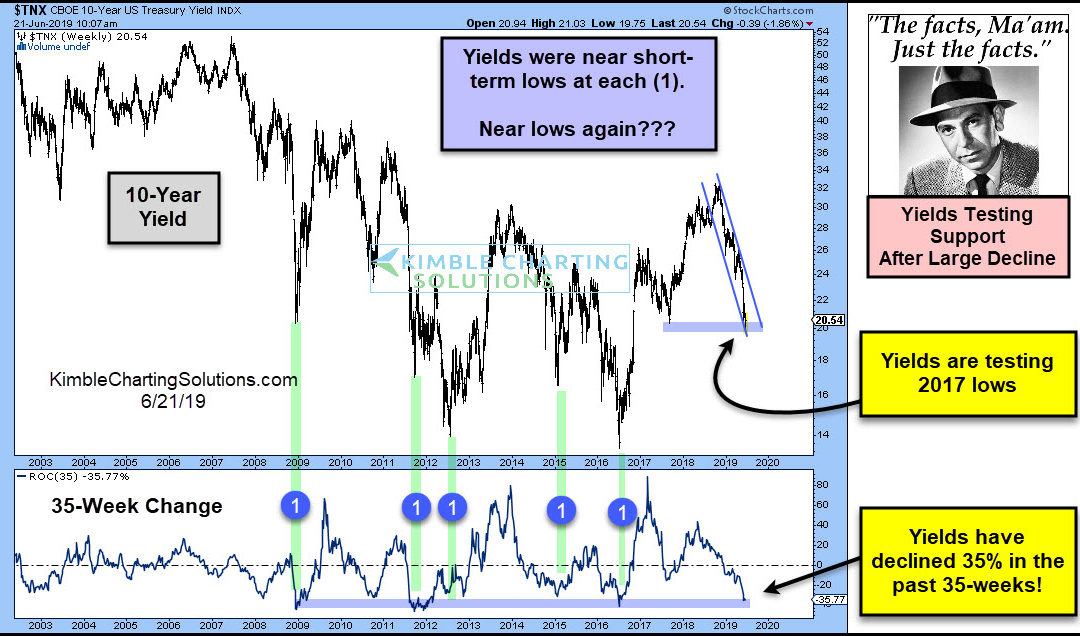
by Chris Kimble | Jun 21, 2019 | Kimble Charting
Are interest rates near a short-term low? Possible! This chart looks at the Yield on the 10-year note (TNX) over the past 15-years. The lower part of the chart measures the 35-week performance of TNX. Five different times over the past 10-years, yields have declined...
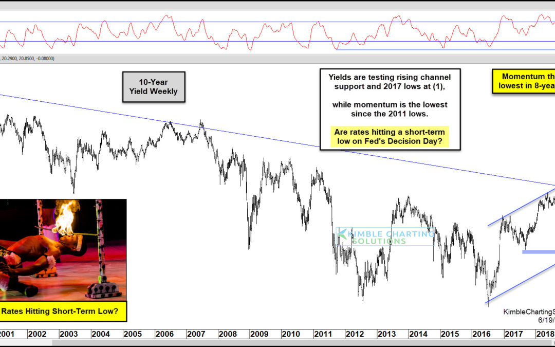
by Chris Kimble | Jun 19, 2019 | Kimble Charting
This afternoon the Fed will announce if they are going to lower interest rates. Does the bond market already have a rate decrease priced into the market? Possible! This chart looks at the yield on the 10-year note over the past 20-years. Without a doubt, the long-term...
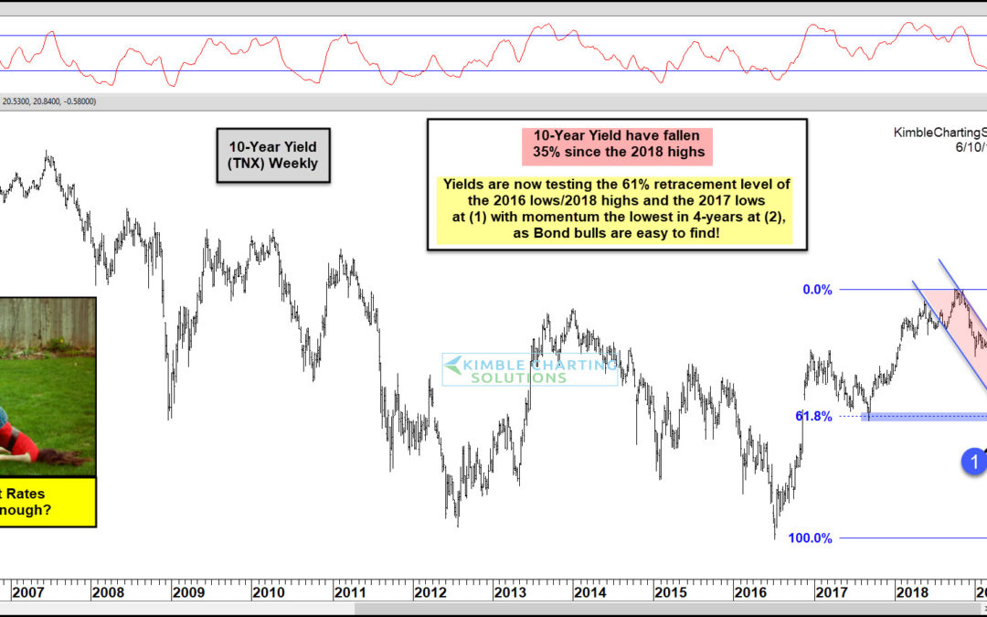
by Chris Kimble | Jun 10, 2019 | Kimble Charting
This chart looks at the Yield on the 10-year note on a weekly basis. Interest rates look to have peaked last October. Since hitting those highs, yields have declined 35%! This large decline has them testing the 2017 lows and its 61% retracement level of the 2016...
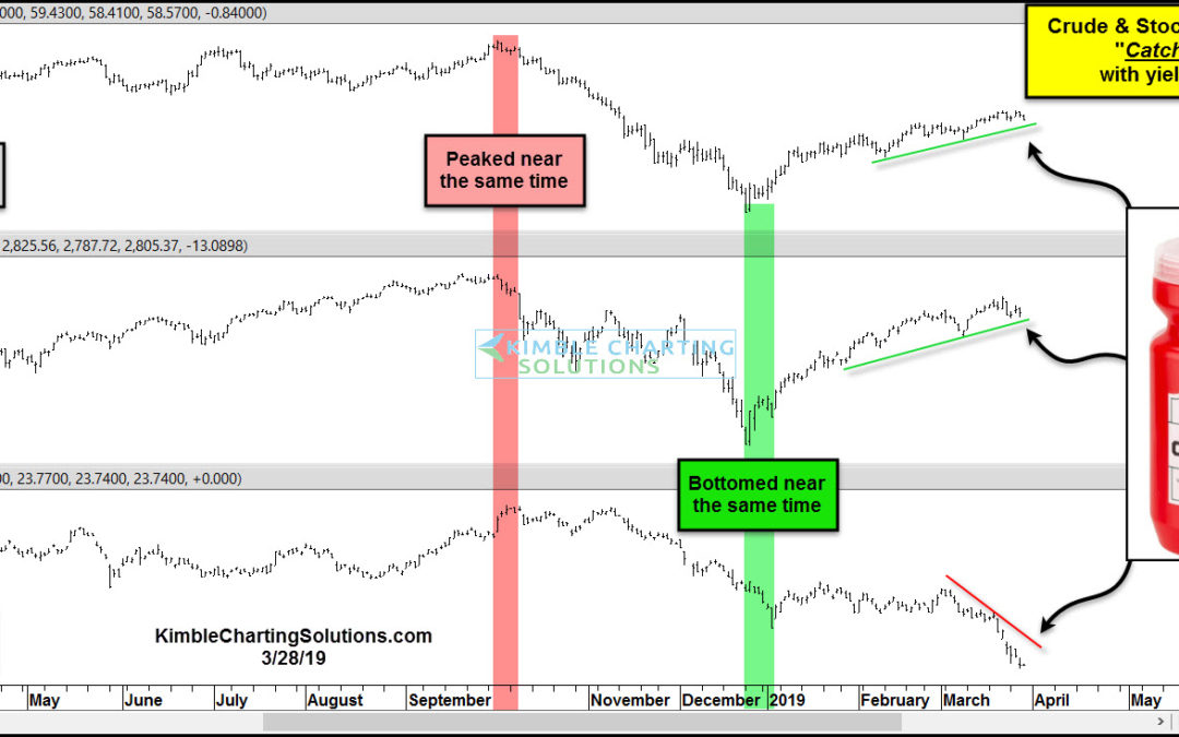
by Chris Kimble | Mar 28, 2019 | Kimble Charting
Crude Oil, Stocks, and Yields have experienced a high degree of correlation over the past few months. All three peaked together near the end of September and all three bottomed together near Christmas. This month a big divergence is taking place! The chart above...
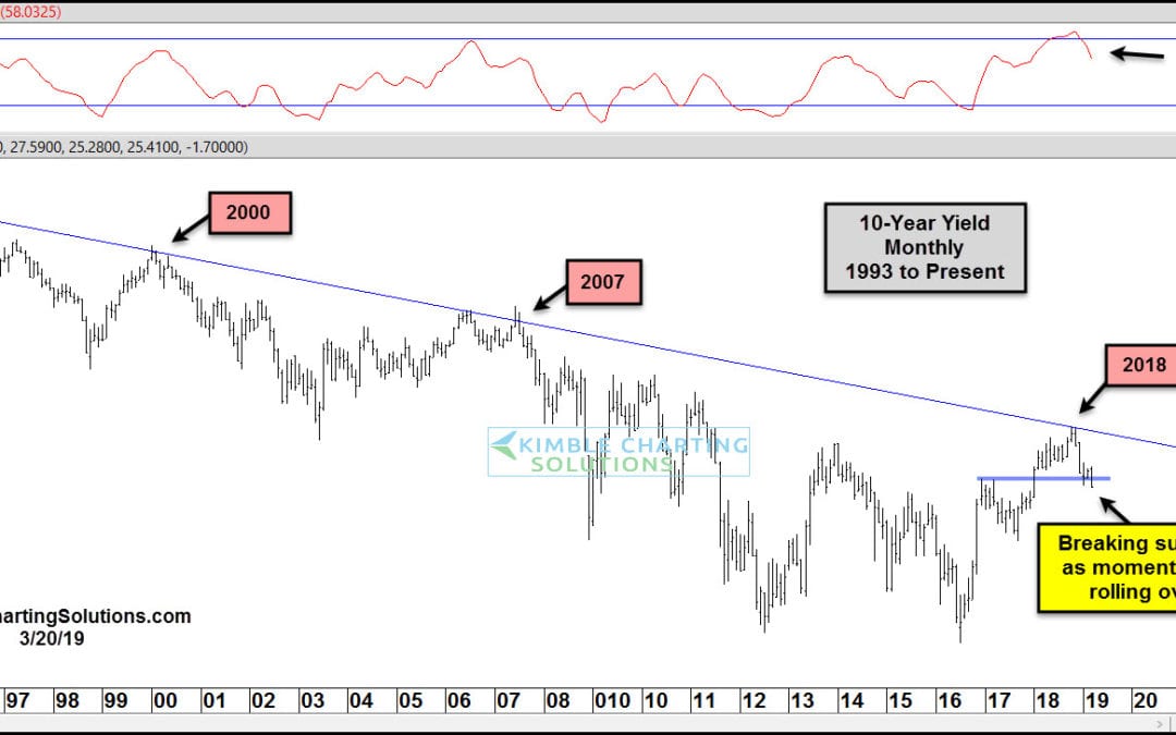
by Chris Kimble | Mar 21, 2019 | Kimble Charting
The Federal Reserve wasn’t quite as hawkish as investors expected. The result: Treasury bond yields (interest rates) fell sharply. In today’s chart of the 10-Year US Treasury Yield, we highlight the reversal in rates that occurred late last year. This wasn’t just any...
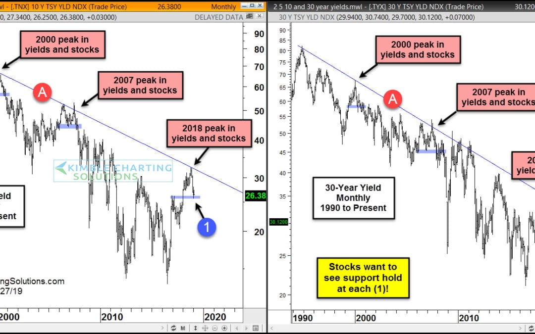
by Chris Kimble | Feb 28, 2019 | Kimble Charting
When the financial media talks about US Treasuries, it is usually focused on the yield curve. Or sometimes they will highlight the 10-year treasury yield and its relation to mortgage rates. But more recently, the news has been focused on the prospects of a yield curve...
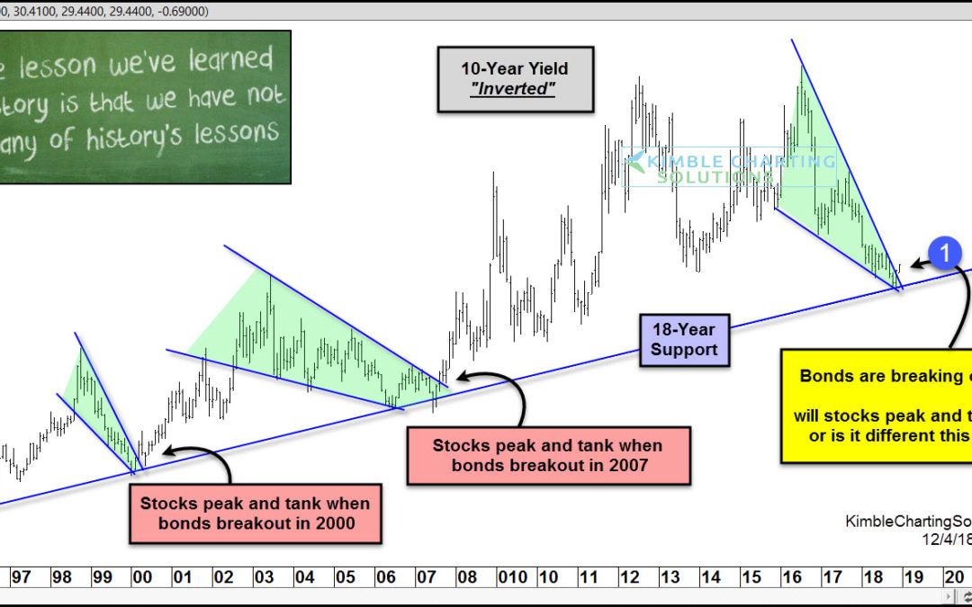
by Chris Kimble | Dec 6, 2018 | Kimble Charting
Are stocks receiving another dire warning, similar to the message received in 2000 & 2007? Very possible! This chart looks at the yield on the 10-year yield, inverted. This chart now resembles bond prices. The inverted yield has remained above a key support line...
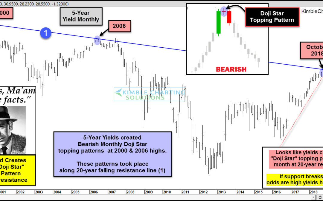
by Chris Kimble | Nov 30, 2018 | Kimble Charting
Could interest rates be peaking after moving much higher over the past 5-years? Yes! Joe Friday shares that the yield on the 5-year note, looks like it created an important topping pattern last month. This chart looks at the yield on the 5-year note over the past...
