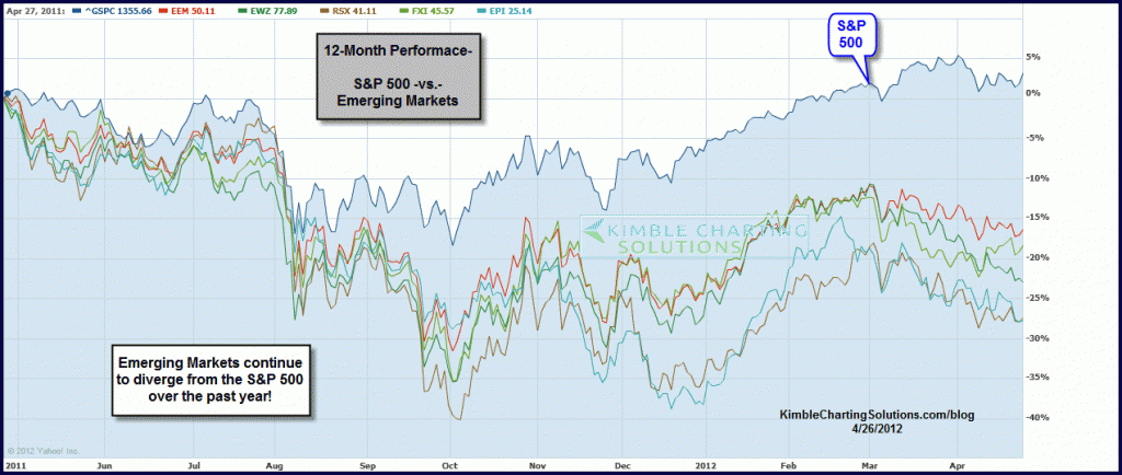
by Chris Kimble | Apr 26, 2012 | Kimble Charting
Its very easy to read research papers from Wall Street firms or hear money managers on CNBC tout that the real growth story continues to lie in the “Emerging Markets” arena. They may be correct in the longer-term, yet the Power of the Pattern...
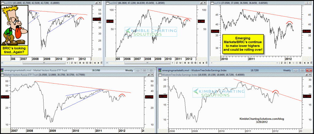
by Chris Kimble | Mar 29, 2012 | Kimble Charting
CLICK ON CHART TO ENLARGE Emerging Markets/BRIC ETF’s continue to create a series of lower highs and of late are acting pretty tired (reflecting relative weaknesss) compared to the broad markets in the states. Keep eye on Emerging Markets to see if they turn...

by Chris Kimble | May 3, 2011 | Kimble Charting
Emerging Market ETF’s are “Sub-Merging” of late, as key support is breaking! CLICK ON CHART TO ENLARGE Is this price action a tip-off to what the results of the “Shanghai Flag” pattern will take? (see post here). ...

by Chris Kimble | Apr 1, 2011 | Kimble Charting
CLICK ON CHART TO ENLARGE BRIC ETF’s are doing well of late. Good to see several ETF’s in the arena acting well! The “Power of the Pattern” suggested we could find relative performance strength in this area and so far the price action and...

by Chris Kimble | Mar 24, 2011 | Kimble Charting
On 3/8 I mentioned it might be time to look at the emerging markets again and the “Power of the Pattern” seemed to favor Thailand (THD) and India (EPI) (see post here) I shared at that time that I would want to be an owner on a breakout. CLICK...
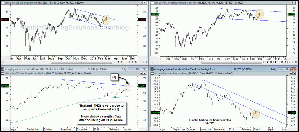
by Chris Kimble | Mar 8, 2011 | Kimble Charting
I have stayed away from the Emerging markets for months, due to poor looking chart patterns. Now some interesting patterns are starting to “emerge!” CLICK ON CHART TO ENLARGE The two most interesting patterns above are Thailand (THD) and India (EPI)! ...

by Chris Kimble | Jan 10, 2011 | Kimble Charting
CLICK ON CHART TO ENLARGE Emerging markets ETF (EEM) has created a rather sizeable rising wedge over the past few months, with the bottom of the wedge attempting to break support. Speaking of weakness and breaking support, India (EPI) is reflecting relative...

by Chris Kimble | Dec 10, 2010 | Kimble Charting
I posted a quiz on 11/11, asking what would you do with the chart below (see post here) Actually the chart was the U.S. Dollar, turned UPSIDE down. At that time roughly 5% of investors were bullish the Dollar and the Dollar was testing STRONG SUPPORT! CLICK ON CHART...
