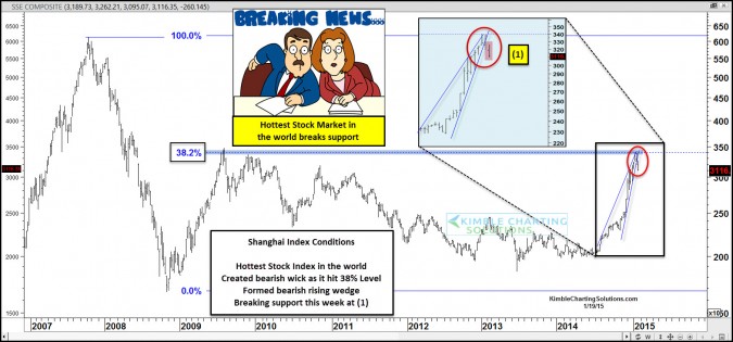
by Chris Kimble | Jan 19, 2015 | Kimble Charting
CLICK ON CHART TO ENLARGE One week ago today the Power of the Pattern shared the following conditions were in play for hottest index on the planet (Shanghai index) The Shanghai index was up 40% in 90-Days, formed a bearish wick as it was facing channel...

by Chris Kimble | Jan 12, 2015 | Kimble Charting
CLICK ON CHART TO ENLARGE When it comes to ”Red Hot” stock markets around the world, the overwhelming winner the past 90-days is the Shanghai index, up more than 40%. Even though the S&P 500 is doing well and is just under 3% away from...

by Chris Kimble | Dec 9, 2014 | Kimble Charting
CLICK ON CHART TO ENLARGE When it comes to year to date or the past 90 days performance, the Shanghai Index is at the top of the list for both time frames! No doubt this index has been white hot of late! Even though the Shanghai has been screaming higher of...
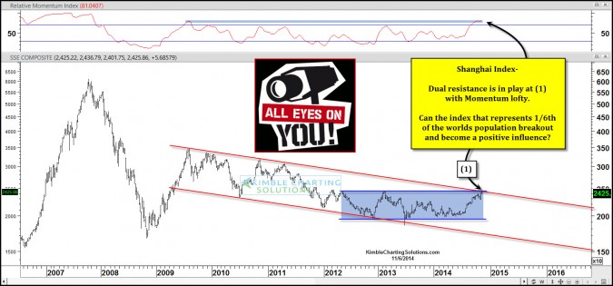
by Chris Kimble | Nov 6, 2014 | Kimble Charting
CLICK ON CHART TO ENLARGE Is what happens in China important to the rest of the world? I would guess a few would say yes. When it comes to stock market performance, is what happens in China important to the S&P 500 or other global stock markets? I...

by Chris Kimble | Sep 3, 2014 | Kimble Charting
CLICK ON CHART TO ENLARGE The Power of the Pattern has been keeping an eye on China ETF FXI, as it approached 6-year falling resistance a couple of months ago. Members bought FXI near resistance with a tight stop, looking for a potential breakout. Of late, FXI...

by Chris Kimble | Jul 23, 2014 | Kimble Charting
CLICK ON CHART TO ENLARGE Many major stock index’s in the United States and Europe are either at all-time highs or near them. One sixth of the worlds population can’t make the same statement though! The chart below reflects that the Shanghai Index...

by Chris Kimble | Jun 12, 2014 | Kimble Charting
CLICK ON CHART TO ENLARGE The Shanghai Index looks to be creating a multi-year descending triangle pattern. A little over 50% of the time the asset that forms this pattern, ends up falling in price. When support breaks, over 75% of the time a meaningful decline...

by Chris Kimble | Apr 21, 2014 | Kimble Charting
CLICK ON CHART TO ENLARGE When it comes to population, China represents one sixth of the worlds population. Does size matter? At this time it appears the Shanghai index is testing the underside of this flag/pennant pattern at (1) above. The Emerging markets ETF...
