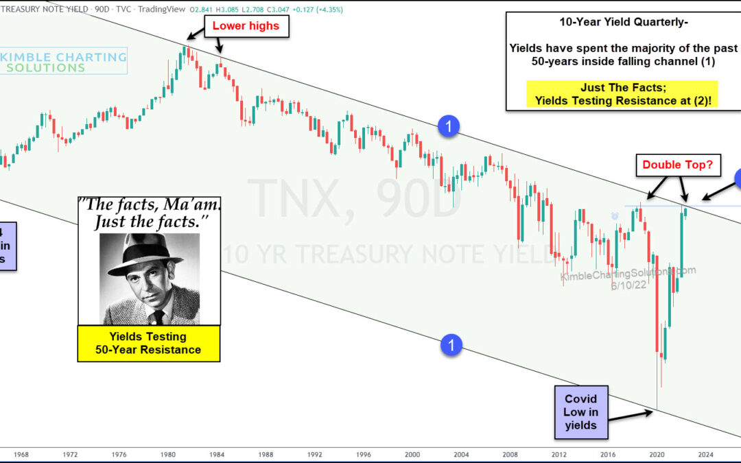
by Chris Kimble | Jun 10, 2022 | Kimble Charting
Have interest rates gone up enough? Odds are high, this question is on the minds of global investors. This chart looks at the 10-year yield, on a quarterly basis, since 1963. For more than 50-years, yields have created lower highs and lower lows inside of falling...
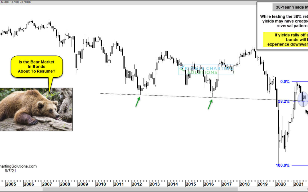
by Chris Kimble | Sep 8, 2021 | Kimble Charting
US Treasury bonds experienced a bear market and added selling pressure following the coronavirus flash crash as bond yields bottomed in early 2020 and took flight. The move higher in yields peaked early this year, taking some pressure off bonds. But if yields should...
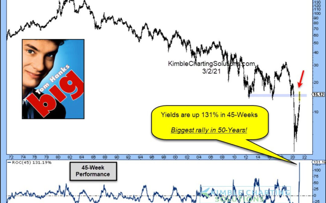
by Chris Kimble | Mar 4, 2021 | Kimble Charting
The waterfall decline of bond yields (and interest rates) has been met with an equally steep rally. In fact, the 10-Year US Treasury bond yield is up 131% in 45 weeks, making it the biggest rally in 50 years! See the chart below. Earlier today we asked if the 40-Year...
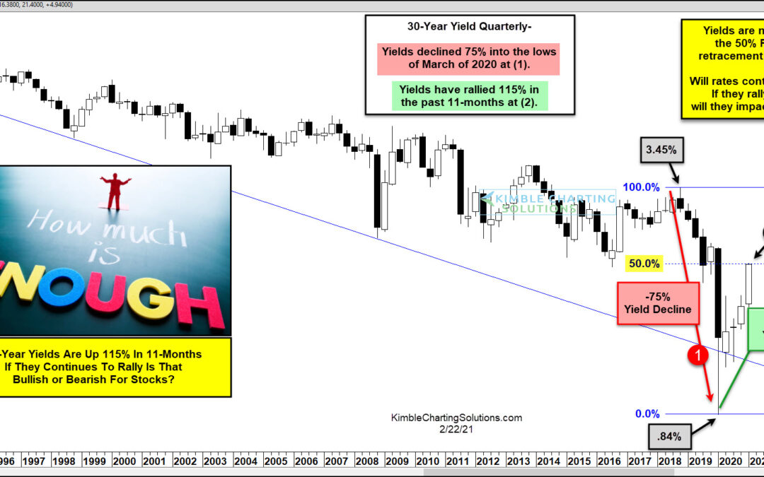
by Chris Kimble | Feb 22, 2021 | Kimble Charting
Interest rates on the 30-year bond fell 75% from November of 2018 until March of 2020 (1). They have rallied 115% in the past 11-months, after hitting lows in March 2020 at (2). As yields have risen 115% off the 2020 lows, the S&P is up nearly 65% at the same...
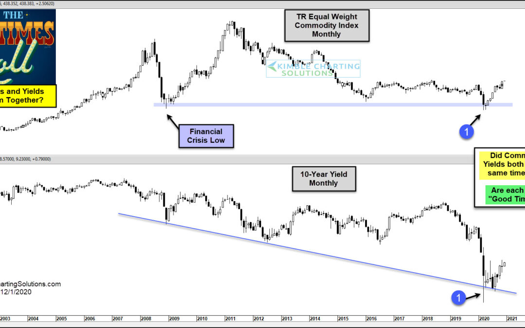
by Chris Kimble | Dec 2, 2020 | Kimble Charting
Commodities have traded “heavy” for the past decade, as bond yields remain low and inflationary forces remain under wraps. But this trend could be up-ended as we head into 2021. Today’s chart 2-pack looks at long-term “monthly” charts of the Thomson Reuters Equal...
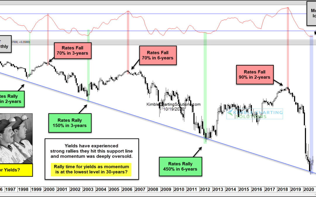
by Chris Kimble | Oct 19, 2020 | Kimble Charting
US treasury bond yields have been trending lower for over 3 decades. Could the latest drop mark a significant low for bond yields and interest rates? In today’s chart, we can see that interest rates have had several spike lows and highs, but that each low is lower and...
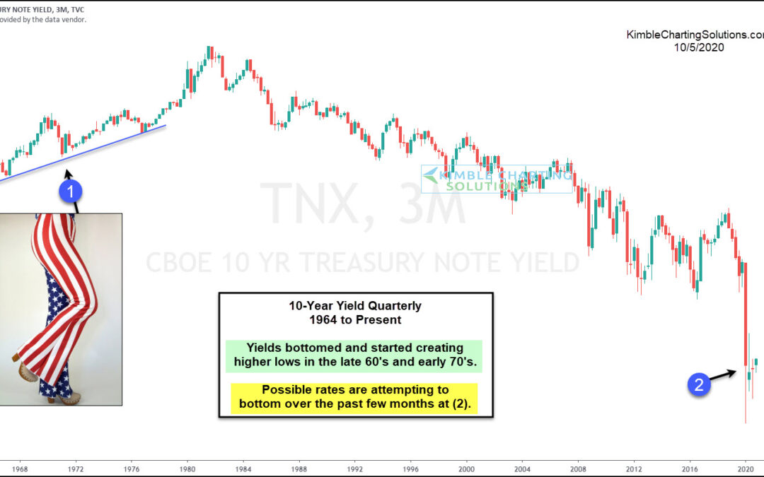
by Chris Kimble | Oct 5, 2020 | Kimble Charting
Are interest rates attempting to create a long-term bottoming pattern over the last 6-months? Possible! This chart looks at the yield on the 10-year note, on a quarterly basis since the early 1960s. In the late 1960s and early 1970s, yields started creating higher...
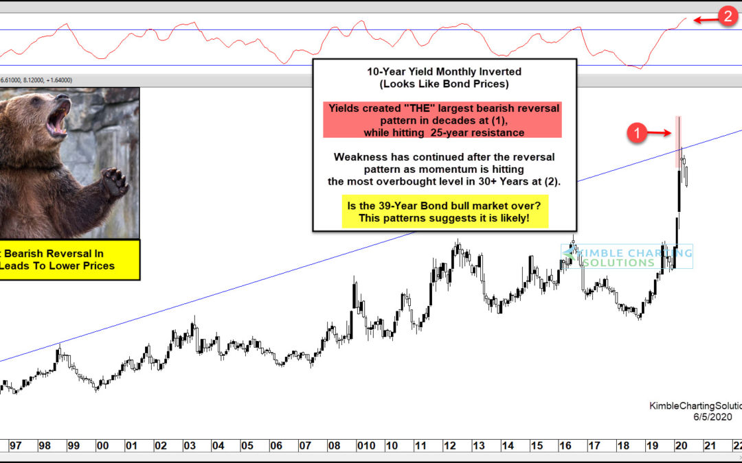
by Chris Kimble | Jun 5, 2020 | Kimble Charting
10 Year US Treasury Bond Yield “inverted” Chart This chart should look familiar, as I’ve shared and updated it a few times to alert clients and readers. It is the 10 Year US Treasury Yield Chart… inverted. As you know, bond yields and price move in opposite...
