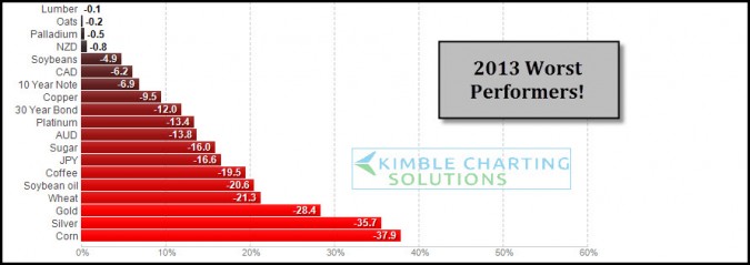
by Chris Kimble | Dec 23, 2013 | Kimble Charting, Sector / Commodity
CLICK ON CHART ENLARGE 2013 has been good for stocks, the above table reflects its not been the best of years for certain assets. These are the worst performers so far YTD. As 2013 is nearing a close I wanted to share these worst performers and apply some Power of the...
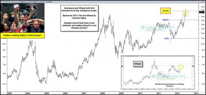
by Chris Kimble | Jul 31, 2012 | Kimble Charting
CLICK ON CHART TO ENLARGE Wheat and Soybean prices are up 30% in the past few months, reflecting the extreme drought conditions. The Power of the Pattern highlighted breakouts earlier this month (see grain breakouts) Now Beans are up against a 161% Fibonacci extension...
