
by Chris Kimble | Mar 17, 2013 | Kimble Charting
Happy St. Patrick’s Day to all! CLICK ON CHART TO ENLARGE The above chart reflects that St Patrick’s wasn’t so lucky for the broadest of U.S. stock index’s 13-years ago. The Wilshire 5000 finds itself kissing the underside of two...
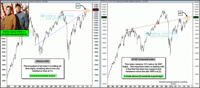
by Chris Kimble | Feb 13, 2013 | Kimble Charting
CLICK ON CHART TO ENLARGE “To boldly go where no man has gone before” was made made popular by the “Star Trek” series back in 1966. The Wilshire 5000 is taking investors where they have never gone before, as it breaks into all-time high...
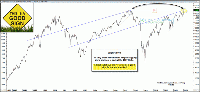
by Chris Kimble | Jan 24, 2013 | Kimble Charting
CLICK ON CHART TO ENLARGE When it comes to the broad market, the Wilshire 5000 is the broadest of all. This index has been steadily moving higher and now finds itself back at its 2007 highs. A breakout above line (1) in the chart above would be a good...

by Chris Kimble | Nov 9, 2012 | Global Dashboard, Kimble Charting
CLICK ON CHART TO ENLARGE The above 2-pack reflects that the NYSE Composite and Wilshire 5000 index COULD BE forming one of the largest “Bearish Head & Shoulders” patterns in the past 100 years. The above chart was created for Premium, ...

by Chris Kimble | Nov 7, 2012 | Kimble Charting
CLICK ON CHART TO ENLARGE Over the past 10-years, the U.S. Dollar has lost over a third of its value, inside of a falling channel. Earlier this year the Dollar broke above the 10-year falling channel and then fell in price as investors became too bullish on the Dollar...
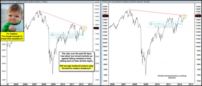
by Chris Kimble | Aug 23, 2012 | Kimble Charting
CLICK ON CHART TO ENLARGE The S&P 500 continues to reflect relative strength compared to its global counterparts (EEM & EFA). At the current time two of the broadest U.S. index’s are up against key falling resistance lines. Can enough traders step...
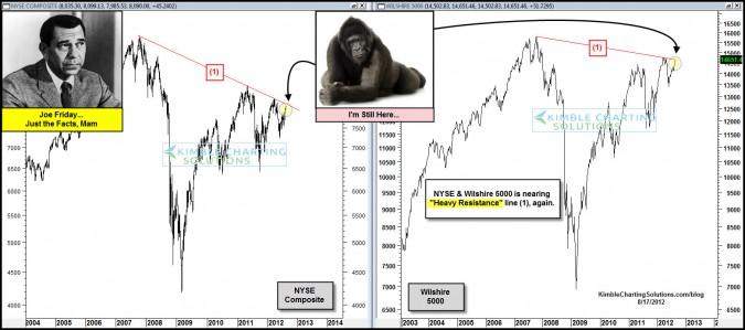
by Chris Kimble | Aug 17, 2012 | Kimble Charting
CLICK ON CHART TO ENLARGE Two of the broadest market index’s in the United States are back at resistance that has stopped their rallies over the past few years. Can these key markets push aside the 800 pound gorilla? Is the U.S. broad markets the only...

by Chris Kimble | Jun 27, 2012 | Kimble Charting
On June the 19th the chart below reflected underlying strength in the broad market, due to the upward slope of the advance/decline line, while the NYSE was reflecting some weakness (see post here) CLICK ON CHART TO ENLARGE Yes challenging news from around the...
