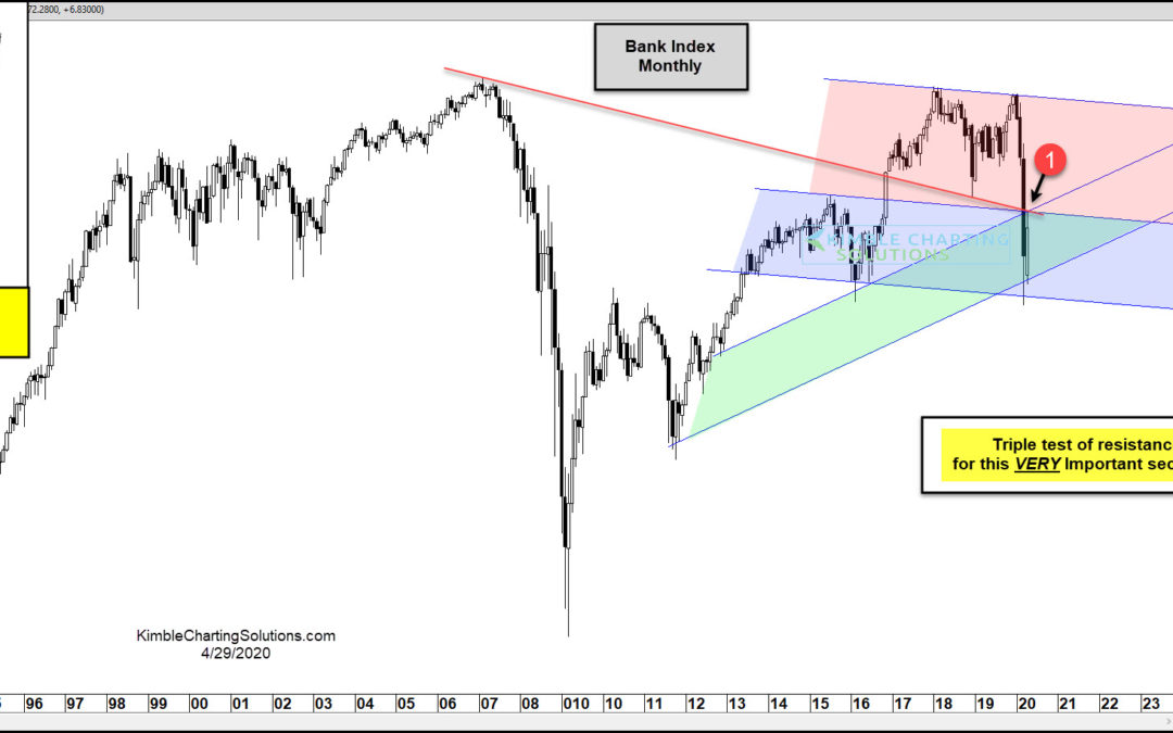
by Chris Kimble | Apr 29, 2020 | Kimble Charting
A healthy banking system is the hallmark of a growing economy. So when back stocks turn “south”, investors should tune in. Like the broader stock market indices, the Bank Index (BKX) crashed in March before bouncing back into April. That bounce has the Bank Index...
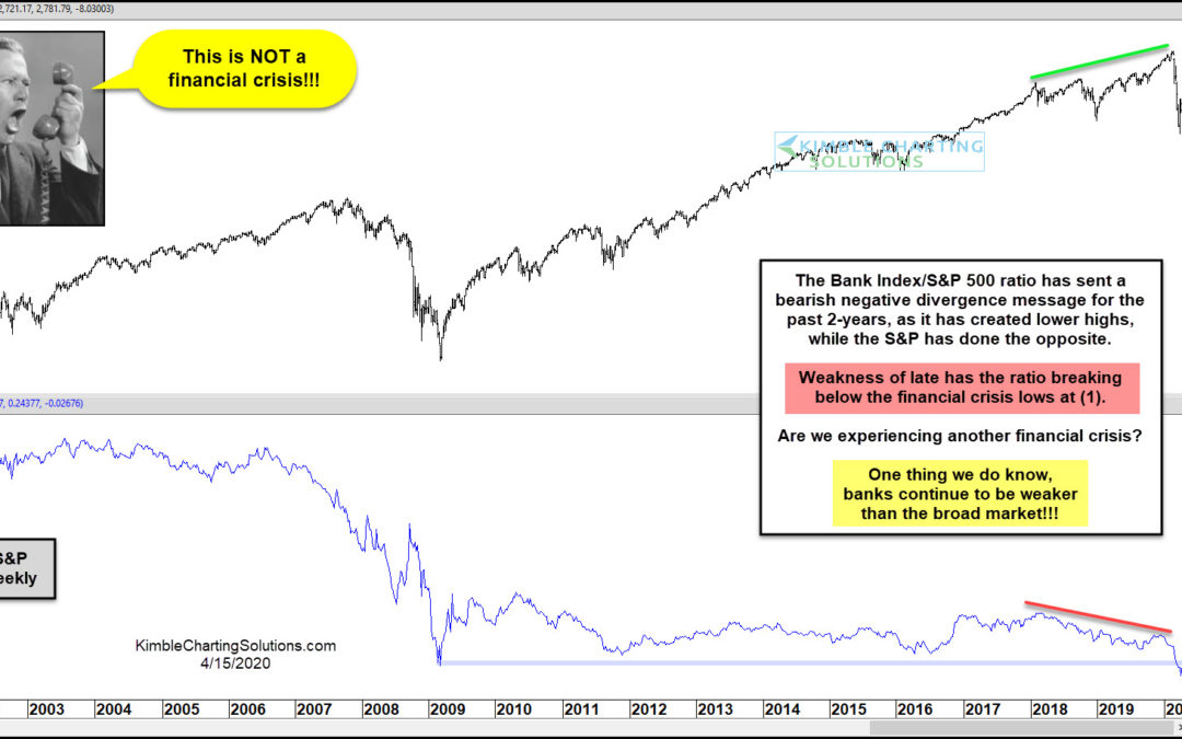
by Chris Kimble | Apr 16, 2020 | Kimble Charting
S&P 500 Index (top pane) vs Bank Index to S&P 500 Ratio (lower pane) As most investors know, the banks play a big role in the overall economy. Healthy banks tend to mean a healthy economy and struggling banks tend to mean an uneven or faltering economy. In...
by Chris Kimble | Dec 9, 2019 | Kimble Charting
Just as the health of the banking sector is a big deal to the economy, it’s equally important to the S&P 500 (SPY) and broader stock market. Although the bull market has grinding higher, it’s awaiting confirmation from the banks and banks stocks. Today’s chart is...
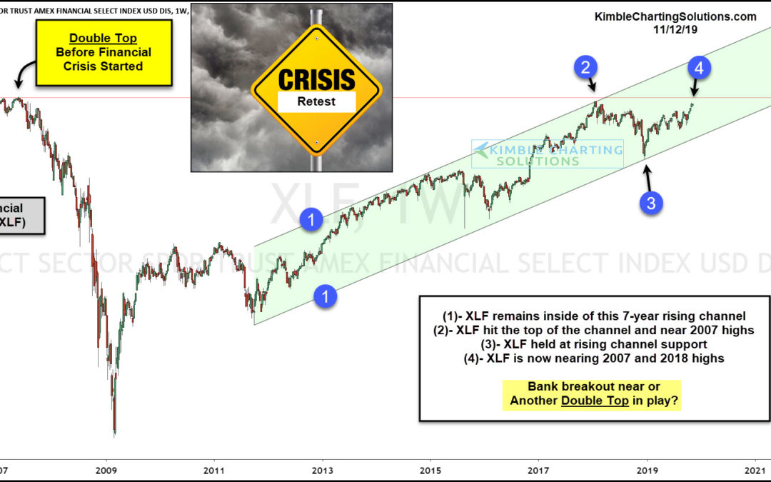
by Chris Kimble | Nov 12, 2019 | Kimble Charting
If the saying “So Goes The Banks, So Goes The Broad Market” is true, banks are facing a critical breakout/resistance test in my opinion. This chart looks at Financials ETF (XLF) over the past 12-years. This chart reflects that a double top took place prior...
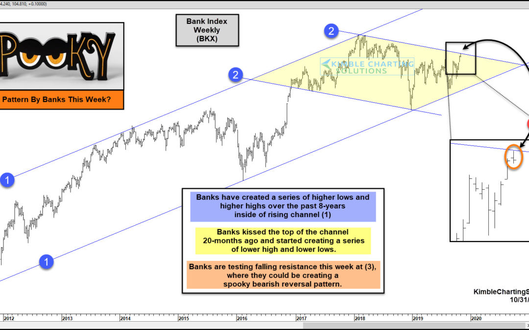
by Chris Kimble | Oct 31, 2019 | Kimble Charting
How Banks perform in the long-term has historically been important to the S&P 500. Are Banks sending a spooky message to the S&P 500 this week? Could Be! This chart looks at the Bank Index (BKX) over the past 8-years. Since the lows in 2011, the index has...
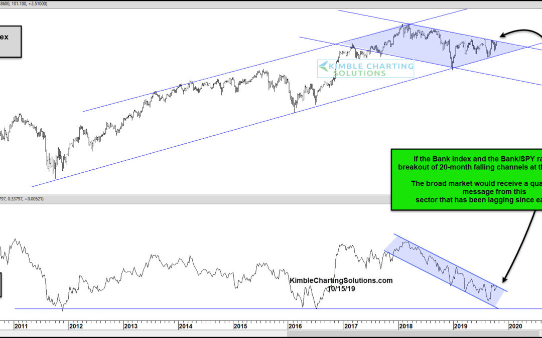
by Chris Kimble | Oct 17, 2019 | Kimble Charting
One of the most important sectors of the stock market is the banking industry and bank stocks. When the banks are healthy, the economy is likely doing well. And when bank stocks are participating in a market rally, then it bodes well for the broader stock market. In...
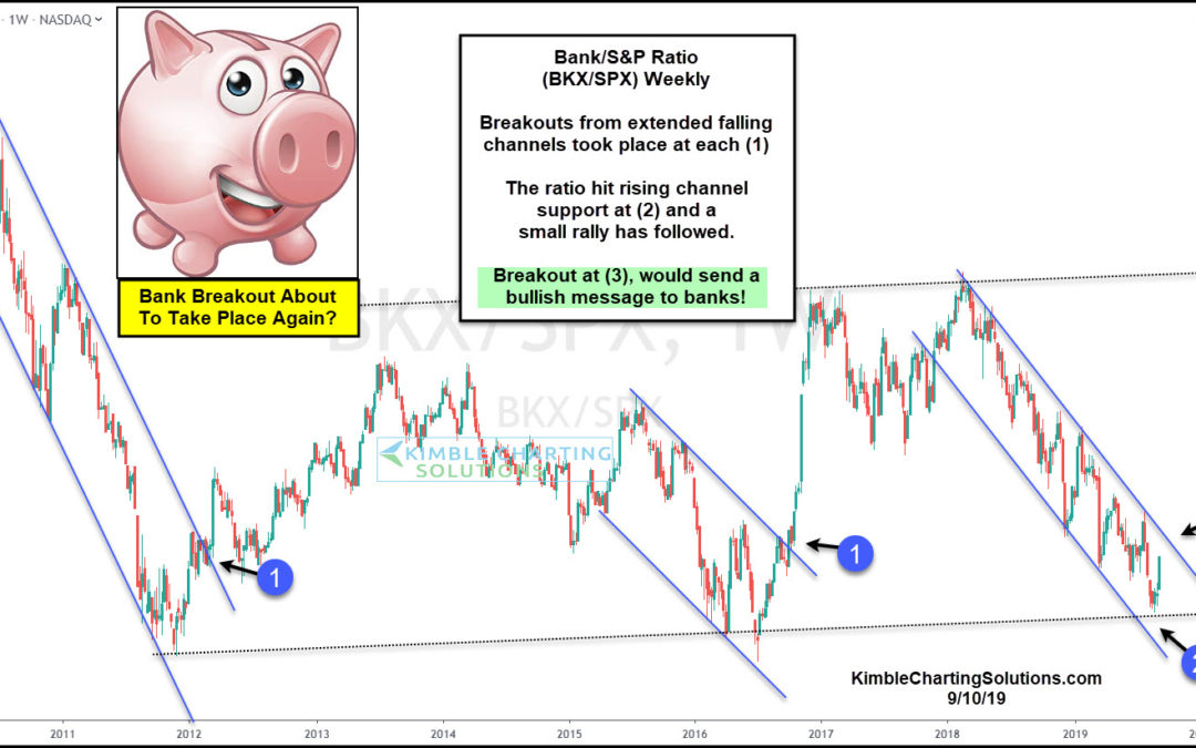
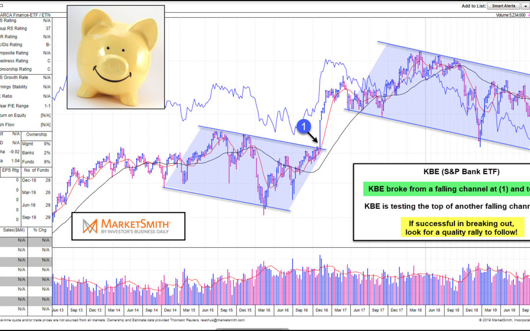
by Chris Kimble | Sep 10, 2019 | Kimble Charting
The Bank Index BKX has been trading in a downtrend since early 2018. And it has been underperforming the broad stock market indices as well. Is the bad news for banks stocks about to end? Stock market bulls sure hope so, as the stock market tends to be on stronger...
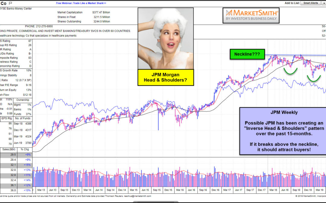
by Chris Kimble | Jul 24, 2019 | Kimble Charting
Is JP Morgan creating a pattern which is suggesting much higher prices? It could be! This chart looks at JP Morgan (JPM) on a weekly basis over the past 5-years. The chart itself comes from MarketSmith, a service provided by Investors Business Daily. Over the past...
