CLICK ON CHART TO ENLARGE
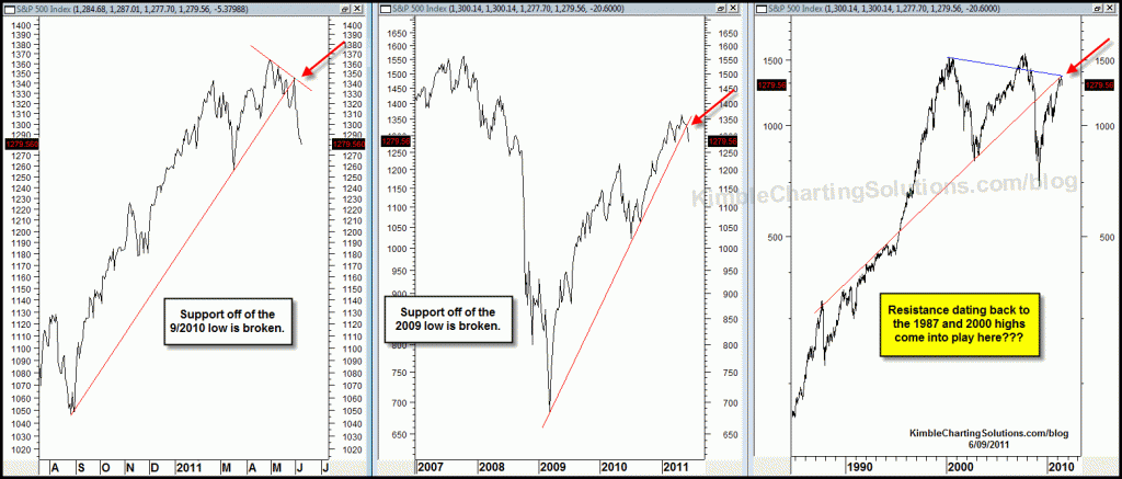
Sometimes key long-term support and resistance lines come together and have the potential to send an important message. Key lines drawn from the 1987 and 2000 highs might have come into play of late!
Any chance the intersection of these lines at (3) could be sending a message that some form of capital preservation strategies might come in handy until resistance is taken out?
CLICK ON CHART TO ENLARGE
The top chart reflects that long-term resistance dating back to the 1987 and 2000 highs is in place. The above 3-pack reflects that some shorter-term support lines look to have been taken out of late!
Another reason to harvest/protect some capital???


Time to use trending tools (moving averages and trendlines) & put the cycling tools away (oscillators)
Sonny….I believe it is great to look at the inflation adjusted prices, it does tell a unique and very valid story. Yet when it comes to investing we tend to buy and sell “un-adjusted prices ” so that is what I chart. I think most of the decisions around the world are made on the unadjusted price so I want to view the charts as the world sees them.
Great question Sonny
Chris,
Doug Short sometimes references S&P 500 prices on an inflationa adjusted basis. Do you ever use inflation adjusted S&P500? Would it make any difference to the current situation?
Thank You Chris G…I appreciate the kind words. I have been in the porfolio building business for the past 31 years, the opportunities have NEVER BEEN BETTER than now!
The most compelling charts I have seen on the web. Thank you, sir.