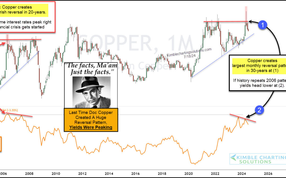
by Chris Kimble | Jul 19, 2024 | Kimble Charting
Investors have been watching the Federal Reserve and interest rates closely for the past several months. Well, actually more like the past several years. But maybe they should be watching copper prices for clues on where interest rates are headed. “The facts, Ma’am....
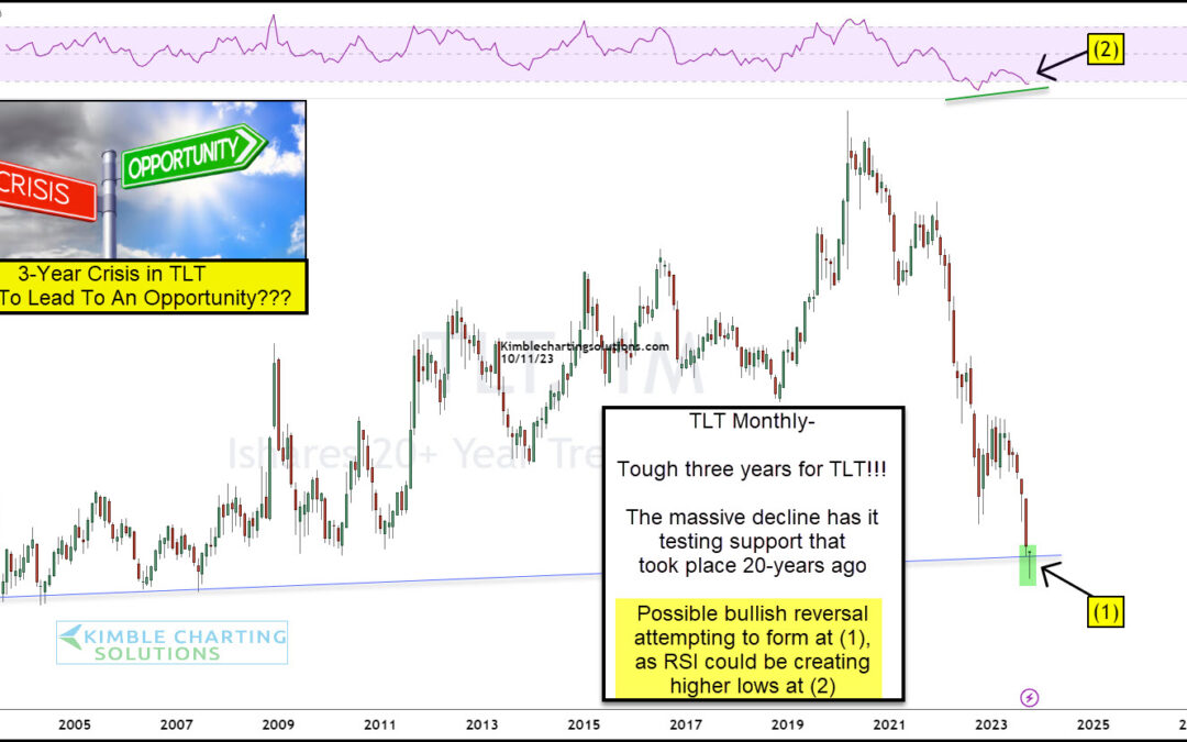
by Chris Kimble | Oct 12, 2023 | Kimble Charting
Rising interest rates has created a decline in treasury bonds not seen in modern times. Well, they say crisis equals opportunity. This may be the case today as we look at a long-term “monthly” chart of the 20+ Year Treasury Bond ETF (TLT). As you an see, it has been a...
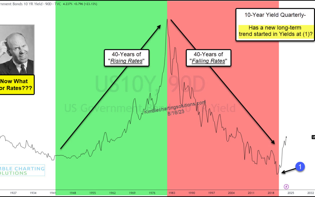
by Chris Kimble | Aug 21, 2023 | Kimble Charting
Rising interest rates are beginning to spook investors. And rightfully so. It’s been the fastest rise in rates in decades. And just when we thought interest rates were easing, they pushed higher once more! 40 years up and then 40 years down… now what for bond yields?...
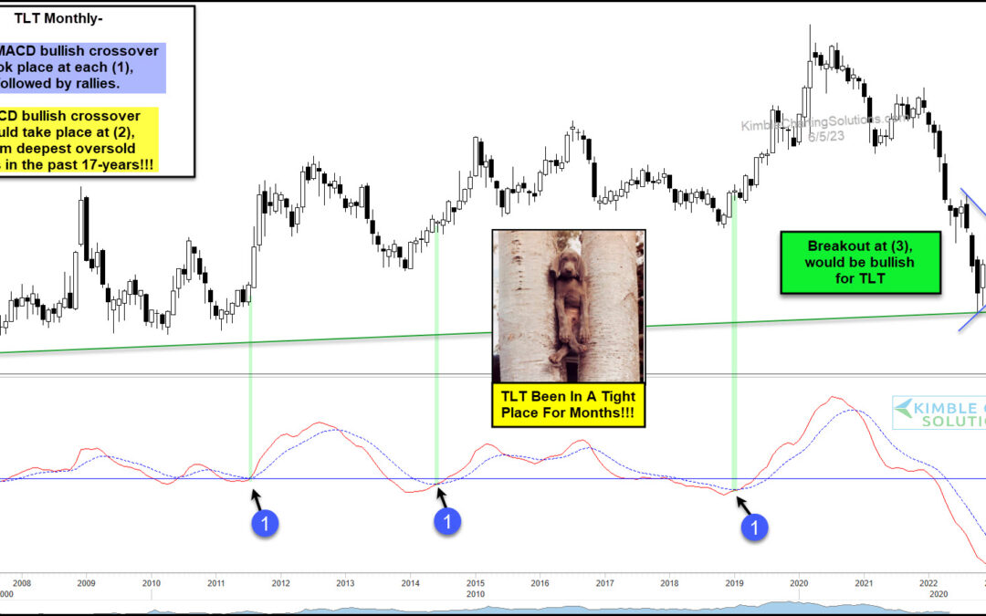
by Chris Kimble | Jun 6, 2023 | Kimble Charting
The popular treasury bonds etf (TLT) has been trading in a very tight space for months. Or better stated, it has been narrowing/tightening for months. This all comes after a precipitous 2-year decline from 2020 into 2022. Above you will find today’s long-term...
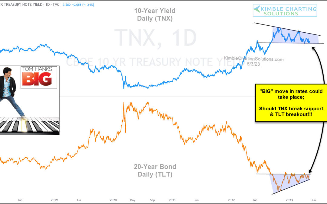
by Chris Kimble | May 5, 2023 | Kimble Charting
As the Federal Reserve continues to fight inflation by raising interest rates, the market is growing uncertain about futures rate hikes. Today, we share a chart comparing the 10-year US treasury bond yield versus the popular 20+ year treasury bond ETF. As you can see,...
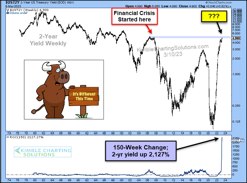
by Chris Kimble | Mar 10, 2023 | Kimble Charting
With bond yields (and interest rates) rising sharply, it’s understandable that most of the world is hoping for lower rates. Lower interest rates allow for more flexible lending to both businesses and consumers… BUT… As the “weekly” chart below shows, the last time...
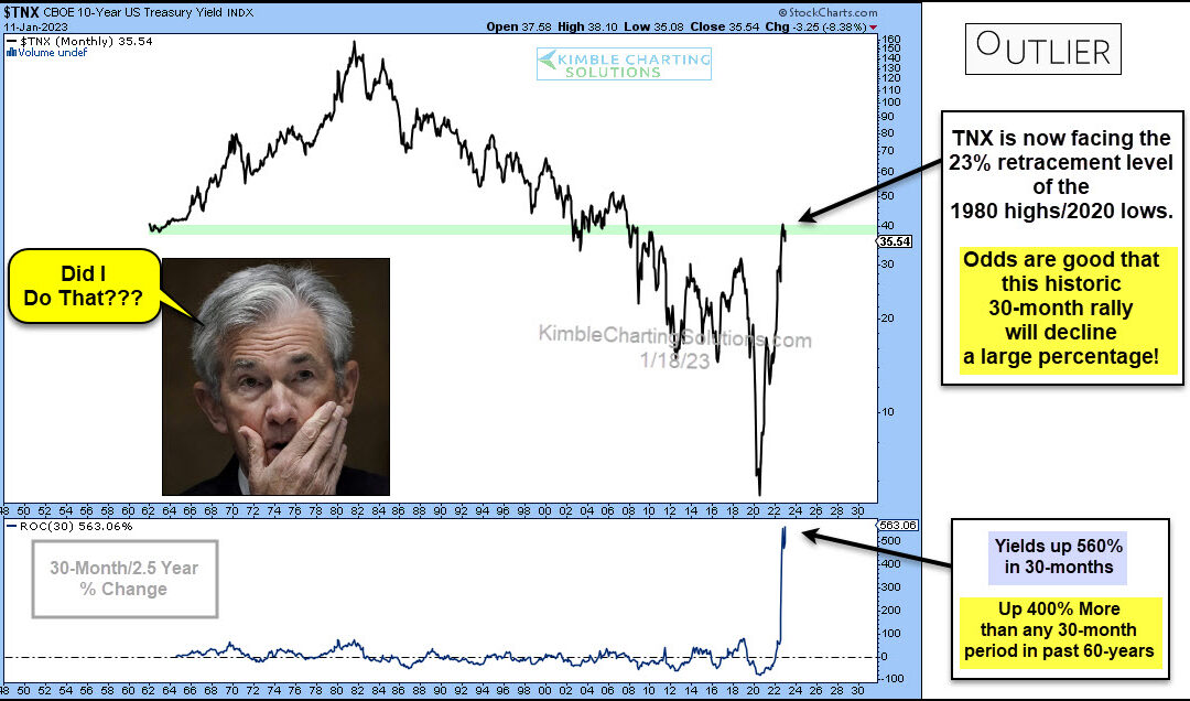
by Chris Kimble | Jan 19, 2023 | Kimble Charting
Interest rates have risen rather quickly as the Federal Reserve attempts to fight inflation. Will the move be a case of too far, too fast? Today’s long-term “monthly” chart of the 10-year US treasury bond yield seems to think so. In my humble opinion, the chart below...
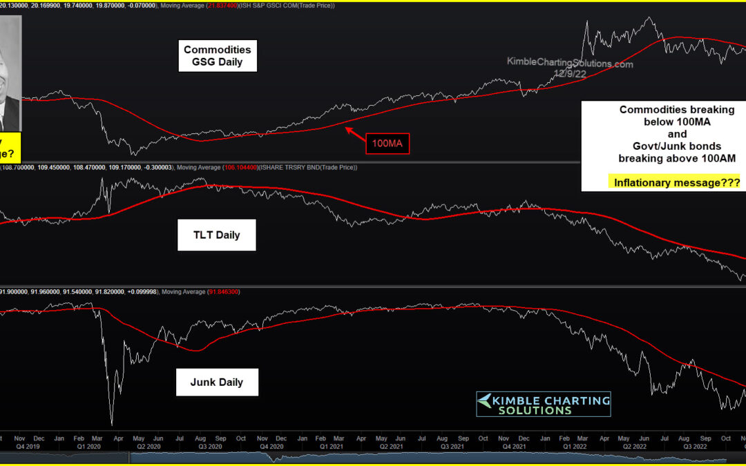
by Chris Kimble | Dec 13, 2022 | Kimble Charting
The financial markets have been volatile this year, to say the least. And much of the volatility has been tied to inflationary concerns and rising interest rates via the Federal Reserve. That said, we’ve come to a point in time where it appears that inflation may be...
