by Chris Kimble | Apr 27, 2023 | Kimble Charting
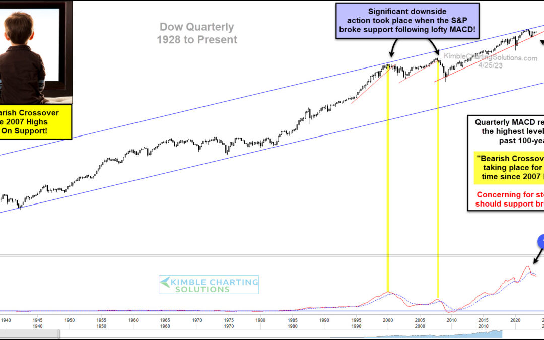
The stock market bounce off last fall’s low has kept investors hopeful that the worst is over. But a recent sell signal on the Dow Jones Industrial Average could upend those hopes… if support doesn’t hold. Below is a long-term “quarterly” price chart of the Dow Jones...
by Chris Kimble | Apr 13, 2023 | Kimble Charting
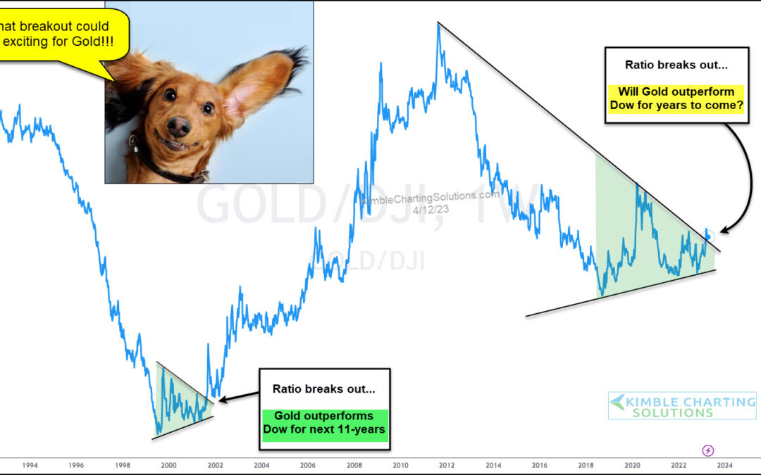
It’s been a decade since Gold outperformed the stock market on a steady basis. 2018-2019 was strong, but precious metals couldn’t keep the momentum going. Today’s chart looks at Gold’s relative performance based on its ratio to the Dow Jones Industrial Average. As you...
by Chris Kimble | Jun 22, 2022 | Kimble Charting
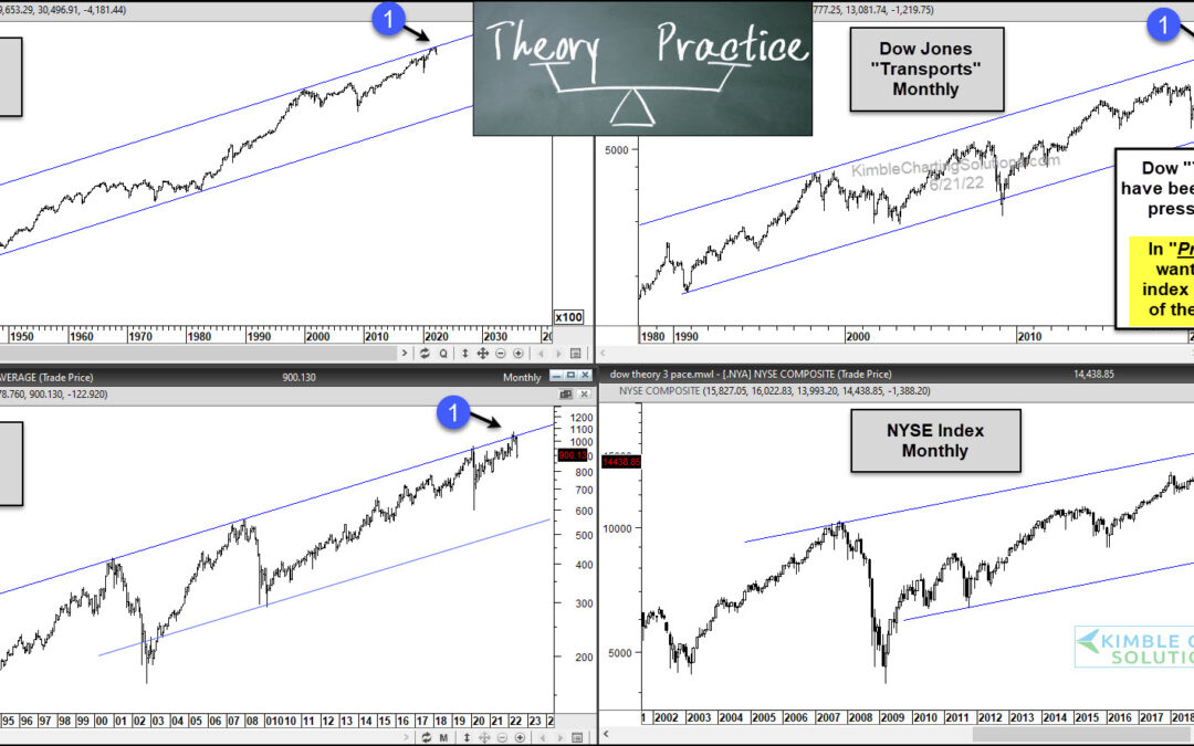
For the past century, investors have use the tried and true Dow Theory sell signal as a bear market warning. Though the transportation sector is much different than it once was, it still carries importance today. Several indices are already in a bear market, so...
by Chris Kimble | Apr 22, 2022 | Kimble Charting
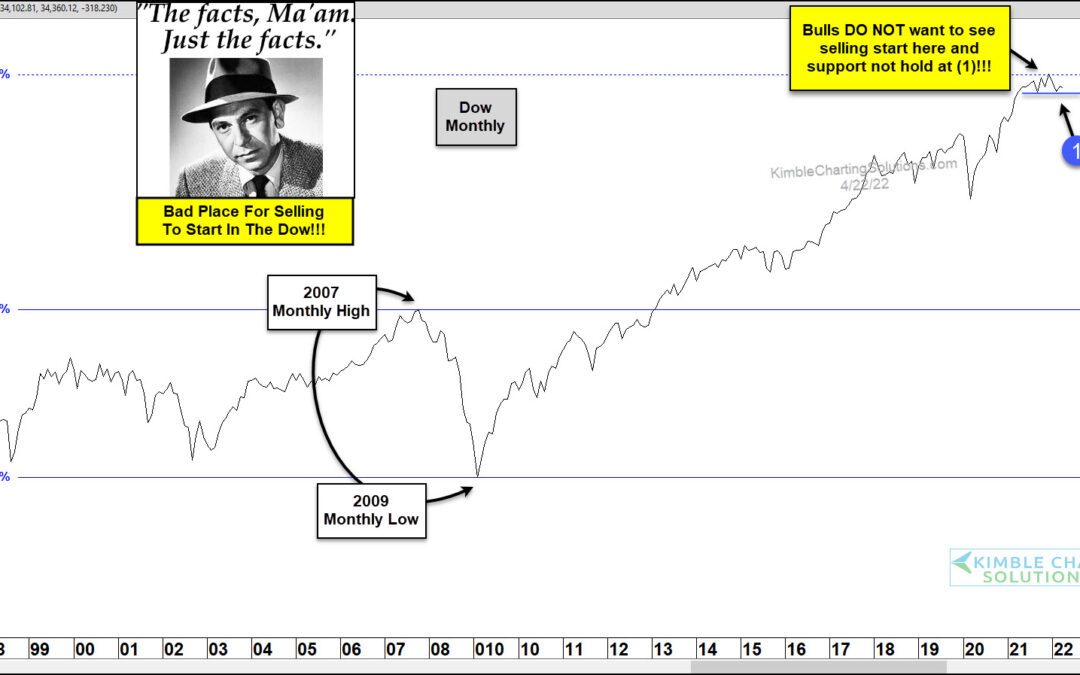
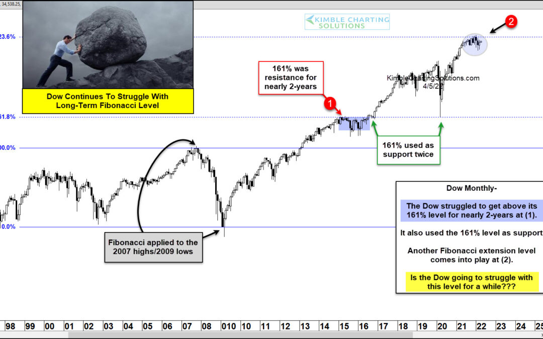
Could the 2007 financial crisis highs and the 2009 lows impact prices 15-years later? We will see! This chart looks at the Dow Jones Industrials on a monthly closing basis. We applied Fibonacci to the 2007 highs and the 2009 lows. The 423% Fibonacci extension level...
by Chris Kimble | Apr 6, 2022 | Kimble Charting
The Dow Jones Industrial Average is in the midst of a bounce off its March low and may be looking to retest its highs in the weeks ahead. But this could be trickier than most rally retests. Why? Because the recent high failed right at the 423.6 Fibonacci extension...
by Chris Kimble | Feb 2, 2021 | Kimble Charting
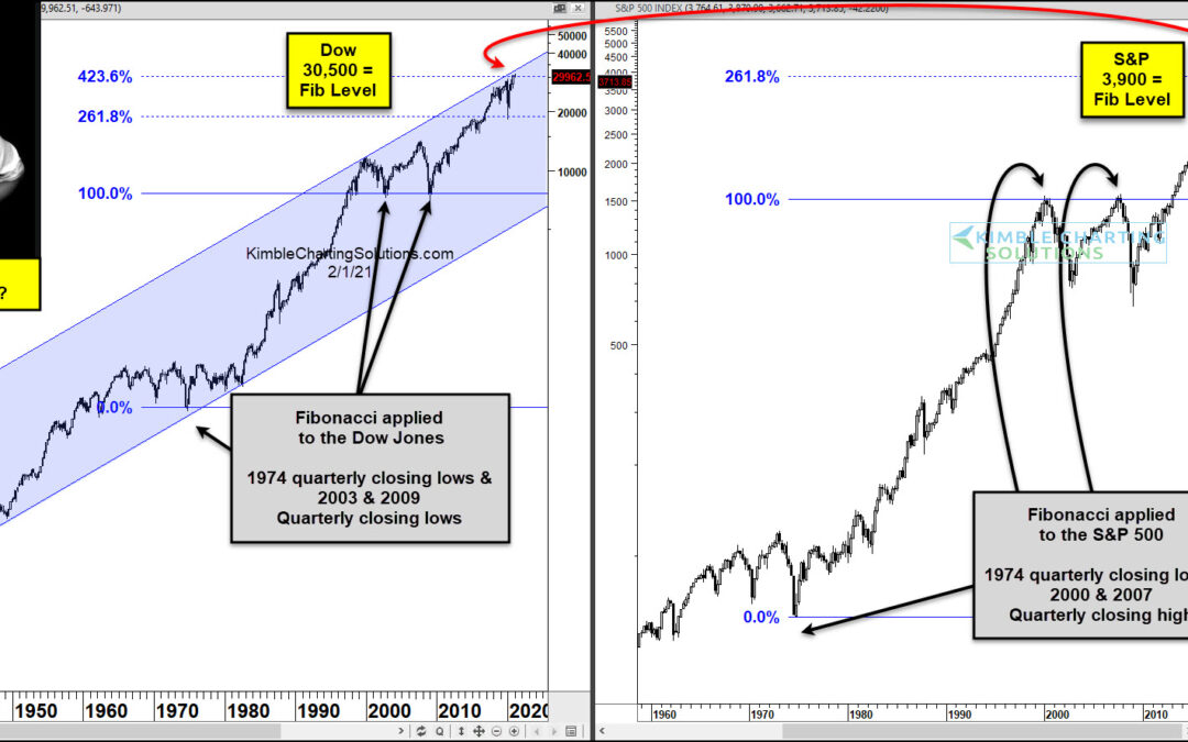
Last year’s coronavirus stock market crash turned into a BIG opportunity for active investors to buy stocks at deep discounts… especially COVID-friendly stocks. Since the March 2020 crash low, stocks have rallied sharply for 11 months… and this rally has a couple of...
by Chris Kimble | Jan 6, 2021 | Kimble Charting
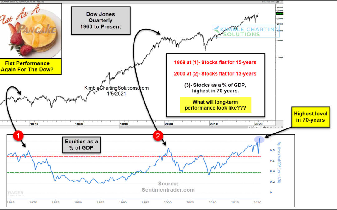
Over the years, active investors turn to several indicators to gauge market returns. And these indicators are used over varying timeframes, depending on the data and chart duration. We often look to price patterns to highlight strengthening trends (breakouts) and...
by Chris Kimble | Nov 10, 2020 | Kimble Charting
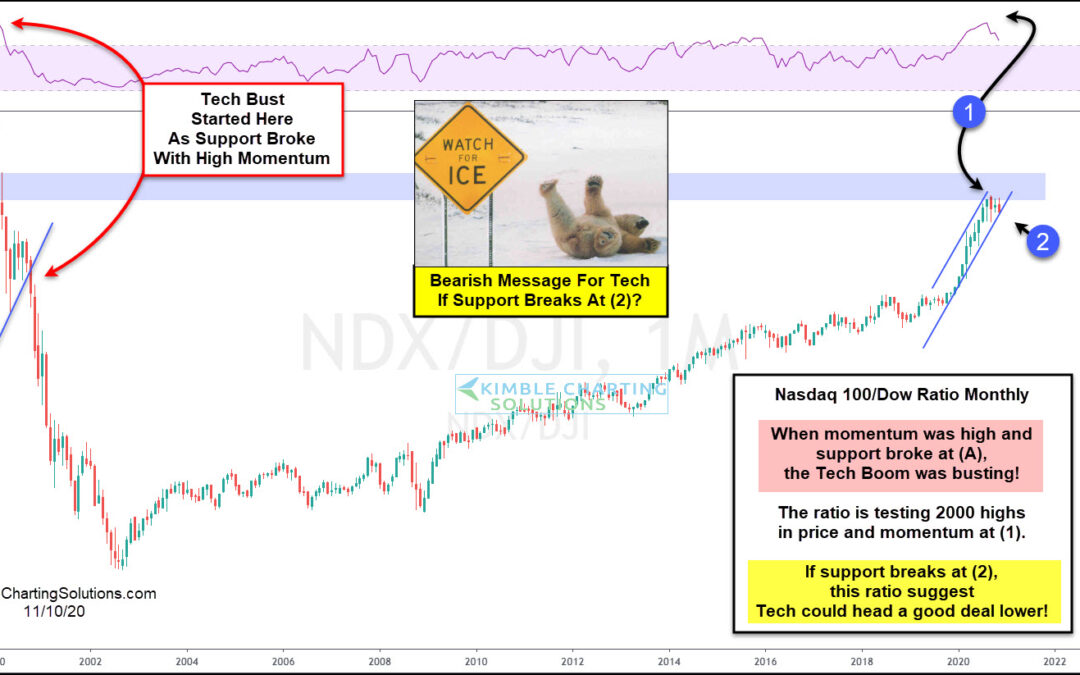
Twenty years ago the NDX 100/Dow Jones Ratio created a topping pattern, as monthly momentum was sky-high, as the Dot.com peak was taking place. Following this setup, the NDX 100 fell nearly 90% in less than three years. The NDX/Dow ratio over the past 90-days is...
