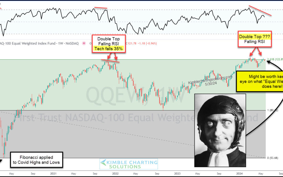
by Chris Kimble | May 31, 2024 | Kimble Charting
Technology stocks have continue to lead the broader market higher in 2024, posting new high after new high. At the same time, this is the very reason we watch the Nasdaq related indices very closely with each pause in the market. When leadership is strong, the market...
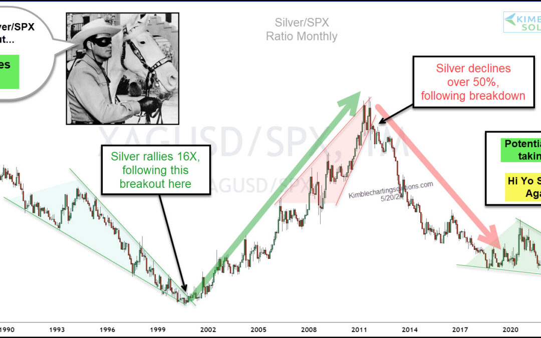
by Chris Kimble | May 21, 2024 | Kimble Charting
When we discuss bull markets and areas of leadership, we usually point to out-performance. We’ve been writing a lot about precious metals lately, and today we look at Silver. Two things we love to see: Silver out-performing Gold (sign of risk-on), and precious metals...
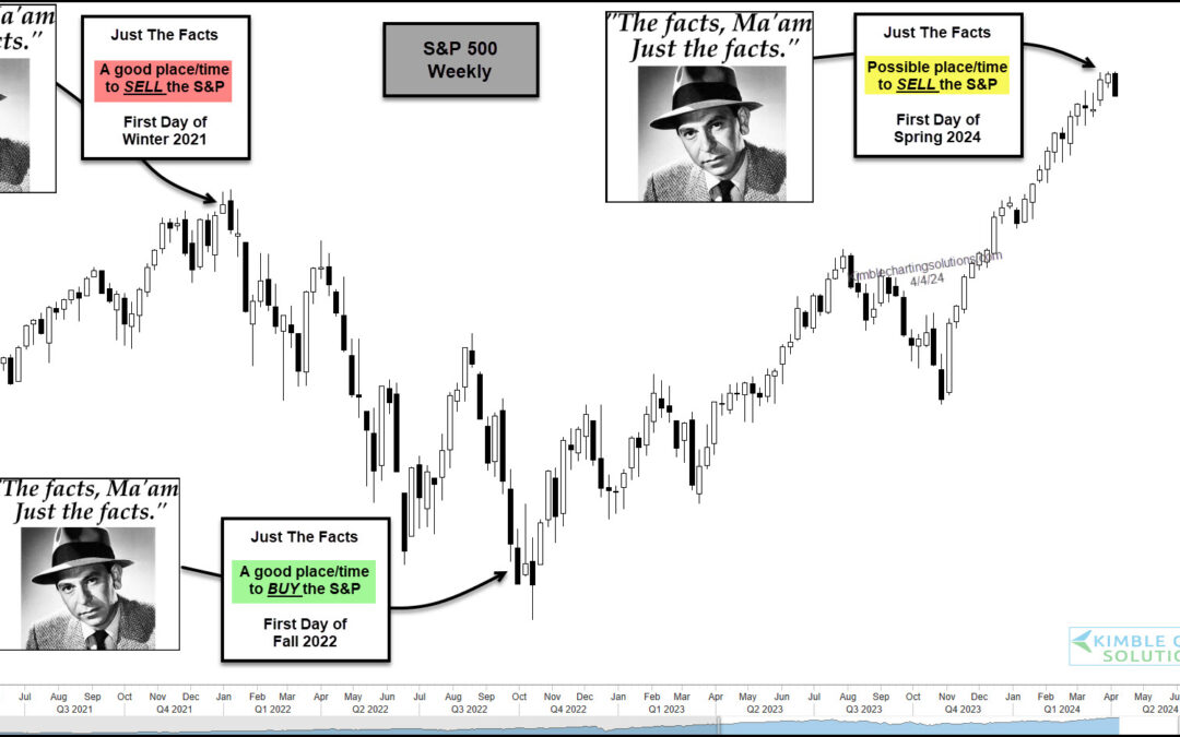
by Chris Kimble | Apr 5, 2024 | Kimble Charting
The stock market has been red hot over the past 5 months or so with both the S&P 500 and Nasdaq sporting big gains. But as we will see in today’s “weekly” chart of the S&P 500 Index, the seasonal start of Winter, Spring, Summer, and Fall can sometimes be a...
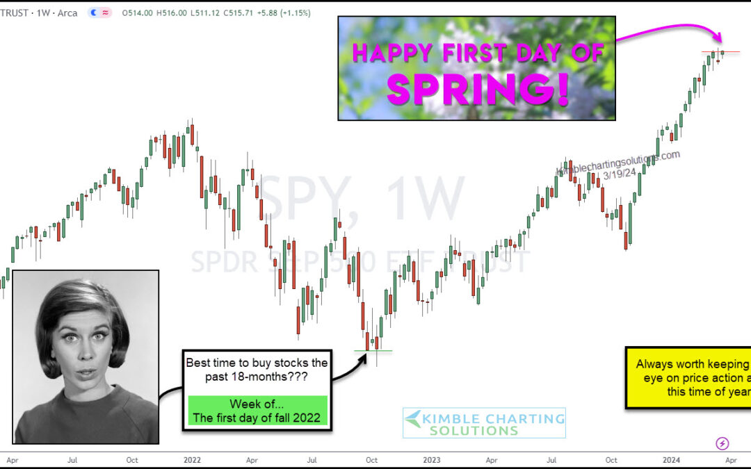
by Chris Kimble | Mar 20, 2024 | Kimble Charting
It is always worth keeping a close eye on the stock market price action around this time of year. 18 months ago, it was the first day of fall that seemed to be a great time to buy stocks… and again this last fall. Heck, even spring of 2023 was good. But the broader...
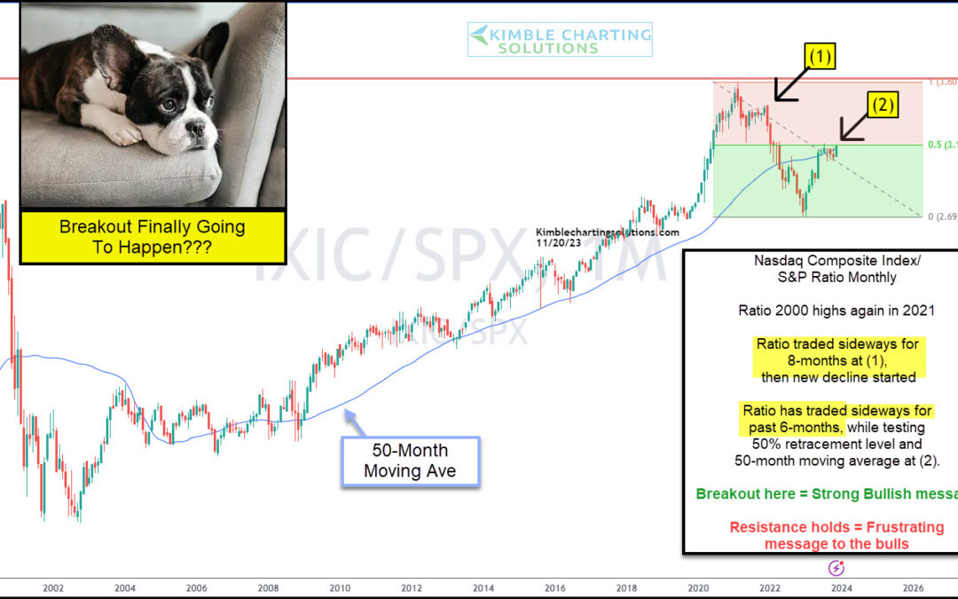
by Chris Kimble | Nov 22, 2023 | Kimble Charting
The main engine of the domestic economy and stock market indices is the technology sector. No doubt about it. Technology stocks have lead the stock market for over two decades, so it’s always worth watching the Nasdaq indices and how they are faring. Today we provide...
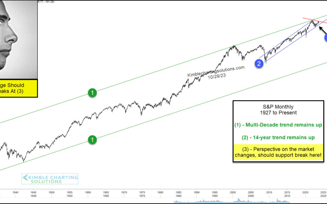
by Chris Kimble | Oct 30, 2023 | Kimble Charting
Stocks have come under pressure and concerns are beginning to mount. But rather than zooming in on the short-term, sometimes it’s good to zoom out and look at the long-term technical picture. And in today’s case, it may very well lead us to the short-term outcome as...
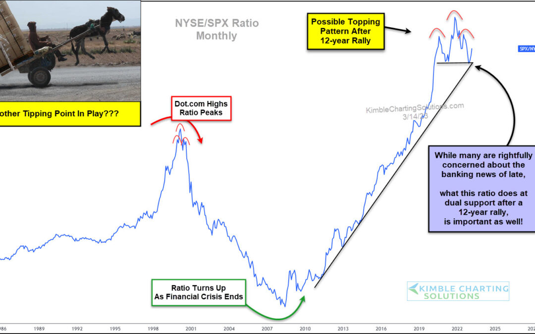
by Chris Kimble | Mar 16, 2023 | Kimble Charting
The New York Stock Exchange (NYSE) is a very broad measure of the stock market with over 2400 companies listed. So when the NYSE begins to underperform, market participants should pay attention! Well, this has been happening over the past year… and it may be reaching...
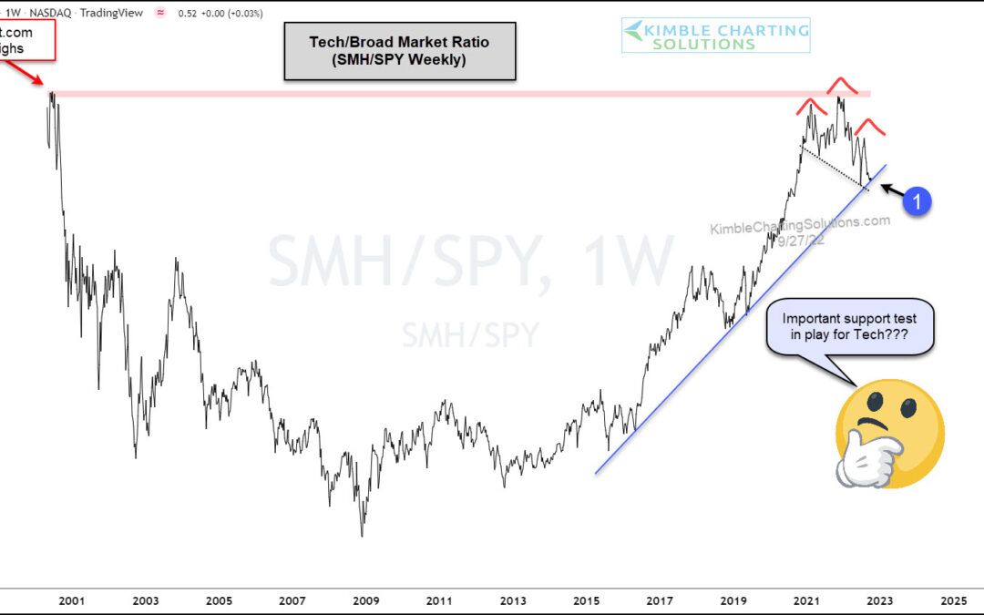
by Chris Kimble | Sep 28, 2022 | Kimble Charting
Today we revisit an incredibly important stock market ratio: The Semiconductors Sector $SMH versus the S&P 500 $SPY. This ratio highlights how an important tech leadership group is performing versus the broad market. And considering that tech stocks lead the...
