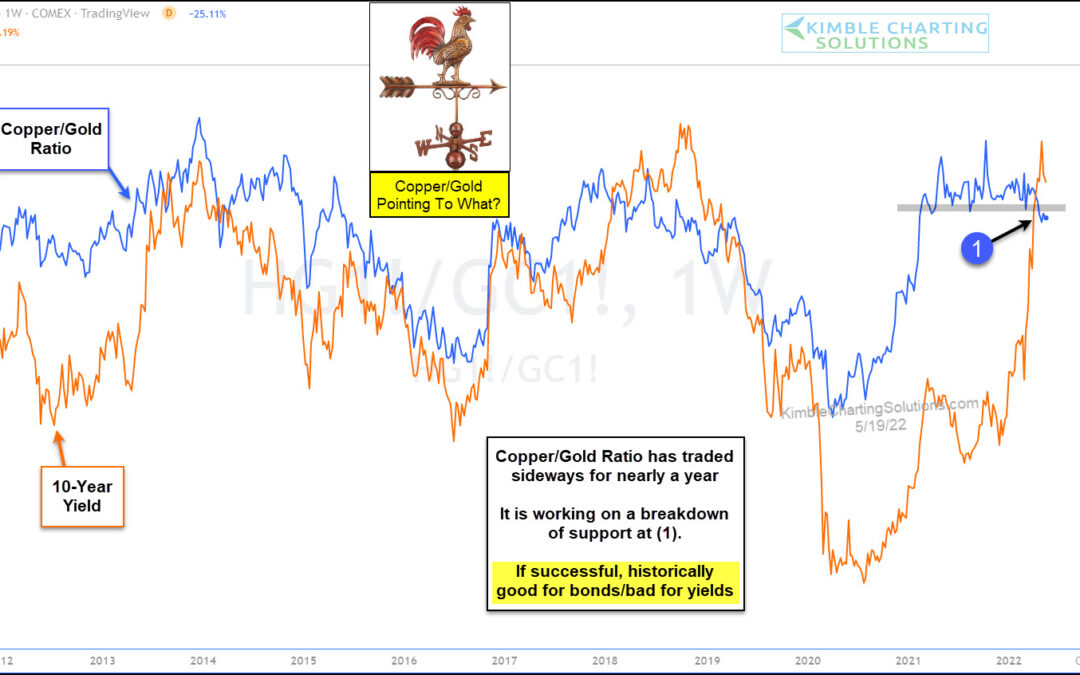
by Chris Kimble | May 19, 2022 | Kimble Charting
Higher commodity prices have seeped into everyday costs (food and energy), and at the same time, interest rates have also been rising. That’s a bad combination for everyday America. But perhaps there is some relief on the horizon… at least in the form of lower...
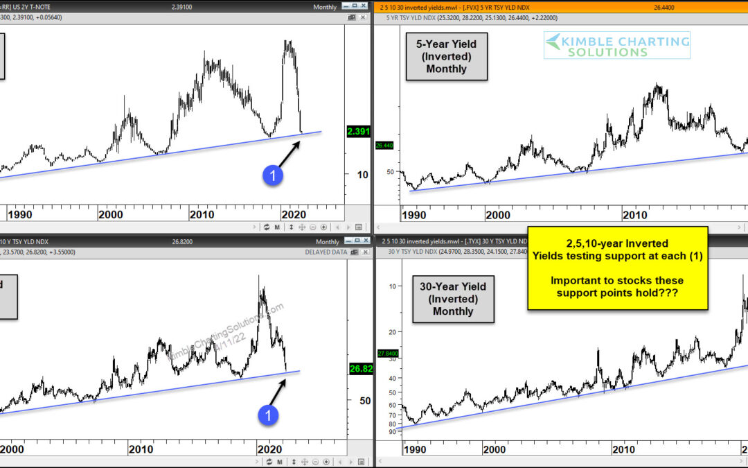
by Chris Kimble | Apr 13, 2022 | Kimble Charting
Over the past two years, we have seen inflation soar. And with that has coming rising interest rates. This week’s CPI and PPI data have only confirmed consumers fears. But how much of the latest inflation data is baked into current interest rates? Today we take a look...
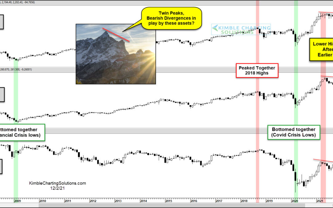
by Chris Kimble | Dec 2, 2021 | Kimble Charting
Uncertainty is mounting as the new omicron covid variant adds to economic concerns like inflation. This week, I shared an article looking at potential topping formations on the Transportation Sector (IYT) and small-cap Russell 2000 Index (IWM). Here we revisit these...
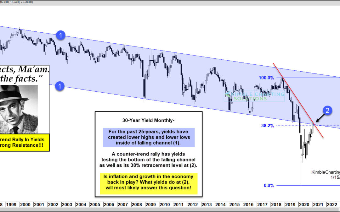
by Chris Kimble | Jan 15, 2021 | Kimble Charting
Treasury bond yields (and interest rates) have been falling for so long now that investors have taken it for granted. But bond yields have been rising for the past several months and perhaps investors should pay attention, especially as we grapple with questions about...
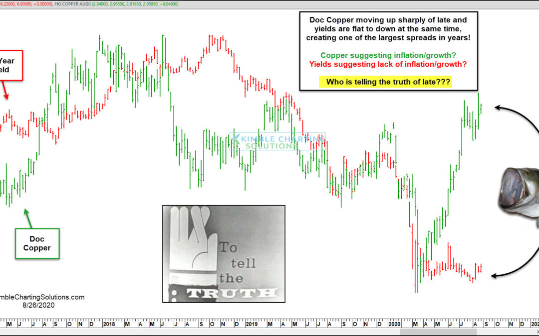
by Chris Kimble | Aug 27, 2020 | Kimble Charting
A good deal of the time, Doc Copper and Yields tend to move in the same direction. Of late, something strange is taking place! This chart looks at Doc Copper (Green) and the Yield on the 10-year note (Red). Both headed sharply lower and bottomed together in March of...
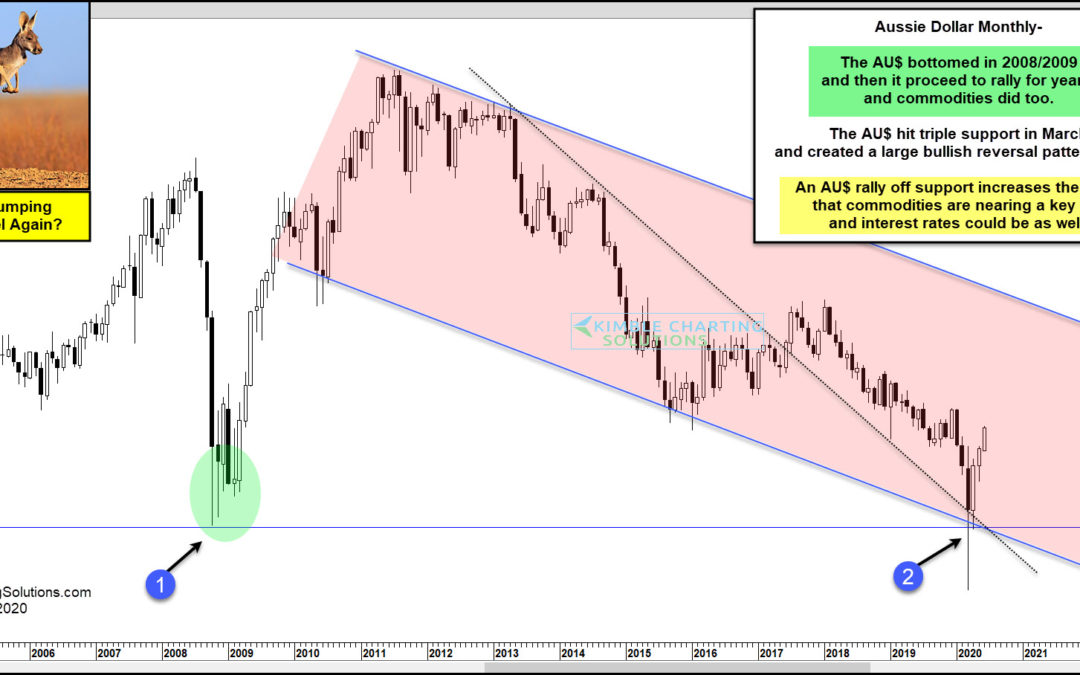
by Chris Kimble | Jun 2, 2020 | Kimble Charting
Is the Aussie Dollar about to jump higher and signal that Commodities and interest rates are about to do the same? Possible! This chart looks at the Aussie Dollar on a monthly basis over the past 16-years. The AU$ created a bottoming pattern over several months in...
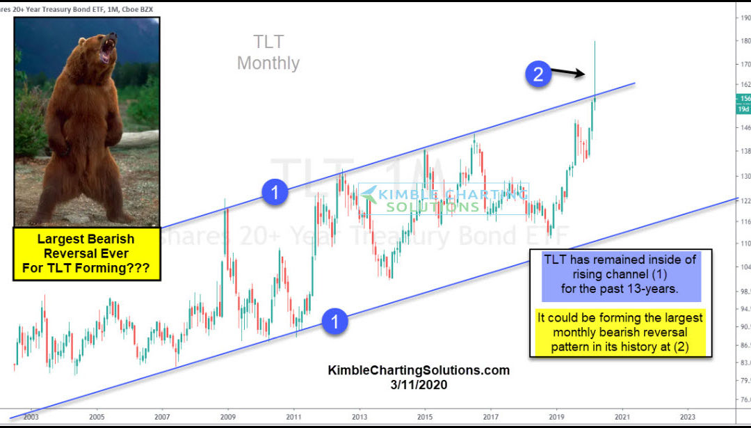
by Chris Kimble | Mar 13, 2020 | Kimble Charting
The financial markets are panicking and it’s producing some huge swings across asset classes. One asset that may be producing a monster reversal is treasury bonds (TLT). The flight to safe havens produced a sharp rise in the 20+ Year US Treasury Bond ETF (TLT)....
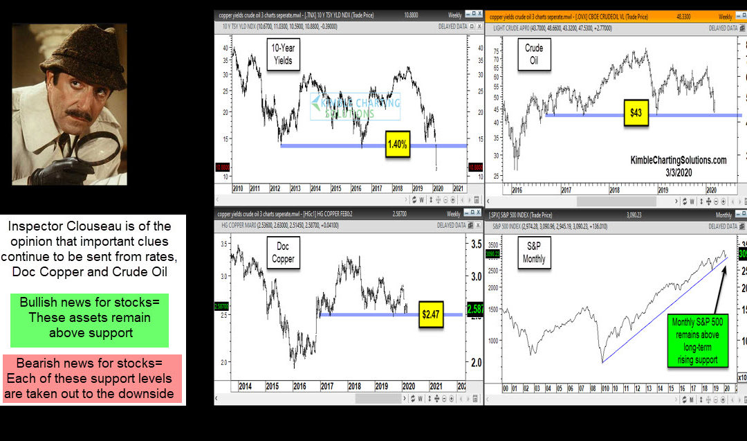
by Chris Kimble | Mar 3, 2020 | Kimble Charting
Will the economy experience a “Demand Shock?” Consumers stay at home and don’t buy many items. Will the economy experience a “Supply Shock?” Workers stay home and don’t create many products. Will a combo of both take place or...
