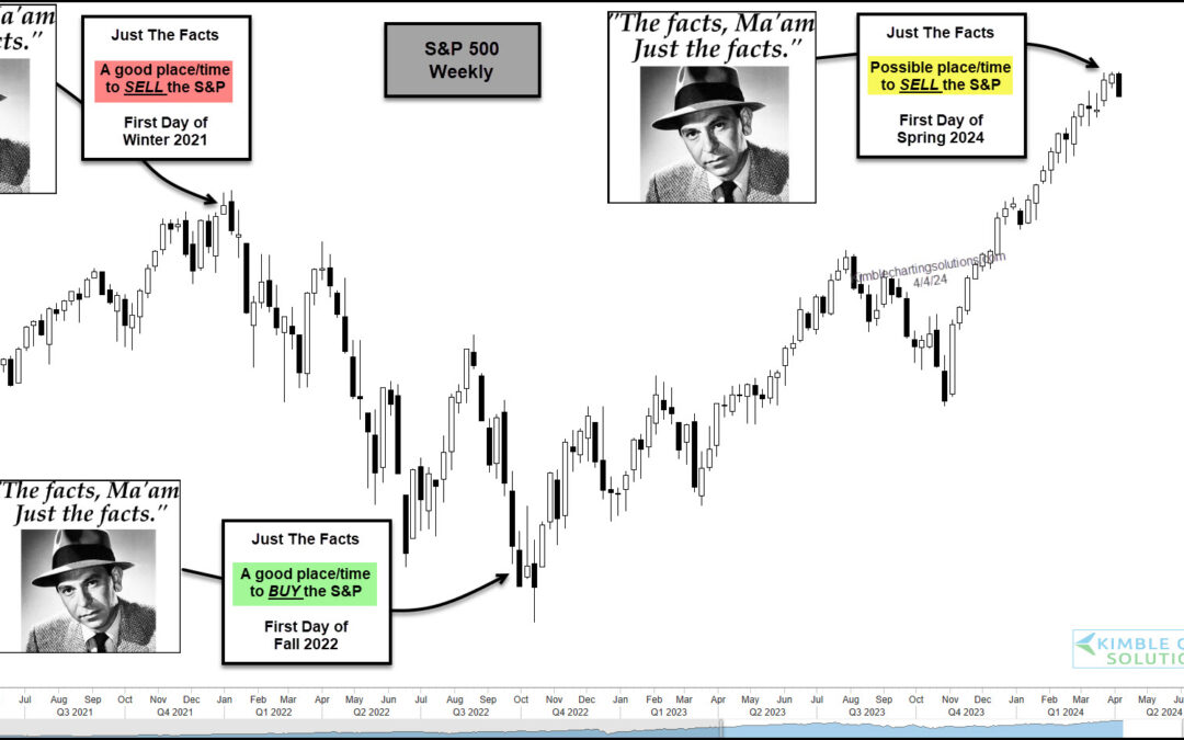
by Chris Kimble | Apr 5, 2024 | Kimble Charting
The stock market has been red hot over the past 5 months or so with both the S&P 500 and Nasdaq sporting big gains. But as we will see in today’s “weekly” chart of the S&P 500 Index, the seasonal start of Winter, Spring, Summer, and Fall can sometimes be a...
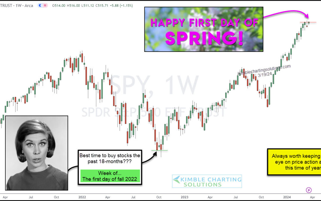
by Chris Kimble | Mar 20, 2024 | Kimble Charting
It is always worth keeping a close eye on the stock market price action around this time of year. 18 months ago, it was the first day of fall that seemed to be a great time to buy stocks… and again this last fall. Heck, even spring of 2023 was good. But the broader...
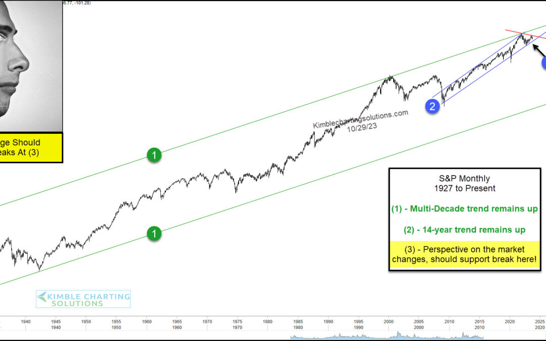
by Chris Kimble | Oct 30, 2023 | Kimble Charting
Stocks have come under pressure and concerns are beginning to mount. But rather than zooming in on the short-term, sometimes it’s good to zoom out and look at the long-term technical picture. And in today’s case, it may very well lead us to the short-term outcome as...
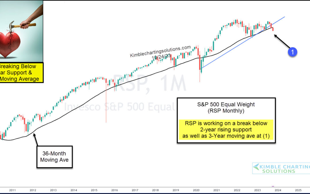
by Chris Kimble | Oct 26, 2023 | Kimble Charting
When evaluating the stock market, looking at several key indicators to evaluate risk and positioning is good. And sometimes, those indicators are actual stock market indices or index ETFs. In today’s case, it’s an index ETF. Today, we look at a long-term “monthly”...
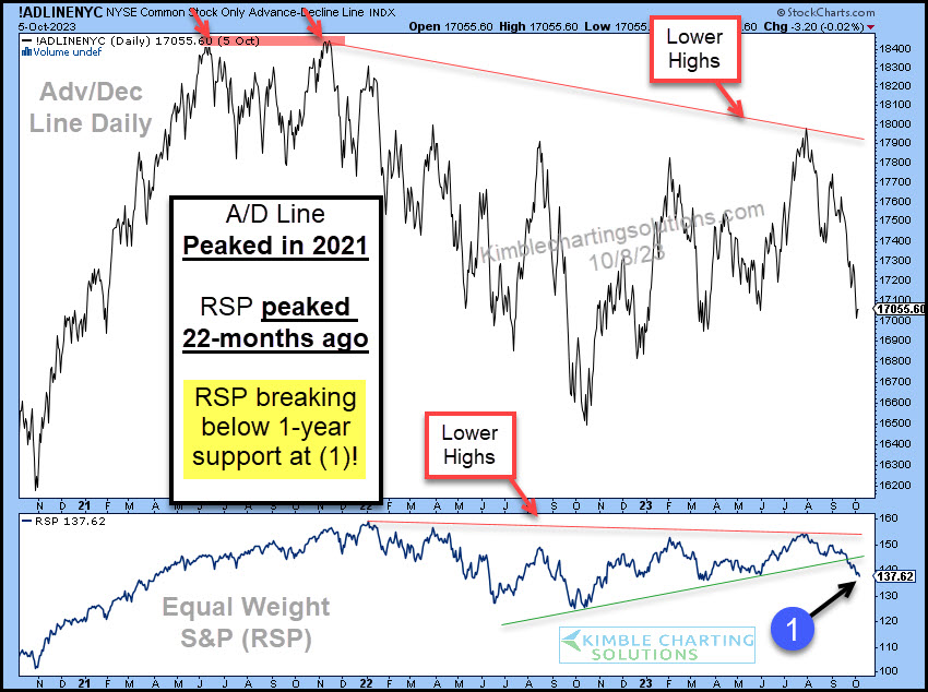
by Chris Kimble | Oct 11, 2023 | Kimble Charting
When market breadth turns south, savvy investors know that it’s time to remain cautious. And that’s been the case for the past several weeks. And it’s looking perhaps even worse today. Below are charts of the NYSE Advance-Decline Line (upper pane) and the Equal Weight...
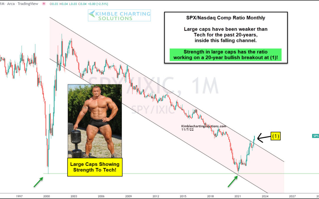
by Chris Kimble | Nov 8, 2022 | Kimble Charting
For the past two decades, the S&P 500 Index has underperformed the Nasdaq as tech stocks have been all the rage. Growth and innovation has transformed our economy and kept those companies (and stocks) firmly in a position of leadership. But is tech leadership...
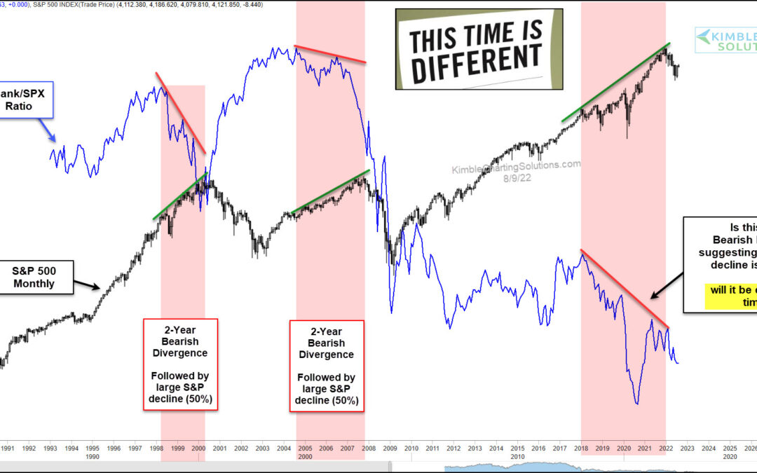
by Chris Kimble | Aug 10, 2022 | Kimble Charting
The health of our banking and financial sector is critically important to a strong economy. It’s also important to the stock market. Today, we look at a long-term ratio chart of the Bank to S&P 500 Indices. We also compare this to the S&P 500 Index performance...
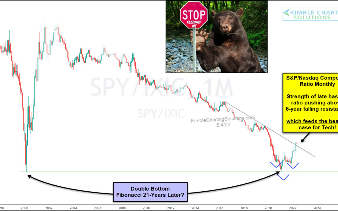
by Chris Kimble | May 5, 2022 | Kimble Charting
The stock market has seen some ugly action here in 2022. But one thing has become clear: growth stocks have been battered worse than value stocks. Within this spectrum, we can also see that technology stocks (also associated with “growth”) have performed worse than...
