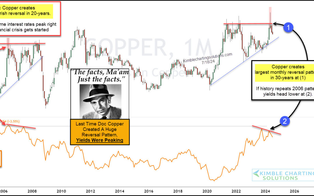
by Chris Kimble | Jul 19, 2024 | Kimble Charting
Investors have been watching the Federal Reserve and interest rates closely for the past several months. Well, actually more like the past several years. But maybe they should be watching copper prices for clues on where interest rates are headed. “The facts, Ma’am....
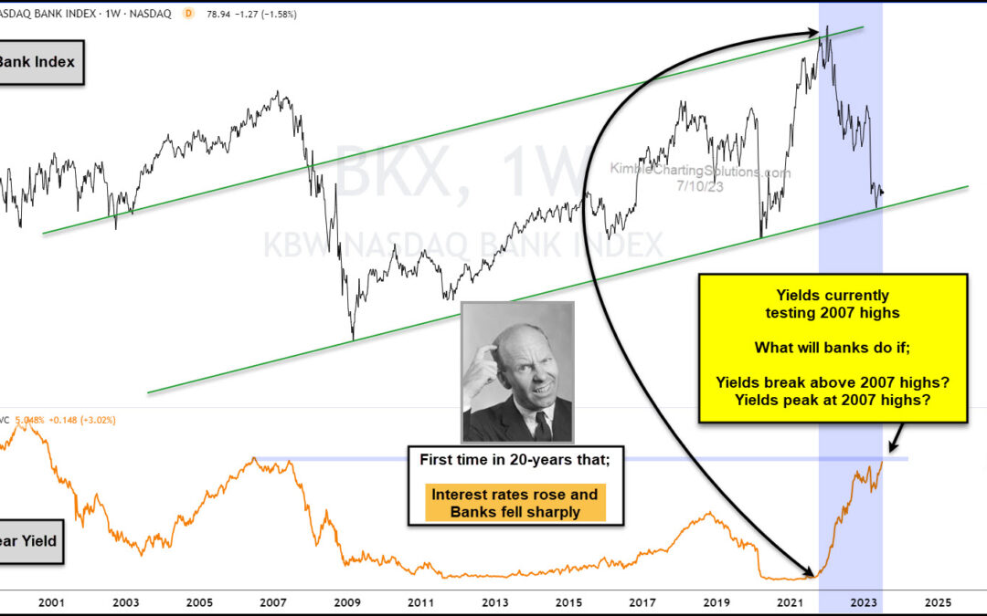
by Chris Kimble | Jul 10, 2023 | Kimble Charting
It’s always nice to see bank stocks leading the market higher… but it doesn’t always work out that way. Which is why we always let the price action (and patterns) dictate our investment choices. For most of my career, though, bank stocks have liked rising interest...
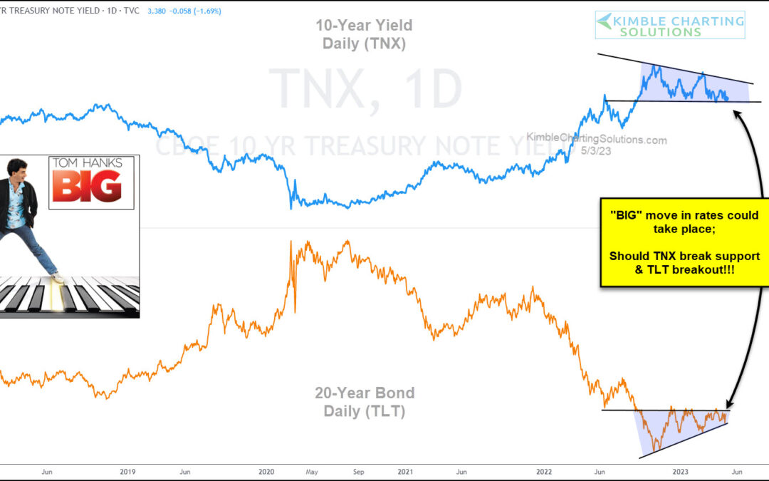
by Chris Kimble | May 5, 2023 | Kimble Charting
As the Federal Reserve continues to fight inflation by raising interest rates, the market is growing uncertain about futures rate hikes. Today, we share a chart comparing the 10-year US treasury bond yield versus the popular 20+ year treasury bond ETF. As you can see,...
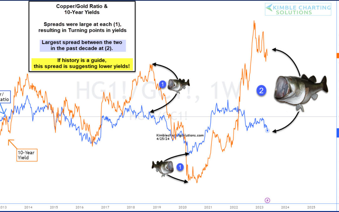
by Chris Kimble | Apr 26, 2023 | Kimble Charting
The past two years have seen headlines dogged by inflation and the Federal Reserve’s fight to end inflation. That fight has seen the Federal Reserve raise interest rates over and over again… and 10-year treasury bond yields have followed suit and risen sharply. One...
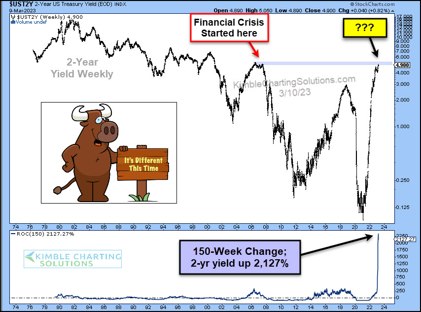
by Chris Kimble | Mar 10, 2023 | Kimble Charting
With bond yields (and interest rates) rising sharply, it’s understandable that most of the world is hoping for lower rates. Lower interest rates allow for more flexible lending to both businesses and consumers… BUT… As the “weekly” chart below shows, the last time...
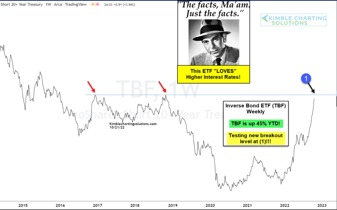
by Chris Kimble | Oct 21, 2022 | Kimble Charting
Rising Interest rates have been very hard on stocks and bonds so far this year. Are any ETF’s doing well during this rapidly rising rate environment? Yup! TBF year to date is up nearly 45%! Joe Friday Just The Fact Ma’am: TBF is screaming higher...
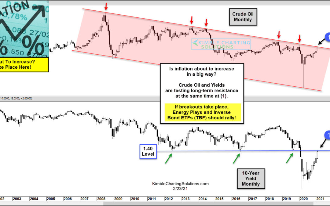
by Chris Kimble | Feb 24, 2021 | Kimble Charting
Inflation seems to be a thing of the past… but current trading in bond and commodity markets tell us that it could become a thing of the future! Inflation hasn’t been an issue, or even on our radar, since the 1980s. Sure, the 2007 surge in oil prices offered some...
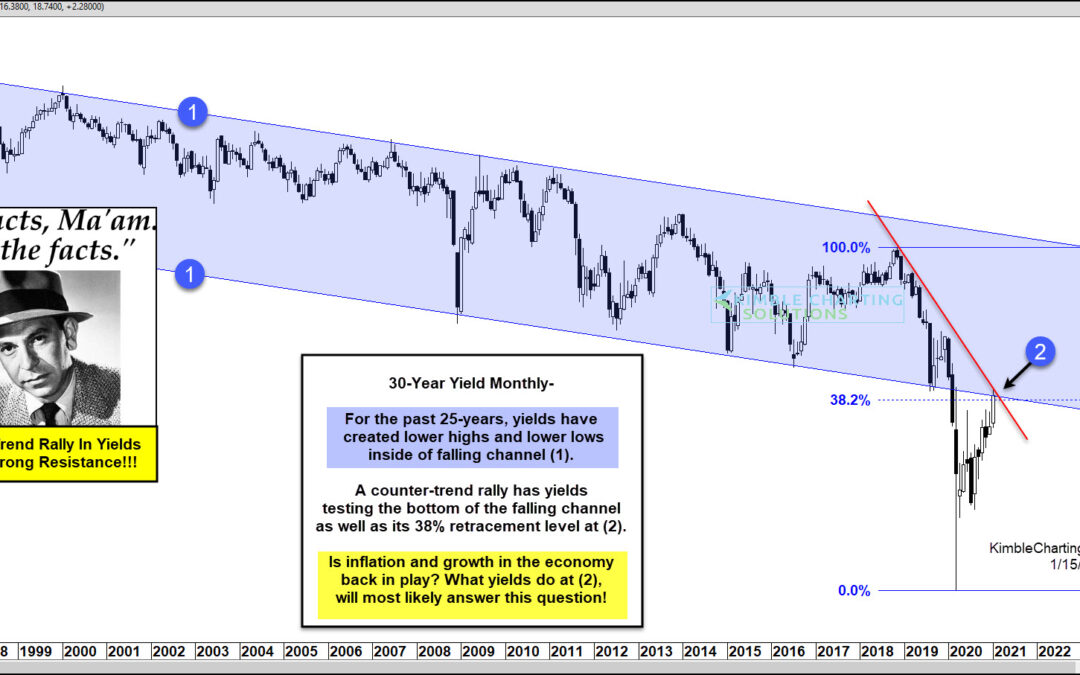
by Chris Kimble | Jan 15, 2021 | Kimble Charting
Treasury bond yields (and interest rates) have been falling for so long now that investors have taken it for granted. But bond yields have been rising for the past several months and perhaps investors should pay attention, especially as we grapple with questions about...
