
by Chris Kimble | Nov 3, 2020 | Kimble Charting
The S&P 500 and the Nasdaq don’t have much to brag about the past 90-days, as their performance has been near flat. It also hasn’t paid a great deal to be long bonds, as popular bond ETF (TLT) has declined over 6%. What asset has it paid to own over...
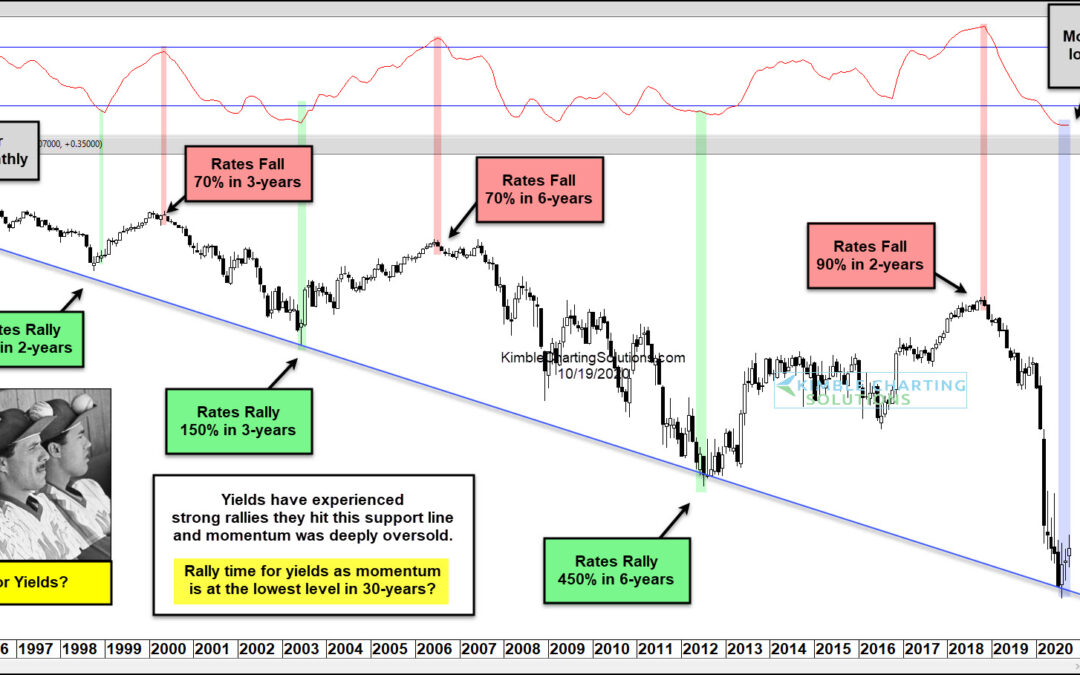
by Chris Kimble | Oct 19, 2020 | Kimble Charting
US treasury bond yields have been trending lower for over 3 decades. Could the latest drop mark a significant low for bond yields and interest rates? In today’s chart, we can see that interest rates have had several spike lows and highs, but that each low is lower and...
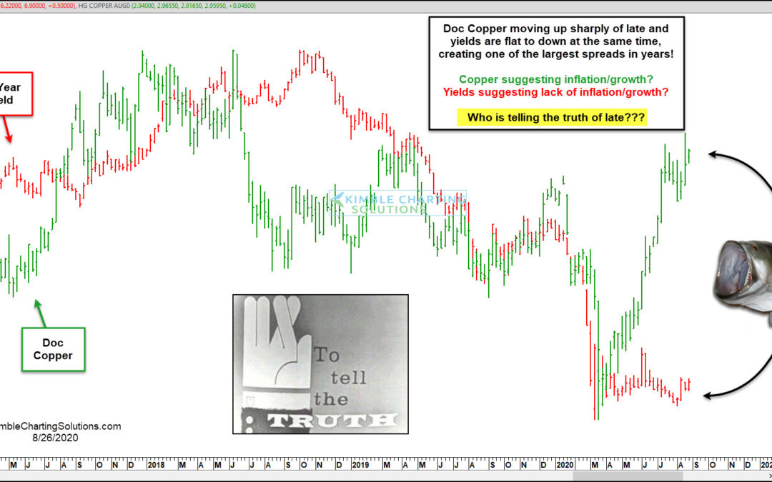
by Chris Kimble | Aug 27, 2020 | Kimble Charting
A good deal of the time, Doc Copper and Yields tend to move in the same direction. Of late, something strange is taking place! This chart looks at Doc Copper (Green) and the Yield on the 10-year note (Red). Both headed sharply lower and bottomed together in March of...
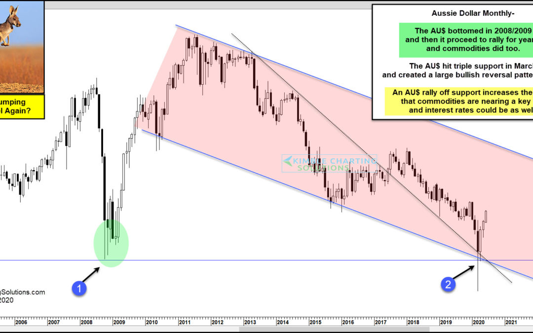
by Chris Kimble | Jun 2, 2020 | Kimble Charting
Is the Aussie Dollar about to jump higher and signal that Commodities and interest rates are about to do the same? Possible! This chart looks at the Aussie Dollar on a monthly basis over the past 16-years. The AU$ created a bottoming pattern over several months in...
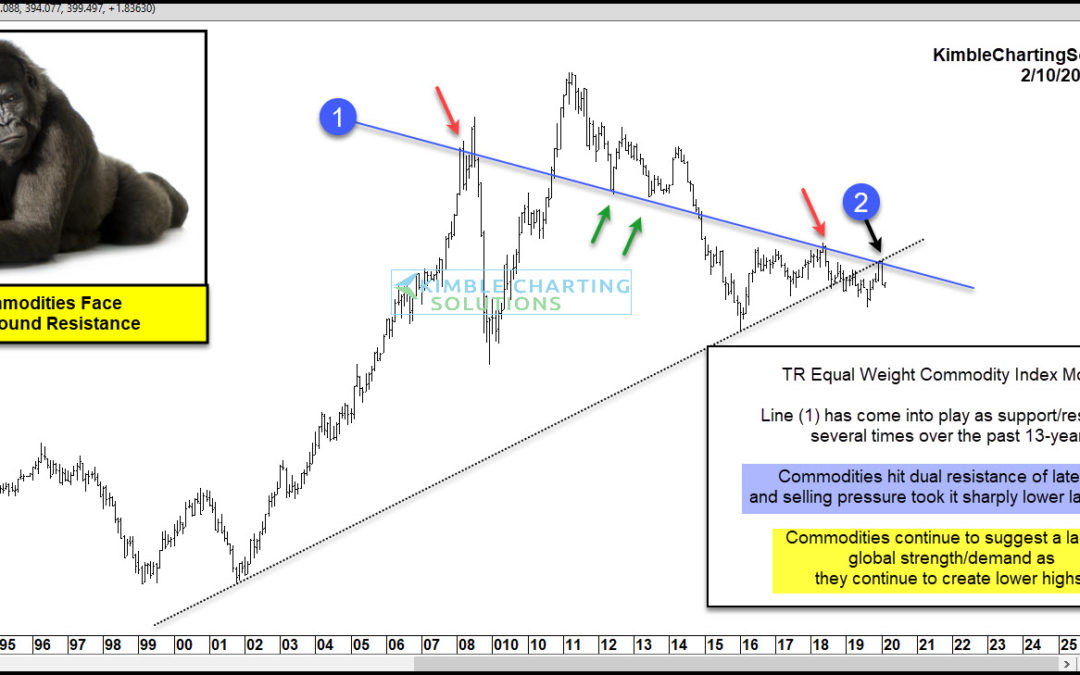
by Chris Kimble | Feb 10, 2020 | Kimble Charting
Are commodities suggesting a lack of demand is in play on a global basis? Possible! Could this impact stocks? So far it has not! The chart looks at the Thompson/Reuters Commodities Index over the past 30-years. This index has created a series of lower highs since it...
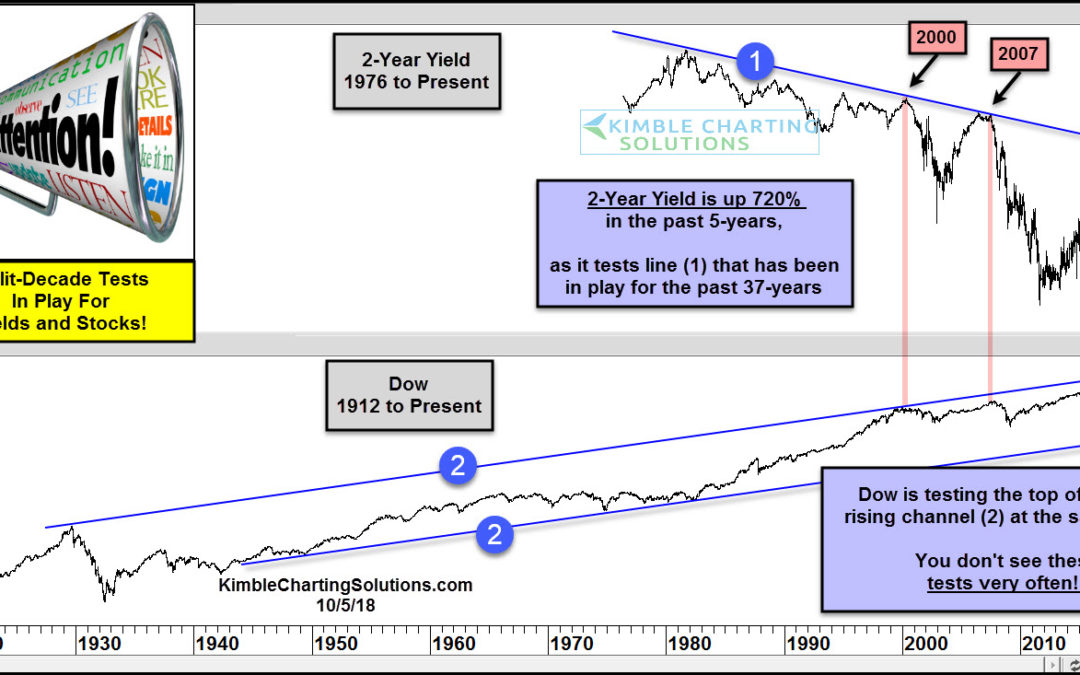
by Chris Kimble | Oct 9, 2018 | Kimble Charting
At what point does the rise in treasury yields (and interest rates) matter to the economy and stock market? Today’s chart looks at the past 4 decades of the 2-year treasury note yield versus the stock market (the Dow Jones Industrial Average). As you can see in the...
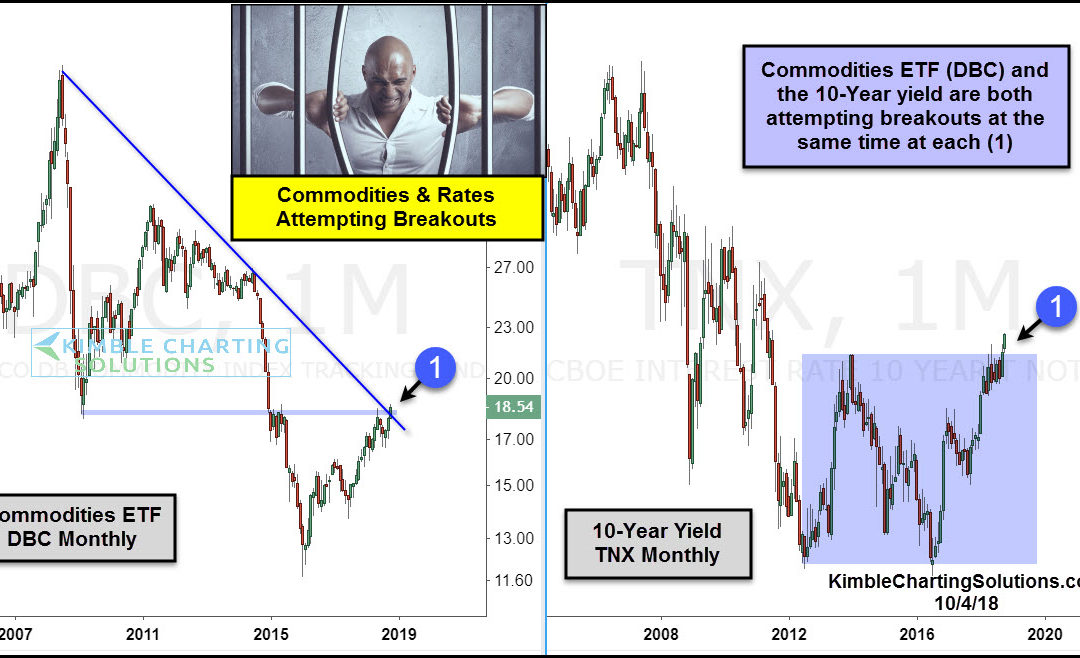
by Chris Kimble | Oct 4, 2018 | Kimble Charting
CLICK ON CHART TO ENLARGE When it comes to assets being in long-term bull markets, Commodities and interest rates do not come to mind, as each has endured long-term bear markets. Could these long-term trends be coming to an end? Possible The 2-pack above looks at...
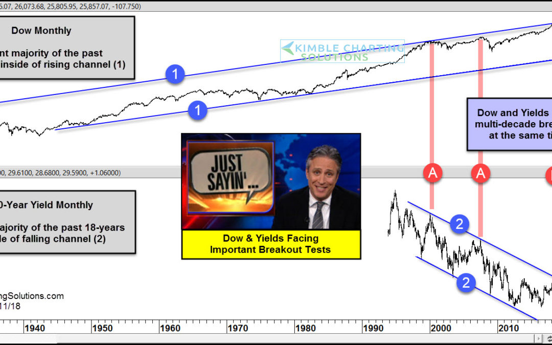
by Chris Kimble | Sep 11, 2018 | Kimble Charting
CLICK ON CHART TO ENLARGE This chart looks at the Dow Jones Industrials Average and the Yield on the 10-year note on a monthly basis for several decades. The top chart looks at the Dow since 1927 and the bottom chart looks at yields since 1994. The Dow has spent the...
