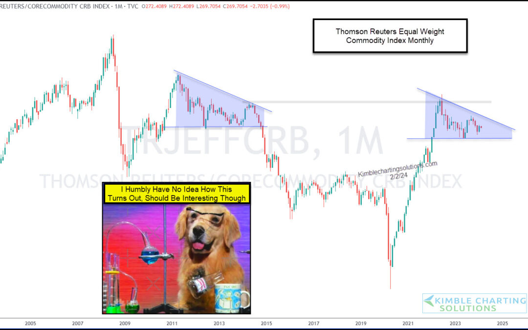
by Chris Kimble | Feb 5, 2024 | Kimble Charting
During the COVID pandemic, commodity prices soared. And this lead to a bout of inflation that we hadn’t seen in years. But commodity prices have leveled off and this has helped to keep inflation in check. This consolidation like pattern can be see on today’s “monthly”...
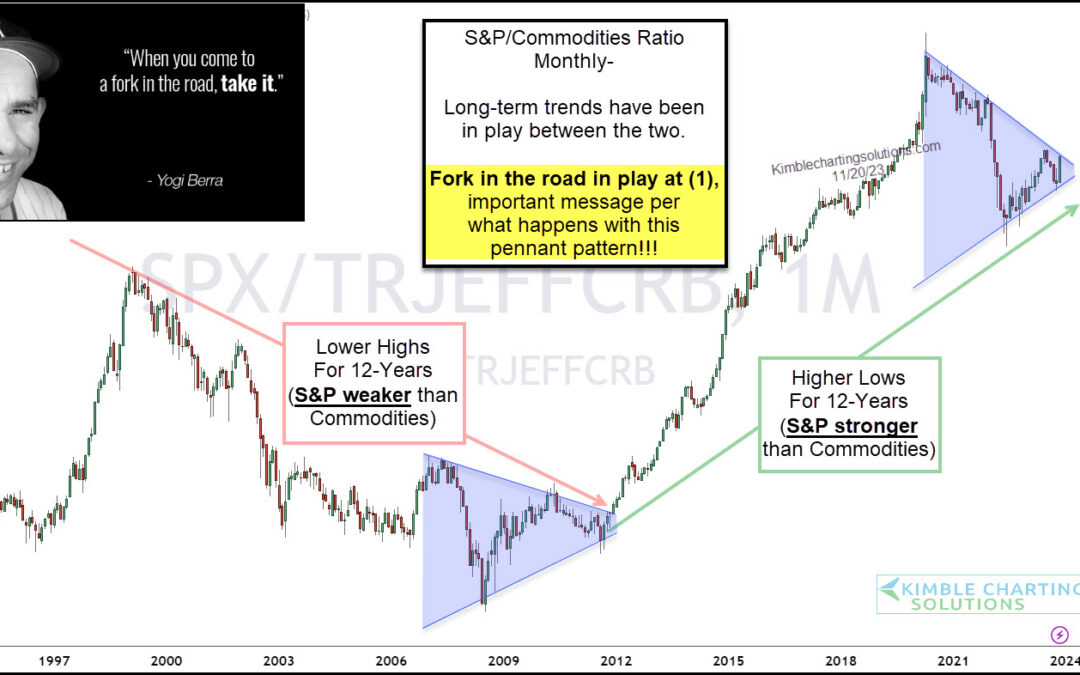
by Chris Kimble | Nov 21, 2023 | Kimble Charting
Who says cycles don’t exist? Today, we put cycles on full display in looking at the performance of two of the most important asset classes: Equities and Commodities. The chart below takes a long-term “monthly” view of the performance ratio of the S&P 500...
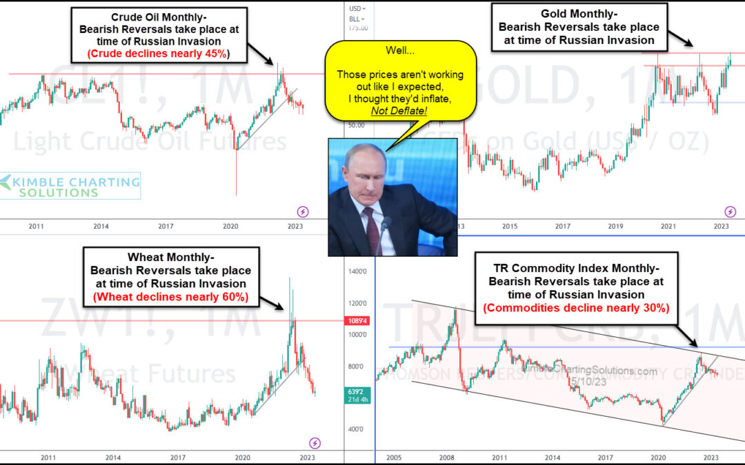
by Chris Kimble | May 11, 2023 | Kimble Charting
Market prices absorb all the information that’s out there. Perhaps that’s why several commodity prices surged in the months leading up to the Russian invasion of Ukraine. And since then, they have come back down to earth. I don’t think this is exactly how Putin...
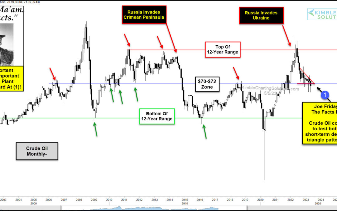
by Chris Kimble | May 5, 2023 | Kimble Charting
The past 12 years have seen some massive swings in the price of Crude oil. And the latest swing higher into 2022 played a role in higher gas prices and inflationary pressures. So how is the most important commodity in the world trading right now? Let’s turn to Joe...
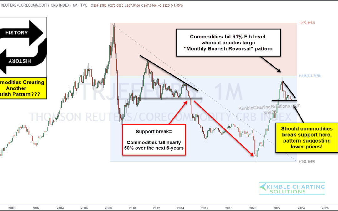
by Chris Kimble | Mar 10, 2023 | Kimble Charting
While inflation continues to dominate the news headlines (and consumer concerns), I think it’s important to highlight an interesting development in the commodities complex. And a potentially positive development! Today we take a look at a long-term “monthly”...
by Chris Kimble | Dec 13, 2022 | Kimble Charting
The financial markets have been volatile this year, to say the least. And much of the volatility has been tied to inflationary concerns and rising interest rates via the Federal Reserve. That said, we’ve come to a point in time where it appears that inflation may be...

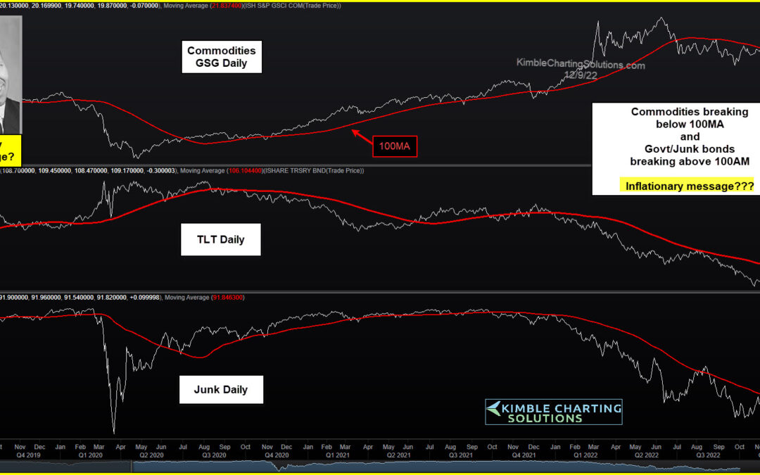
by Chris Kimble | Sep 2, 2022 | Kimble Charting
The red-hot run higher in commodities sent inflation soaring higher. And this lead to the Federal Reserve raising interest rates at a fast clip. BUT it appears that the commodities rally may be slowing down (or over). As this data gets prices in, could it lead to...
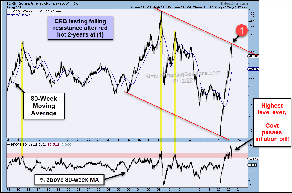
by Chris Kimble | Aug 12, 2022 | Kimble Charting
It’s fair to say that inflation has been one of the key economic buzzwords of 2022 (along with interest rates). Will the Federal Reserve’s last two big rate hikes help? Will the latest government inflation bill matter? Perhaps. But one key ingredient may have peaked a...
