by Chris Kimble | Nov 11, 2021 | Kimble Charting
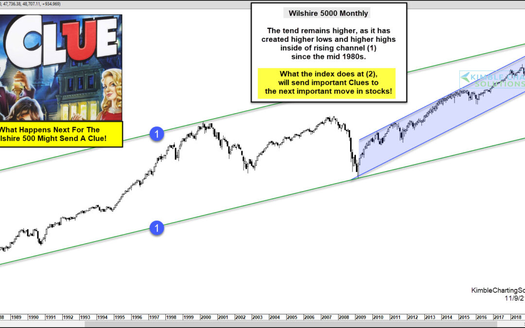
When investors want to get a sense of the broader U.S. equities market, one index they analyze is the Wilshire 5000. The Index is made up of all American stocks actively traded in the U.S. Simply put, this broad index is a gauge of market health and can provide...

by Chris Kimble | Mar 27, 2020 | Kimble Charting
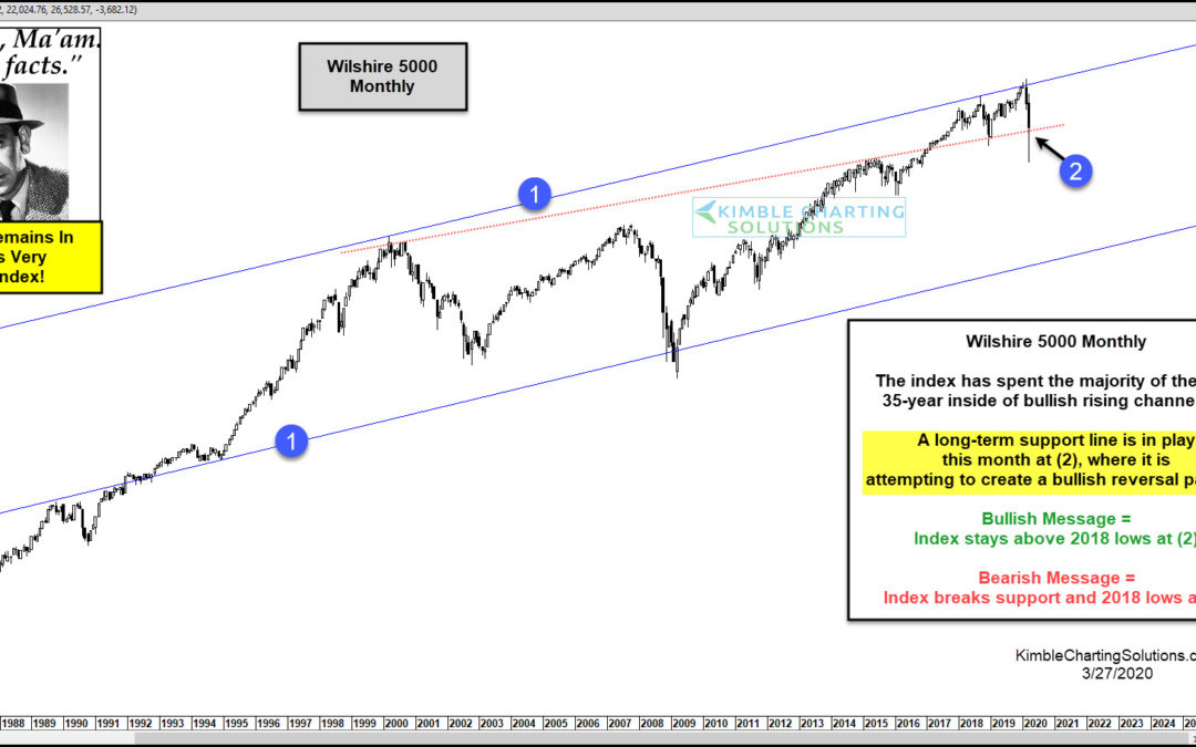
One of the broadest indices in the states remains in a long-term bullish trend, where a critical support test is in play. The chart looks at the Wilshire 5000 on a monthly basis over the past 35-years. The index has spent the majority of the past three decades inside...

by Chris Kimble | Jun 24, 2019 | Kimble Charting
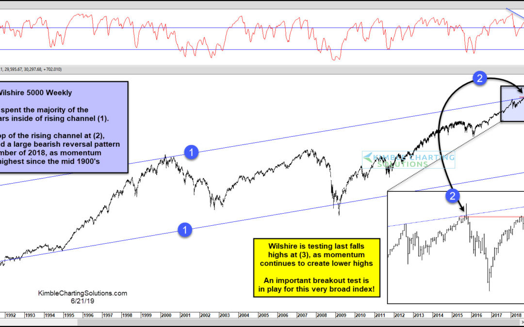
The stock market has been on fire of late, rallying up to the edge of price resistance on several indexes. Today, we look at one of those stock market indexes: the Wilshire 5000. The Wilshire 5000 tracks all of the stocks in the US market, so it is a broad-based index...

by Chris Kimble | Mar 6, 2019 | Kimble Charting
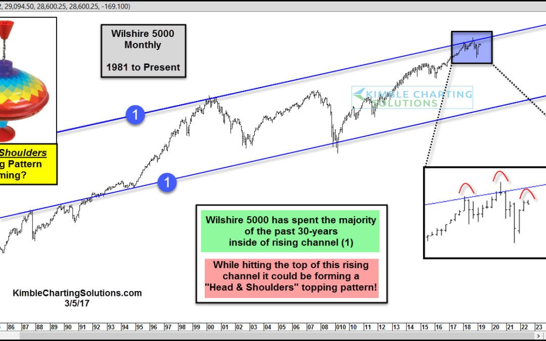
The Wilshire 5000 Index has spent the past 30 years trading within a bullish price channel up-trend – see (1) in today’s chart above. The price action of late has NOT broken the long-term bull trend. Though the latest move off the 2009 lows has been bullish, and...

by Chris Kimble | Dec 18, 2018 | Kimble Charting
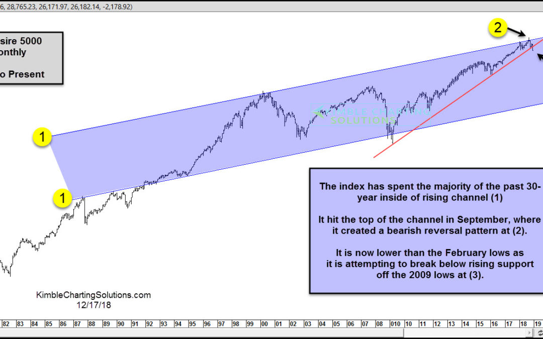
The Wilshire 5000 is a must-follow stock market index that measures the market in its broadest form. So when this index flashes caution, it’s best that investors pay attention. For the past 30 years, the Wilshire 5000 has traded within a very broad channel (1). In...

by Chris Kimble | Nov 30, 2017 | Kimble Charting
Rocky took some many punches and kept coming back. Fighting the trends highlighted below might be a little painful to the pocketbook. Below looks at three broad-based indices on a monthly basis over the past few decades- CLICK ON CHART TO ENLARGE Breakouts continue to...

by Chris Kimble | Mar 28, 2016 | Kimble Charting
This picture caught my eye, as some think certain things are hard to accomplish, due to age. Speaking of “age and accomplishments,” the chart below of the Wilshire 5000 came to my mind. CLICK ON CHART TO ENLARGE As mentioned above, this very broad index...

by Chris Kimble | Mar 3, 2016 | Kimble Charting
CLICK ON CHART TO ENLARGE The 3-pack above looks at three very broad indices in the states. Each chart is based upon monthly prices. Each index remains inside of 5-year rising channels and each has declined in price over the past year. The declines in price, has taken...
