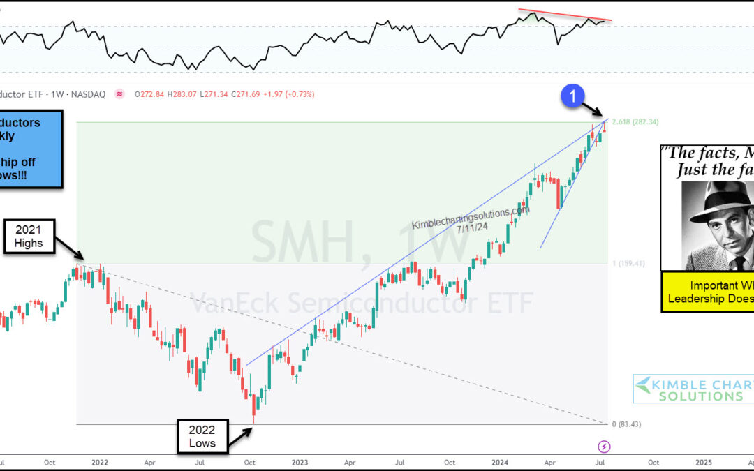
by Chris Kimble | Jul 15, 2024 | Kimble Charting
Technology stocks have been a bona fide leader, repelling sell off attempts and pushing higher. Same goes for the undisputed king of technology, the Semiconductors Sector (SMH). BUT, we are at a critical crossroads for SMH (and the broader market!). “The facts, Ma’am....
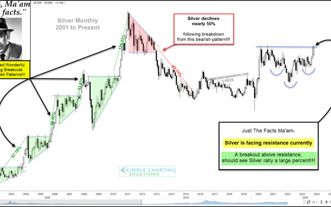
by Chris Kimble | May 17, 2024 | Kimble Charting
Precious metals have been very strong over the past two years, with Gold breaking out of a historic bullish pattern. Is it time for Silver to do the same? Silver has rallied sharply but is facing heavy resistance. Let’s look at the chart! “The facts, Ma’am. Just the...
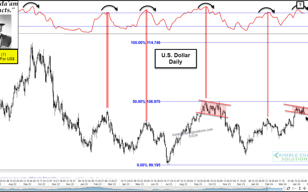
by Chris Kimble | May 3, 2024 | Kimble Charting
The U.S. Dollar is a key variable in all aspects of the marketplace. The strength of the dollar factors into the price we pay for food, gas, and everyday groceries. It also affects the equity and bond markets as investors factor in the risks of a dollar that is too...
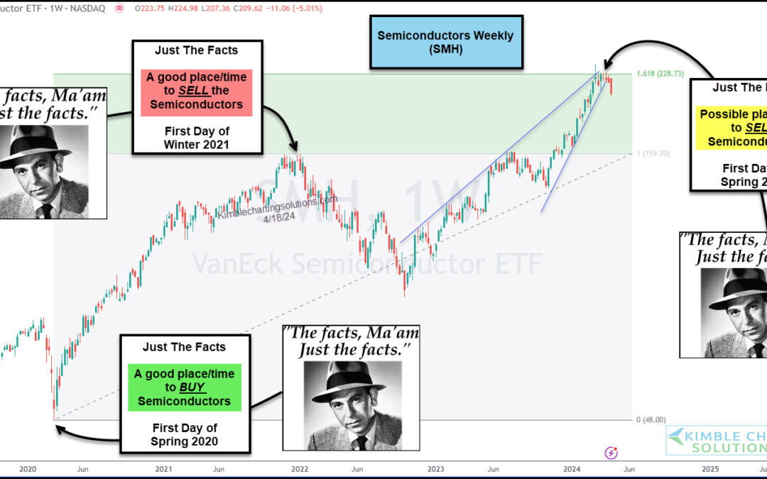
by Chris Kimble | Apr 19, 2024 | Kimble Charting
We often talk about leadership. Stocks that are leading the market higher. Sectors that are leading the market higher. Indices that are leading the market higher. Why? Because it pays to be invested in leadership when the market is on the way up. And one can avoid...
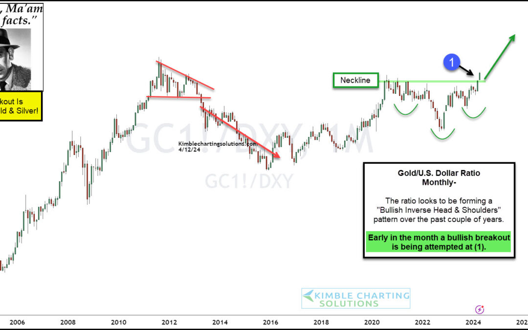
by Chris Kimble | Apr 12, 2024 | Kimble Charting
I have spent a lot of time discussing the bullish implications of Gold price patterns and the recent Gold breakout attempt. So why not offer up yet another example of why Gold (and precious metals partner, Silver) are brimming with bullish possibilities. For...
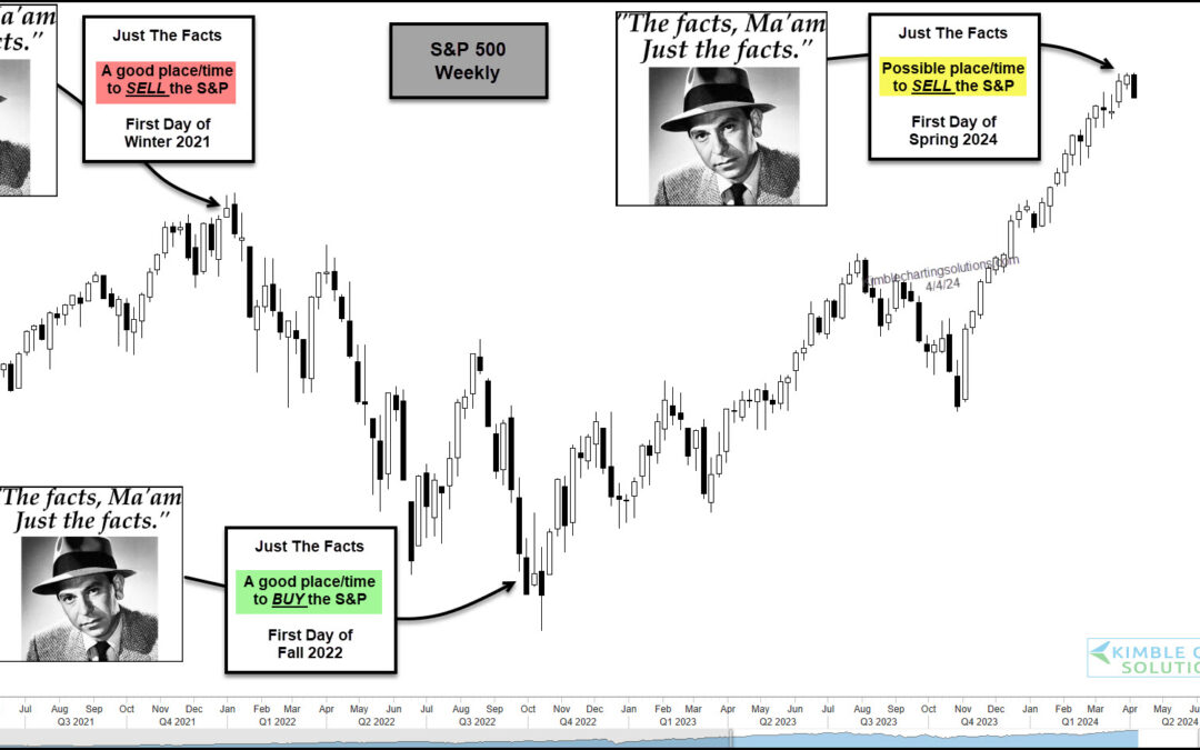
by Chris Kimble | Apr 5, 2024 | Kimble Charting
The stock market has been red hot over the past 5 months or so with both the S&P 500 and Nasdaq sporting big gains. But as we will see in today’s “weekly” chart of the S&P 500 Index, the seasonal start of Winter, Spring, Summer, and Fall can sometimes be a...
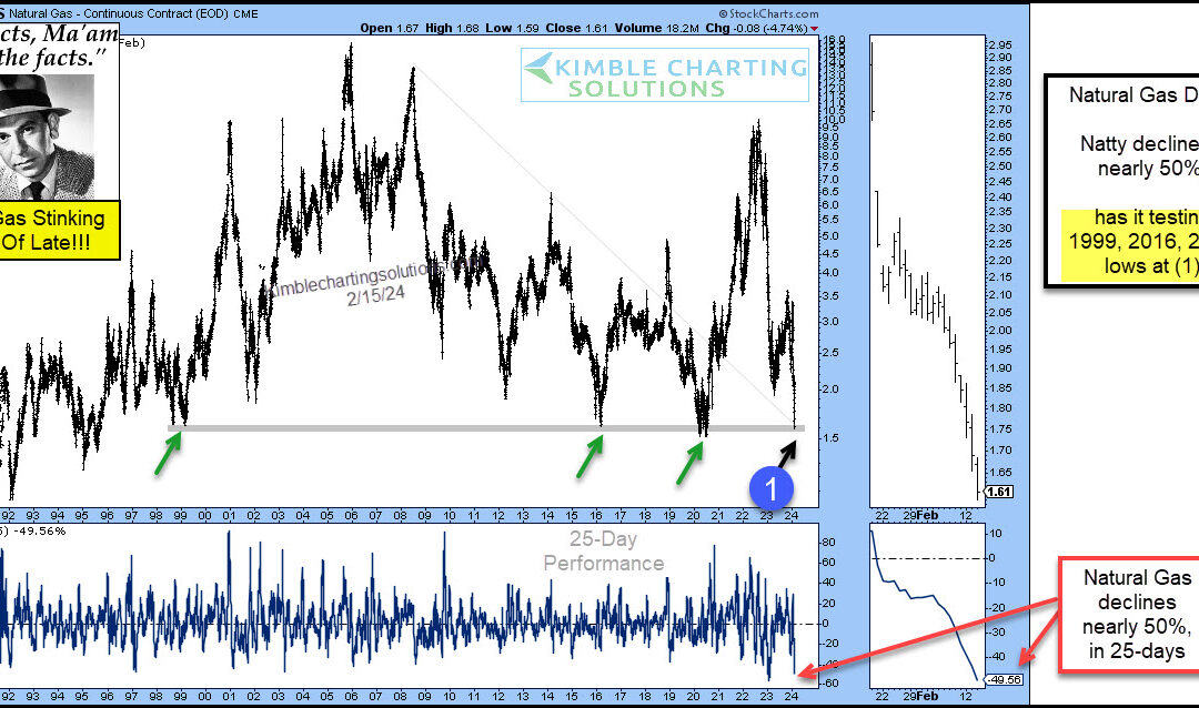
by Chris Kimble | Feb 16, 2024 | Kimble Charting
It’s been a rough go for Natural Gas prices. Even with elevated inflation numbers, Natural Gas is still in crash mode. “The facts, Ma’am. Just the facts.” – Joe Friday Today’s Natural Gas chart highlights the crash in Natural Gas prices. Natty has fallen nearly 50...
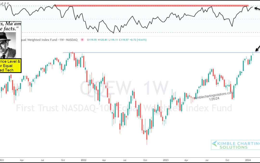
by Chris Kimble | Jan 29, 2024 | Kimble Charting
The end of year rally has trickled over into 2024 and it has been lead by tech stocks. But has the rally gotten long in the tooth? “The facts, Ma’am. Just the Facts.” – Joe Friday Today’s “weekly” chart of the Nasdaq 100 Equal Weight Fund (QQEW) highlights an...
