by Chris Kimble | Feb 7, 2020 | Kimble Charting
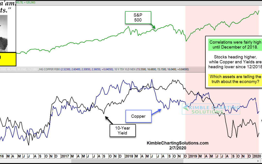
Historically Stocks, Yields and Doc Copper often trend in the same direction. Unless its different this time, one asset(s) is way out of whack! This chart looks at the S&P 500, Doc Copper and the Yield on the 10-year note over the past 5-years. From late 2015...

by Chris Kimble | Sep 18, 2019 | Kimble Charting
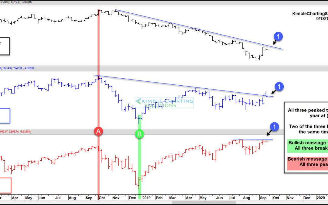
It’s not often that three asset classes reach similar important trading points all at once. But that’s exactly what’s happening right now with stocks, crude oil, and treasury bond yields. And this is occurring on Federal Reserve day no less! Something has got to give....

by Chris Kimble | Dec 6, 2018 | Kimble Charting
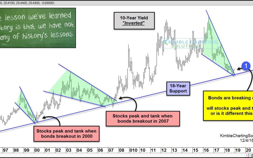
Are stocks receiving another dire warning, similar to the message received in 2000 & 2007? Very possible! This chart looks at the yield on the 10-year yield, inverted. This chart now resembles bond prices. The inverted yield has remained above a key support line...

by Chris Kimble | Nov 30, 2018 | Kimble Charting
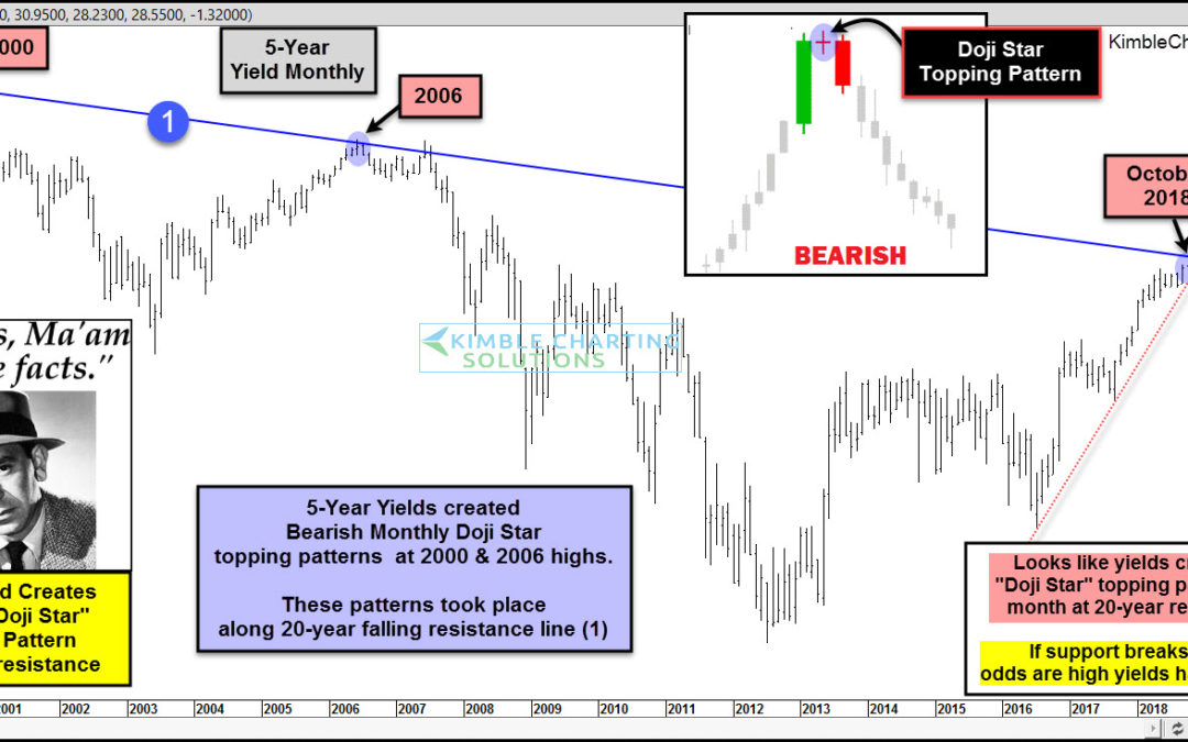
Could interest rates be peaking after moving much higher over the past 5-years? Yes! Joe Friday shares that the yield on the 5-year note, looks like it created an important topping pattern last month. This chart looks at the yield on the 5-year note over the past...

by Chris Kimble | Oct 10, 2018 | Kimble Charting
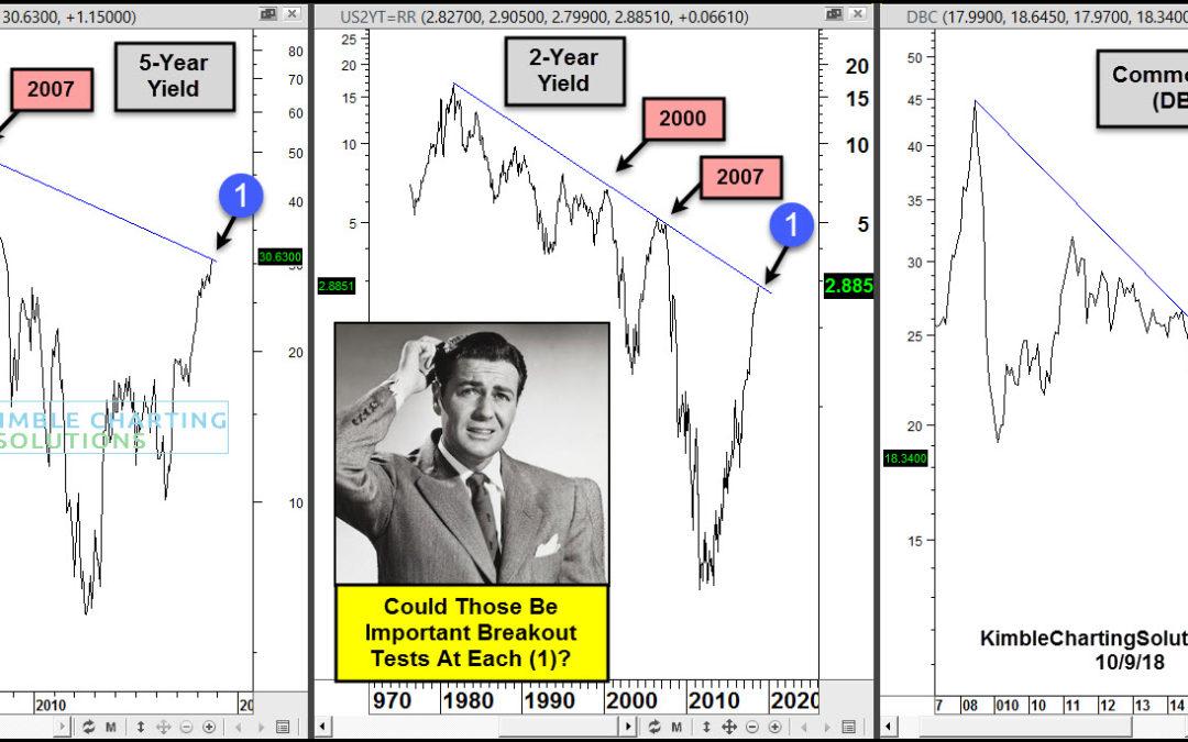
CLICK ON CHART TO ENLARGE This chart looks at Commodity ETF (DBC) over the past 12-years as well a 2 & 5-Year yields over the past couple of decades. DBC peaked in 2007 and has created a series of lower highs ever since. The rally over the past couple of years has...

by Chris Kimble | Oct 9, 2018 | Kimble Charting
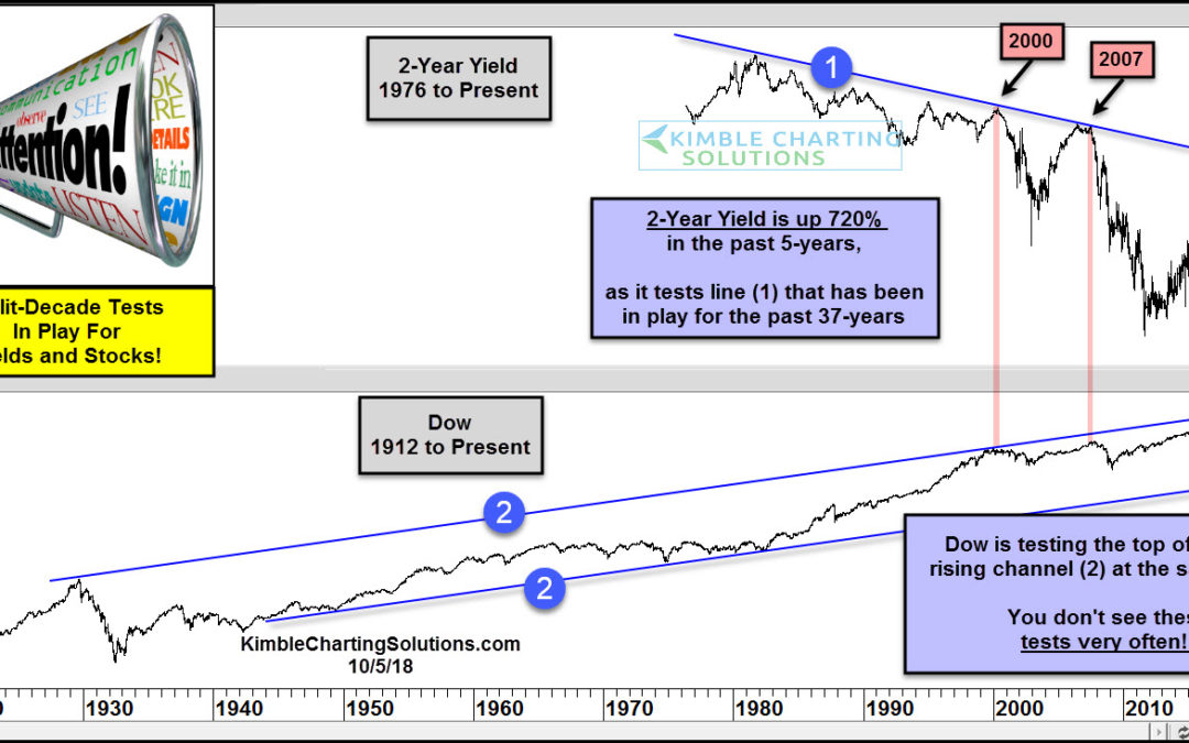
At what point does the rise in treasury yields (and interest rates) matter to the economy and stock market? Today’s chart looks at the past 4 decades of the 2-year treasury note yield versus the stock market (the Dow Jones Industrial Average). As you can see in the...

by Chris Kimble | Oct 8, 2018 | Kimble Charting
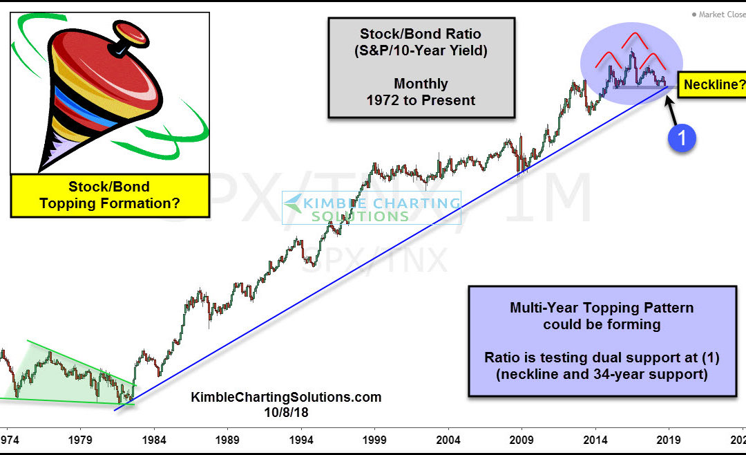
CLICK ON CHART TO ENLARGE This chart compares the relative strength of Stocks to bonds by creating the S&P 500/10-Year yield ratio (SPX/TNX) on a monthly basis, since the mid-1970’s. The stock/bond ratio’s trend has been up for the past 34-years,...

by Chris Kimble | Sep 11, 2018 | Kimble Charting
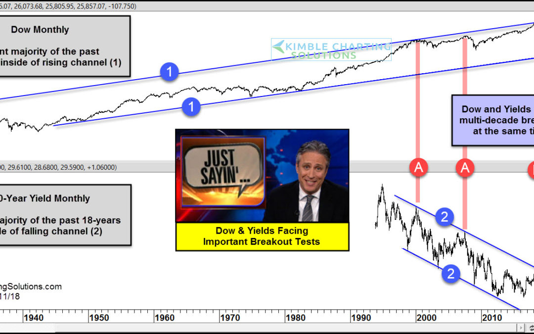
CLICK ON CHART TO ENLARGE This chart looks at the Dow Jones Industrials Average and the Yield on the 10-year note on a monthly basis for several decades. The top chart looks at the Dow since 1927 and the bottom chart looks at yields since 1994. The Dow has spent the...
