Thanks to the overwhelming email response to the quiz chart below, that was posted last Friday. (see quiz post here) The response from all over the world was appreciated and fun to see all of your outstanding thoughts and opinions. Thanks Again for your participation and the kind words many of you shared!
CLICK ON CHART TO ENLARGE
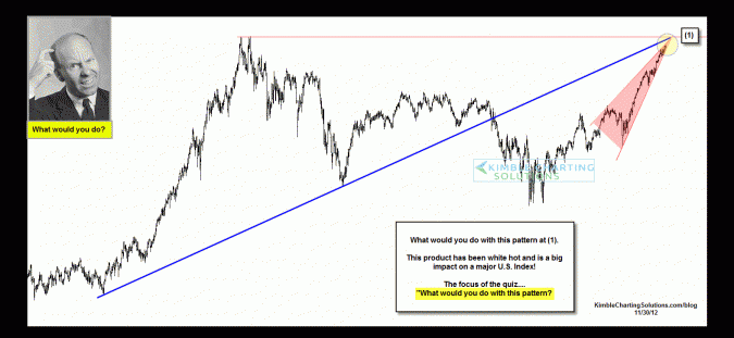
I found this pattern interesting for several reasons.... This is a two decade long chart, it is a Dow stock, it represents an industry that touches many of our lives and the patterns reflect a price point where a few investors might want to protect gains, if they invested in this stock over the past few years.
CLICK ON CHART TO ENLARGE
This chart is of Home Depot (HD) HD is nearing the double top highs of 1999 at the top of a rising wedge. A break above the 1999 highs would be good for this stock and the Dow. Do keep in mind a few investors could start harvesting gains at it nears its 1/1/2000 closing highs at $68.
Selling pressure could well pick up if the bottom of this steep rising wedge give way!
–


