CLICK ON CHART TO ENLARGE
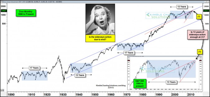
The chart above reflects that since the late 1800’s, the Dow has experienced three periods where it traded sideways, ranging from 13 to 17 years. The S&P 500 finds itself within a few percentage points of where it was 13 years ago.
The prior sideways markets resulted in upside breakouts. The patterns reflect the markets are close to an upside breakout again.
Where did the PE ratio stand, when prior breakouts took place?
CLICK ON CHART TO ENLARGE
The above chart is another of Doug Short’s masterpieces! This chart reflects the long-term PE ratio created by Crestmont Research.
I’ve highlighted what the PE ratio was at the end of the prior 13-17 year sideways markets, which ranged from 6 to 7. The current PE ratio stands at 21. Investors might take note that if you exclude the PE ratio peak in 2000 (33.8), the current PE ratio is much close to market highs than lows over the past century!
A Power of the Pattern perspective… notice that at the end of prior long-term sideways markets, steep bearish rising wedges weren’t in place like they are today.
Can the markets break to the upside of the current 13-year sideways pattern? Yes they could, anything is possible and investors have to remain open minded to all possibilities!
How many long lasting bull markets have started when the PE ratio stood at 21? Not too many so far!
Will it be different this time? Stay tuned!!!
If you would like to know how our Members are attempting to take advantage of this situation, send an email to [email protected] or click on the box below and we will share what assets we are over and under weighting at this time.
Follow us ……@kimblecharting


I’ve had my eye on this chart for two years. One other point, the PE’s at 6-7 were hit when the market was below the regression red line