CLICK ON CHART TO ENLARGE
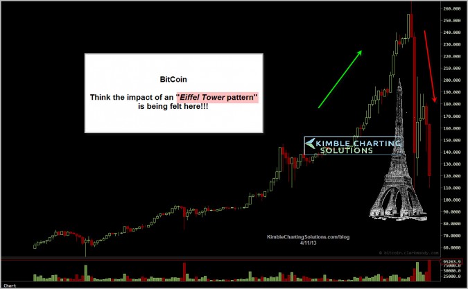
The impact of an Eiffel Tower pattern is this….if you see the left side of the Eiffel tower, you often will experience the right side too!
Bitcoin has fallen 50% in a few days!!! These pattern suggest investors sell on a support break of the left side of the pattern!
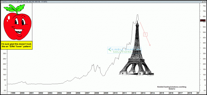
The Power of the Pattern suggested last October that an Eiffel Tower pattern was forming in Apple (see post here)
CLICK ON CHART TO ENLARGE
Think any investors wish they had sold Apple at the time this pattern was forming and Apple was trading at over $600 per share?
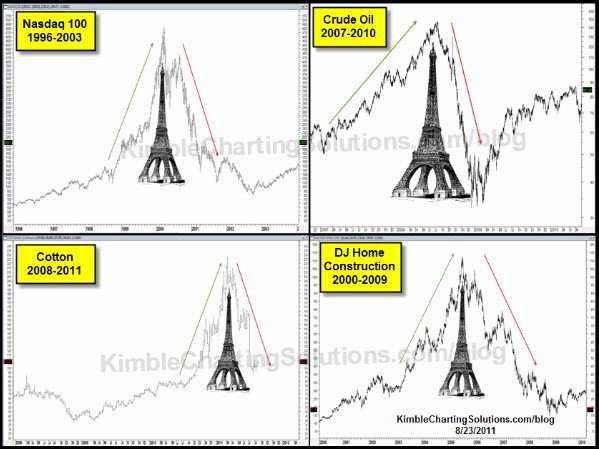
Is Apple and Bitcoin the only assets that have made “Eiffel Tower” patterns? The 4-back below reflects a few of them over the past 20 years! (Click here for more Eiffel info)
CLICK ON CHART TO ENLARGE
Could gold have made an Eiffel Tower pattern? (see post here) Its not the “odds of this pattern being an Eiffel tower, its the impact if it is!!!
Don’t underestimate the Power of the Eiffel pattern in any asset!!!
–
–


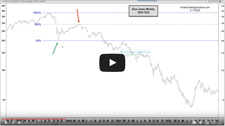
Damn! That Eiffel Tower pattern … It’s just like S&P500 on weekly charts!
🙂
Vali