CLICK ON CHART TO ENLARGE
What are and Why could Eiffel Tower Patterns be important to my investments/portfolio? If a rally creates a chart, that looks like the “left side” of the Eiffel tower, investors often end up experiencing the “right side” of the pattern too! True Eiffel towers on the right side, decline to where the left side started, in other words, wiping out all the gains!
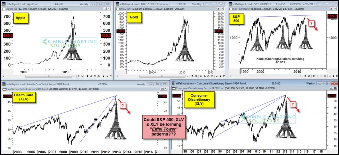
The 4-pack below reflects completed Eiffel tower patterns in a variety of assets that took place over the last 17-years. Completed meaning the decline wiped out the prior gains!
CLICK ON CHART TO ENLARGE
The Power of the Patterns showed that Apple could be forming this pattern at its peak (Apple Eiffel here) and that Gold could be forming one as well, within 10-days of its peak in August of 2011 (Gold Eiffel here). In hindsight, does any investor wish they had sold Apple at $650 per share or Gold at $1,850, when I present the Eiffel in the assets?
Now the Power of the Pattern is reflecting in the 5-pack above that the S&P 500 (SPY), Health Care (XLV) and Consumer Discretionary (XLY) could be forming Eiffel Tower patterns. Nothing is proven that these patterns are in place, yet the potential is there!!! The outcome of these patterns would have a big impact on portfolio construction!
Remember this when it comes to Eiffel Tower patterns…”its not the odds of this pattern coming true that is key, its the impact if it does!”
–
–


