CLICK ON CHART TO ENLARGE
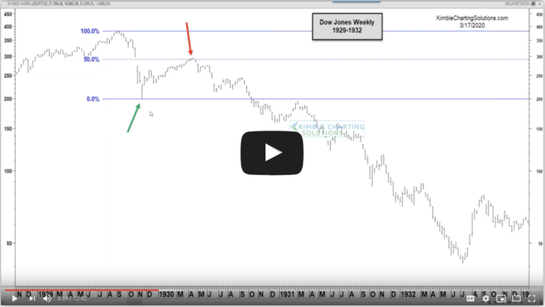
An Eiffel Tower pattern formed in Apple (Apple Eiffel here) and Apple declines over $300 per share. Gold looks to have formed an Eiffel Tower pattern as it became the largest ETF on the planet! (Gold Eiffel here) Long Gold owners are feeling the brunt of that pattern the past few days.
A little bit before the top in 2011 and a 17% decline in the S&P 500 in 5 months, “look alike” patterns were taking place (See look alikes, Dominoes & Slipper slides)
Could the S&P 500 be forming a third Eiffel Tower pattern of the past 13 years in the chart above? Way too soon to tell.
Remember this…Its not the odds of a Pattern coming true that counts, its the impact if it does!!!
–
–


