CLICK ON CHART TO ENLARGE
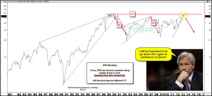
JP Morgan has declined 50% in value twice along line (1) since 1998.
Now this leading financial company is back at this key resistance line again, has formed a bearish rising wedge and is now looking like support of the wedge is breaking to the downside. I shared the pattern on Stocktwits last week, reflecting that JPM was sending a message investors should pay attention too, per the direction the broad markets could head!
Follow us at here …..@kimblecharting
Is this pattern only taking place in JP Morgan?
CLICK ON CHART TO ENLARGE
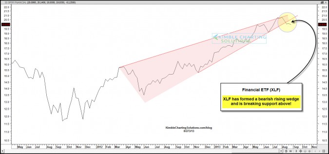
The above chart reflects that not only has JPM formed a bearish rising wedge and is breaking support, XLF is as well!
So Goes the Banks, So Goes the markets and Broad economy? I will let you be the judge of that.
–
–


