CLICK ON CHART TO ENLARGE
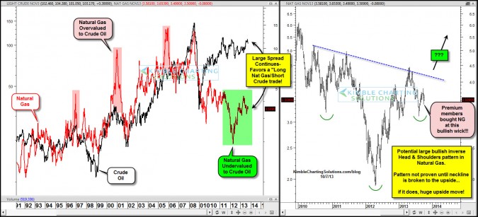
The left chart is a overlay between Crude Oil and Natural Gas over the past 20 years. Some times one product outperforms another and creates “large spreads” which in time will narrow. Since 2010 the spread between Crude/Natural Gas has become very wide.
The spread at this time reflects that Crude has outperformed Nat Gas to a large degree. A few weeks ago when Natural gas created a bullish wick on support, Premium members went long Natural gas, reflected in the chart on the right.
At the same time Premium Members have been short Crude oil since it hit the $110 level 5 weeks ago.
CLICK ON CHART TO ENLARGE
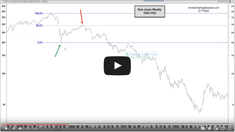
Some people might think it is odd to have opposite positions in the energy complex….the chart below reflects it might not be the “odd couple” trade some suspect!
–
–


