CLICK ON CHART TO ENLARGE
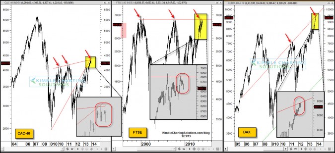
The above 3-pack looks at long-term patterns in France, London and Germany. Each chart reflects attempted breakouts is at hand, for these major markets.
The gray boxes take a very short-term snap shot of each market at the resistance and the red oval highlights “engulfing bearish patterns” in these key markets.
What goes up in a down market? Correlation!!!
The Power of the Pattern reflected that the majority of the key worlds index were all “attempting breakouts at the same time!” (see post here)
If the worlds markets don’t succeed breaking out at the same time, could the majority of the turn weak at the same time since correlation is so high? Stay tuned…
–
–


