CLICK ON CHART TO ENLARGE
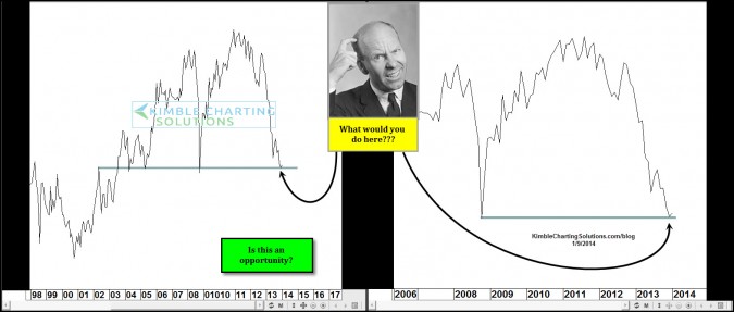
The chart above reflected whats looks to be a Power of the Pattern opportunity at hand, which was shared with members a week ago and was a posted Friday for blog viewers to see. Thank you from the large response from around the world on what people would do with this pattern and so many wanting to know what it was.
The 2 charts above are both “monthly closing charts.” The chart on the left is the XAU index and the chart on the right is the ETF GDX
CLICK ON CHART TO ENLARGE
I shared the above chart with premium members last week…The above chart reflects the Gold Bugs index and the S&P 500 in the top half, the bottom chart is the gold bugs/spy ratio, reflecting that it has tanked over the past couple of years, creating a “Fish Mouth Spread” where often rallies in the Gold bugs index has taken place in the past, since 1998.
Of note…the gold bugs index was oversold in 2000, when SPY was overbought! What followed was a huge rally in the Gold bugs index and a 50% decline in SPY. Current reading in the ratio are the lowest since 2000. Could a rally in the gold bugs and a decline in SPY take place again? Stay tuned!
–
–


