CLICK ON CHART TO ENLARGE
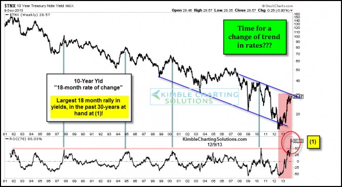
If an asset rose 50% more than than its seven biggest rallies in 30 years, would you say that is closer to the norm or closer to an aberration? In my humble opinion, it seems closer to an aberration.
Almost 6 months ago I shared the above chart with Premium Members that the yield on the 10-year note had just experienced the largest 18-month rally in yields in the 30 years. I shared numerous chart with Premium Members that bonds were at a rare opportunity.
To put the rally in perspective, it was 50% larger than any of the prior 18-month rallies. For sure, it was a rare event. At the same time the rally in yields took it from the bottom to the top of a falling channel, nothing fancier than that.
CLICK ON CHART TO ENLARGE
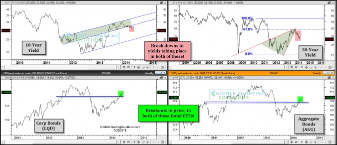
The above 4-pack reflects that the yield on the 10 & 30 year bonds are breaking down and two popular bond ETF’s are breaking above more resistance lines. While much the chatter on the TV and street is about the Taper, its just not happening at this time, as we are unwinding from the 18-month aberration in yields that peaked around Christmas of 2013.
If rates continued to fall and the CRB index did too, what macro message would they be sending? Commodity traders have now established the largest long positions in 10-years. The last two times they were this bullish the CRB fell 50% and 28%! (see here)
–
–


