

CLICK ON CHART TO ENLARGE
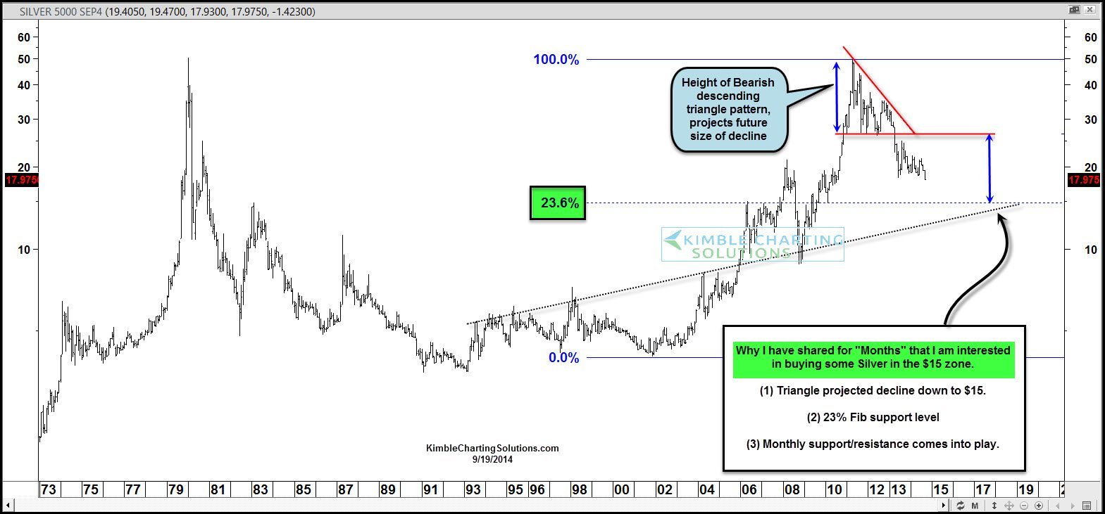
The above chart was created when Silver was trading at $28 per ounce. I shared with Premium Members in June of 2012, that Silver looked to be creating a bearish descending triangle and the measured move was calling for Silver to hit $15 per ounce (see projection of red arrow above). Since the chart was made, Silver is down 40% in value and is nearing the projected price of the descending triangle.
CLICK ON CHART TO ENLARGE
I have been sharing with metals members for months that the $15 zone in Silver looks to be an interesting place to pick up some Silver. The above chart highlights why the Power of the Pattern thinks this could be a potential good buy point.
–
–
