
CLICK ON CHART TO ENLARGE
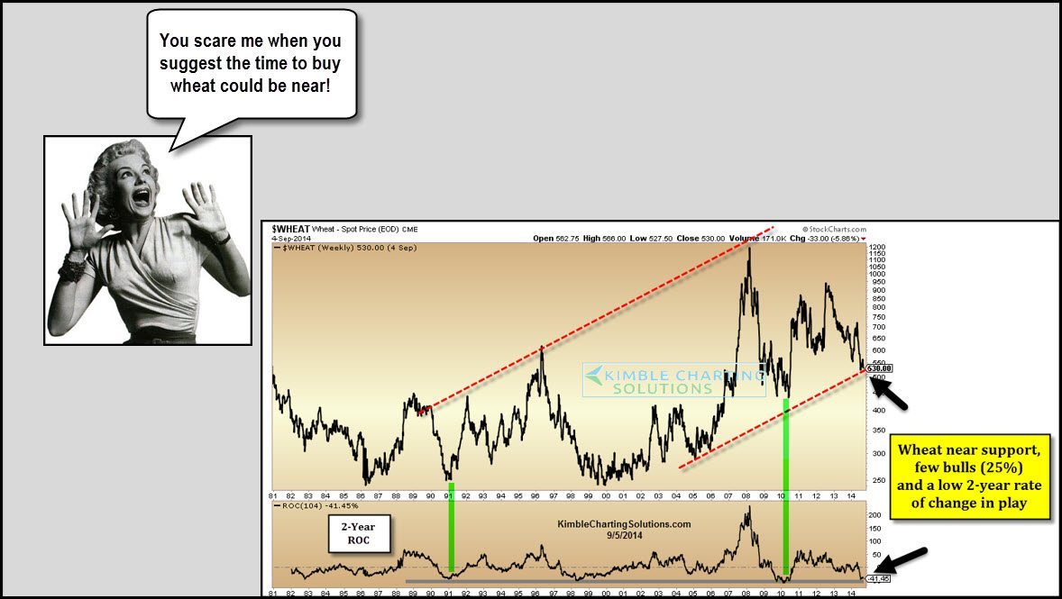
When it comes to poor performance over the last couple of years, Wheat sure comes to mind! The lower section of the chart above is the 2-year rate of change (ROC) applied to Wheat.
As you can see the ROC has been this low only a few times over the past 25 years. Understandably, few investors like wheat at the time (25% bulls).
A support line is coming into play right now too. This sector is very much on the radar screen for our members, with a specific game plan in mind.
Is this a “scary trade idea?” I love this type of risk/reward set up in the grain complex!!! If this worm turns, JJG has a chance to create some extra pocket change for investors.
–
–
