
CLICK ON CHART TO ENLARGE
This time of year people seem compelled to make predictions for the year ahead. Making year-ahead predictions is above my pay grade, I will leave that exercise to the smart people.
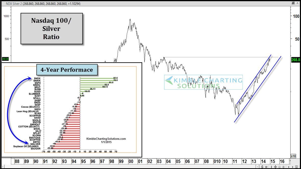
In the theme of looking ahead, I would like to look back of the past few years first. The table in the lower left reflects the 4-year performance of a few assets. Looking at the “Good” first, the Nasdaq 100 has been hot, out performing the S&P 500 by almost 50%. When it comes to the “Bad”, Silver is near the bottom, losing almost 40% of its value.
The chart above is the Nasdaq/Silver ratio, which reflects the strong outperformance of the NDX over Silver.
CLICK ON CHART TO ENLARGE
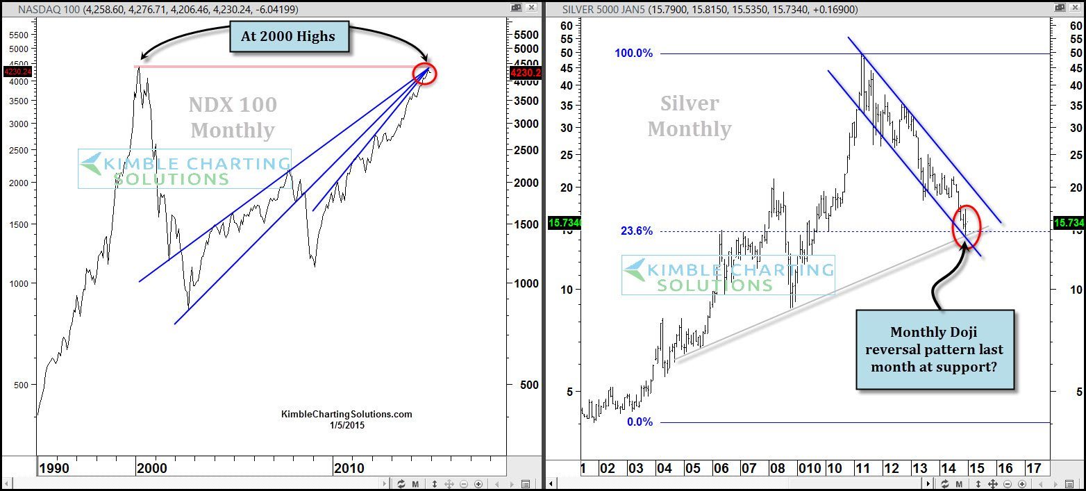
The 2-pack above reflects how these assets are headed in different directions! NDX has been very strong, taking it back to its 2000 monthly closing highs. Silver’s decline has taken it down to the 23% Fibonacci level of its 2000-2011 rally, where two other support lines come into play. As Silver was hitting these levels, it may have created a “monthly doji star” reversal pattern last month.
Will the Nasdaq be the top performer over the next 1 to 4 years after such a strong run? Will Silver remain as a bottom dweller 1 to 4 years from now, after getting hammered the past few years? The answers to these questions are also above my pay grade.
These type of performance extremes does bring up the idea of a “pair trade” (short Nasdaq/Long Silver) somewhere in the future, due to these extremes in performance over the last 4-years.
At this time, there is no hurry in establishing the pair trade, because positive momentum still remains with the NDX 100 and against Silver. The Power of the Pattern in the 2-pack above does reflect that both the NDX & Silver do find themselves at price points where reversals could take place.
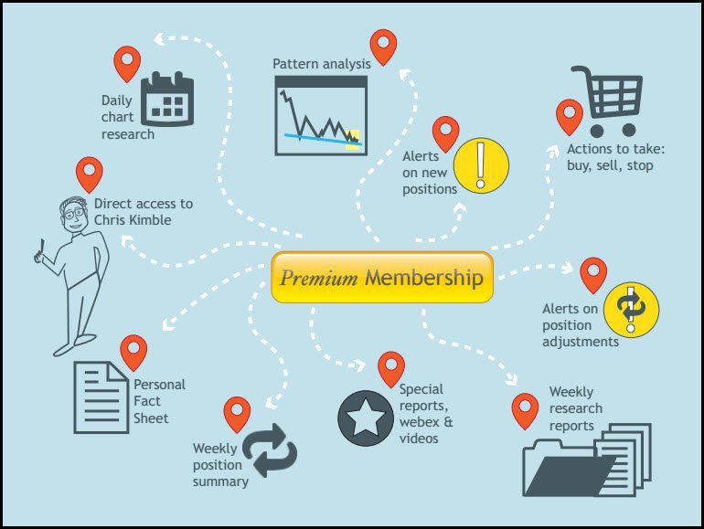
I will be keeping Premium Members abreast of this situation on a daily basis going forward. Below is a visual example of what Premium Members receive.
Full Disclosure, Premium Members are short EFA, own $EFZ
CLICK ON CHART TO ENLARGE
–
See more of our research at Kimble Charting Solutions (HERE)
–
