CLICK ON CHART TO ENLARGE
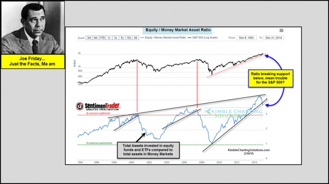
The bottom chart above from Sentiment Trader, reflects that the Equity to Money market ratio was recently hitting all-time high levels. Of late the ratio is turned a little lower and broke below a rising support line. Humbly, I don’t feel this should be viewed as a micro trading tool. I do feel it is very much worth keeping an eye on for big picture perspective. With the ratio hitting all-time highs, it remains on my radar screen for sure.
For some reason recently, the ratio has softened and is breaking support. In hindsight when the ratio broke support back in 2000 & 2007 it ended up being a decent big picture signal. Is the current break of support something to be concerned about? A little too soon to tell IMHO.
CLICK ON CHART TO ENLARGE
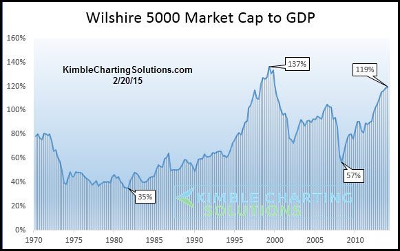
This chart looks at the Wilshire 5000 and compares it to GDP. As you can see, its hitting the second highest level in the past 45 years, only being surpassed by levels hit in 2000 and well above 2007. From a trading perspective this doesn’t mean much.
Joe Friday just the facts…Long-term trends are up, as they are above key support and moving averages. On the flip side, no long lasting bull market in the past half century has ever “started” when the Wilshire 5000 to GDP ratio was this high.
Would be honored if you were a member…Click here for available research options 
–


