
 CLICK ON CHART TO ENLARGE
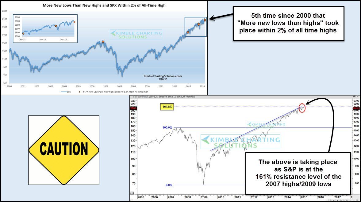
The top part of the chart highlights times when more “new lows versus new highs” took place within 2% of all-time highs. This just took place for the 5th time, in the past 15-years.
Looking back, this event took place in 2012 and didn’t mean much as the market continued higher. Last year it happened twice, right before the “Ebola” decline of just under 10%. It did take place back in 2007 and most know the results back then.
Should the bulls be concerned? This is what has my attention – The lower chart above applies Fibonacci to the 2007 weekly closing high and the 2009 weekly closing low. The S&P rally has pushed the S&P up to the 161% Fibonacci extension level of these key dates and up against a rising resistance line. Since the S&P has reached this resistance zone, its made little progress of late.
Seeing the New Low/High situation taking place as the S&P 500 is facing the extension level, does increase my attention to this key price level.
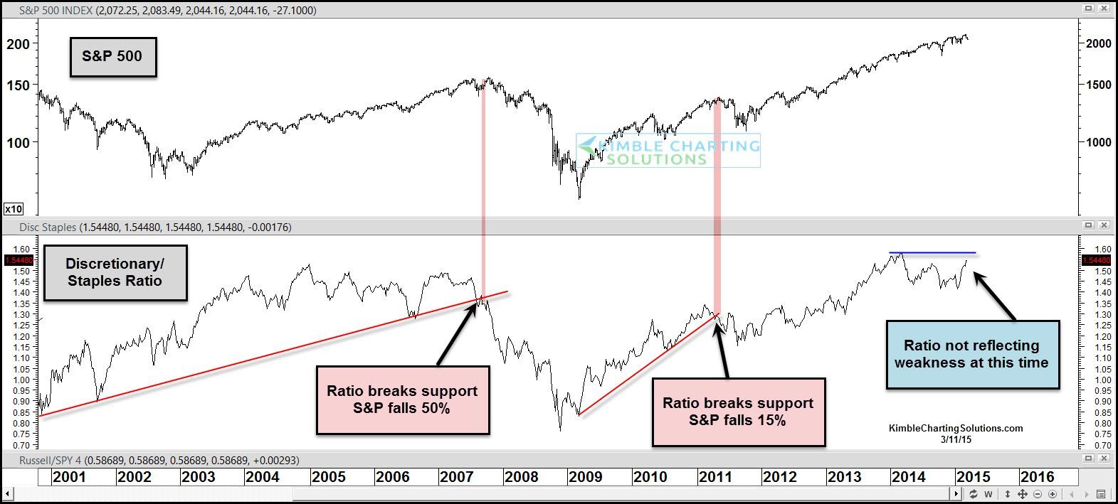
Technical concerns would grow if….The Advance/Decline line weakens here and should the Discretionary/Staples ratio below break support.
 CLICK ON CHART TO ENLARGE
As you can see, the last two largest declines in the past decade (2007 & 2011) took place “after” the Discretionary/Staples ratio broke below rising support. At this time the ratio is above support and is near the highs of a year ago.
If you are concerned the market might be topping, it might be worth keeping a close eye on what this ratio does going forward along with the Advance/Decline lines as well.
We send research to Premium Members Daily and Triple Play members weekly….Click below for details
–
