
CLICK ON CHART TO ENLARGE
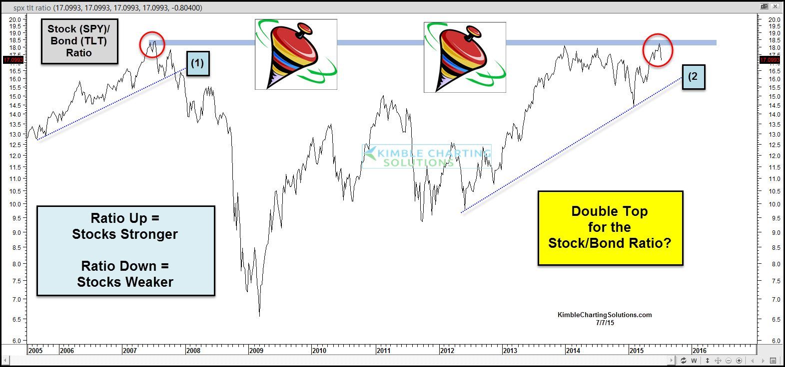
This chart looks at the Stock/Bond ratio over the past 10-years.
As you can see the ratio hit all-time highs back in 2007 and once it turned lower and broke support line (1), the trade was to overweight bonds and underweight stocks.
In 2009 the ratio was very low and turned up and the trade for the next few years was to be overweight stocks and underweight bonds.
Now the ratio is back to 2007 levels. Is a double top in the ratio in play?

CLICK ON CHART TO ENLARGE
This chart reflects that the S&P 500 has been struggling at its Fibonacci 161% Extension level.
It has broken below support line (1), that is based upon weekly closing prices. Now line (2) is being tested above, which is based upon weekly lows, coming off the 2009 & 2014 lows.
If the ratio would happen to break support line (2) in the top chart and the S&P 500 breaks support line (2) above, sellers could step forward and it could pay to overweight bonds and underweight stocks again!
–
