
Today I am featuring a guest post by my good friend, Ryan Detrick, which looks at the Death Cross in greater detail than I have ever seen.
Yesterday, we had what technicians call a Death Cross form on the Dow. This happens when the longer-term 200-day moving average crossed beneath the faster moving 50-day moving average. As the name would suggest, this is viewed as a big concern. The flip side is the Golden Cross, which is when the 50-day moving average moves above the 200-day moving average. Here is what the recent Death Cross looks like.
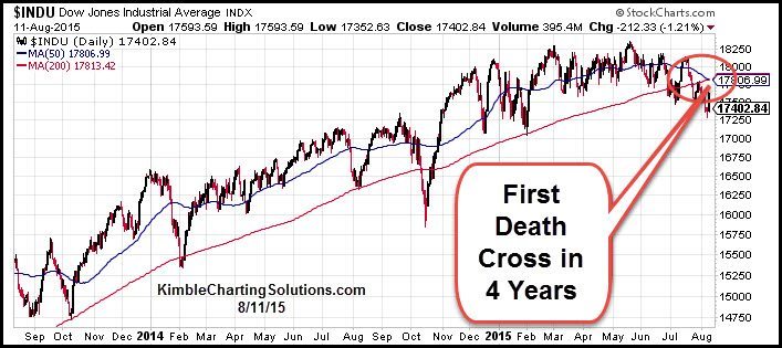
CLICK ON CHART TO ENLARGE
Does this matter? In other words, should we panic? You will probably read over the next few days how this ominous signal happened in early January 2008, right ahead of the Financial Crisis. But don’t forget the last time it happened was August 2011, a great time to buy ahead of a historic four year rally. I looked back to 1900 and found this is the 74th Death Cross. The returns after the 73 other Death Crosses lead to consistent underperformance.
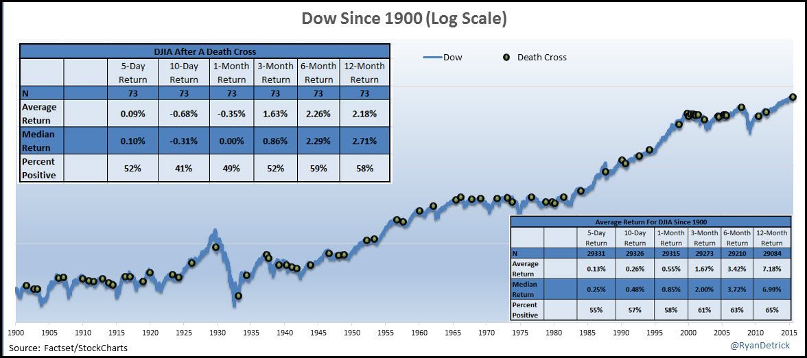
CLICK ON CHART TO ENLARGE
Now what struck me was when you have clusters, that is when you should worry. Clearly we don’t have any clusters happening right now. At the same time, some of those Death Crosses took place just a few days apart. Should we really even count them if they are bunched together? So next I looked at all the Death Crosses that took place with the 200-day moving average above the 50-day moving average for at least 100 trading days. This should give us some better trends coming into the Death Cross and took us down to 52 prior instances, but once again, the results going out a year are poor.
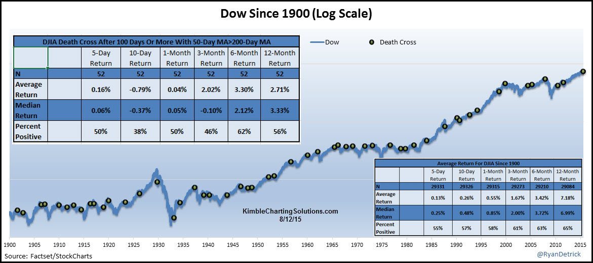
CLICK ON CHART TO ENLARGE
I noticed the current Death Cross took place about four years from the previous Death Cross. Turns out, the Dow went 906 days without a Death Cross. That is the second longest streak ever! The only two in the same ballpark were late 1998 and late 1929. Two times that brought about flat to lower markets going out 15 to 20 years.

CLICK ON CHART TO ENLARGE
So next I looked at all the times we had long periods without a Death Cross. There were 10 other times with more than 500 trading days without a Death Cross. Once again, extremely poor returns after this signaled.
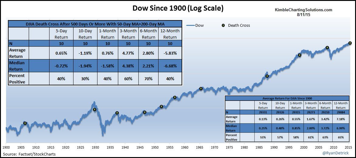
CLICK ON CHART TO ENLARGE
Lastly, the Dow is less than five percent away from a new all-time high. I wondered if this was meaningful. There were six other Death Crosses that took place within 7.5% of a new all-time high. Wouldn’t you know it, weak returns going out is the norm.

CLICK ON CHART TO ENLARGE
No other way to put it, but the Death Cross we just saw is a huge warning sign. I am surprised by the results, but I don’t argue with them. Thanks for reading and good luck.
–
