
CLICK ON CHART TO ENLARGE
Junk bonds have been in the news a ton over the past few months, mostly in a bad way, as they have been falling in price since April of 2014.
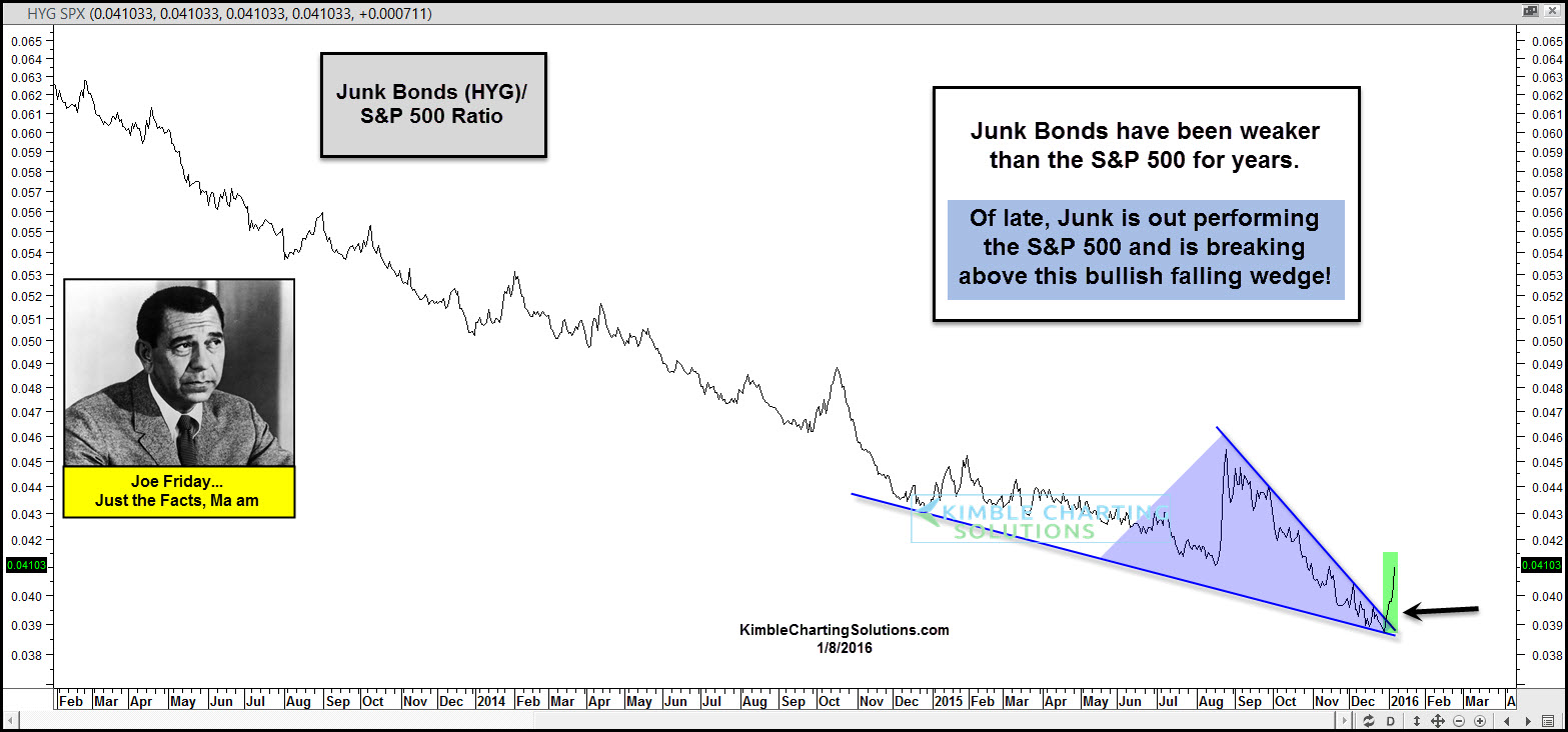
The chart above looks at the Junk Bond (HYG)/S&P 500 ratio. As you can see, the ratio has been heading south for years, reflecting that junk has been weaker than the broad market.
On December the 21st, the Power of the Pattern shared that HYG was at its 50% Fibonacci retracement level of the rally off the financial crisis low. At the same time it was on potential support, momentum was hitting very oversold levels and volume was spiking higher, which might be reflecting a panic in this very hard hit sector. (See Post Here)
Joe Friday Just the Facts….The HYG/SPX ratio above looks to have formed a bullish falling wedge and it is breaking out of late, reflecting the Junk bonds have been stronger than the S&P recently!
Full Disclosure…Premium Members bought HYG on support a few weeks ago, with a stop below the 50% Fib level.
–

Do you think high yield leadership will lead prices higher for energy equities, the broad market overall, both? Or perhaps is this just a dead bounce that will finish off a H & S pattern started in ’13?
Thanks!