
CLICK ON CHART TO ENLARGE
The majority of stock markets around, are in a downtrend over the past 9-months.
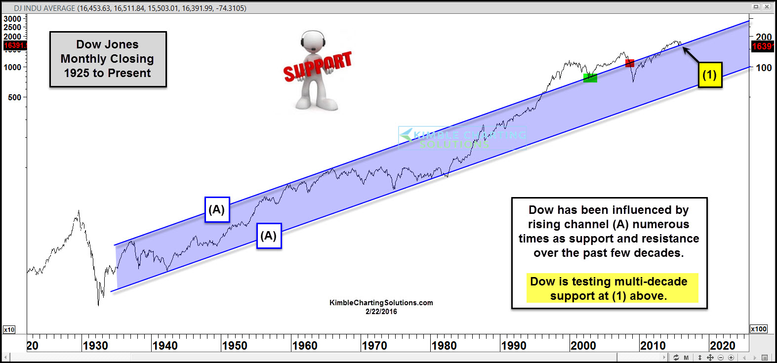
This morning we are taking a look at the Dow over the past few decades, actually 9 decades. The Dow has formed a rather uniform rising channel since the 1930’s, channel (A). Channel support held at the 2002/2003 lows and when channel support gave way back in 2008, market markets fell hard.
Even though the markets have been in a down trend the past 9-months, long term channel (A) remains in play as support at (1) above and support is support until broken.
We humbly remain of the opinion, that this rising channel is very important for portfolio construction going forward. The Dow remains in a long-term upward trend and to remain in this trend, support needs to remain in play!
–

I don’t like this chart.
It should be: ’29 to early ’40s falling triangle.(Slump to WWII)
then, ’44 to ’64 – rising channel. (Kennedy assassinated)
Thence to ’71 – Nixon abandons gold – start worrying. Flat.
Then, ’80s till millenium bust – hubris; “We can fly !”
And thence till now, well, we’re still taking the Koolaid, we are in denial, but we can still fool (and hence, can still rob) the rest of the world – that is, until they wake up; which seems to be what is happening about now (?)
But what do I know? I am trying to relate what seem to me to be major changes in gear to known major economic perterbations – the slump, the war, post war recovery, oil shocks and the war lost in Vietnam, fiscal lunacy as a Wall St prop, and the FRB suicide squad. Each time a change in govt policy, which the bankers have each time exploited. This is looking at economic reality to see if it has links with financial jiggery pokery: but is this permitted, or should we just look at the electronic entrails, and ignore what we know has been affecting them ? Is chartism a “pure” numbers game ?