
CLICK ON CHART TO ENLARGE
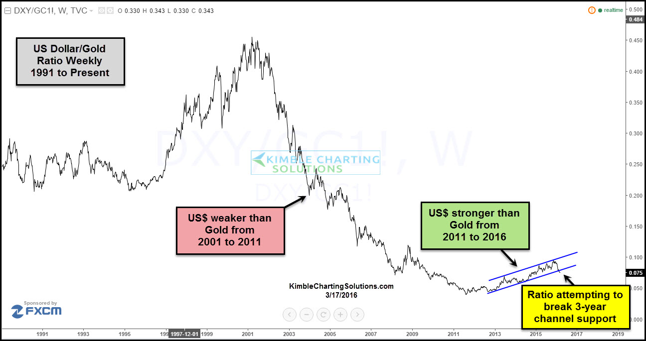
The above chart looks at the U.S. Dollar/Gold ratio over the past 25-years. From 2001 to 2011, the ratio headed sharply lower, reflecting that the US$ was much weaker than Gold for almost a decade. Starting in 2011, the ratio has turned up, reflecting that the US$ has been stronger than Gold. In the lower right corner of the chart above, the ratio is making an attempt to break below 3-year rising channel support.
Below looks at the same US$/Gold ratio and we applied the 50 & 200 Day moving averages to the chart.

CLICK ON CHART TO ENLARGE
The 50-day moving average is now crossing below the 200-day moving average, often called the “Death Cross.” At the same time the ratio is attempting to break below 3-year rising support at (1) above.
This is the first time in years that a “Death Cross” and a break of rising support, is taking place at the same time. The day before the highest weekly close in history, the Power of the Pattern suggested that Metals could be a place to avoid for years to come.
The combo of a breakdown in the ratio and the death cross, would suggest that a multi-year trend could be changing at this time!
If this type of info is important to you, we would be honored to have you as a Metals Member. Monthly membership is just $29 (sign up here). We pass along a 20% discount for annual membership (sign up here)
–

Authority and determination majing must be spread all through the enterprise
construction as effectively.
If the ratio is turning down, wouldn’t that portend a trend like 2001-2011? Doesn’t that mean gold would be a place to invest, not avoid? Thank you.
I love what you guys tend to be up too. Such clever work and coverage!
Keep up the excellent works guys I’ve added you guys to my
blogroll.
Should it not be the opposite:
“Metals could be a place to be for years to come” ?