

CLICK ON CHART TO ENLARGE
The top chart above highlights that the Dow has spent the majority of the past 70-years inside of a rising channel.
The bottom chart highlights that the 10-year yield has spent the majority of the past 25-years inside of a falling channel.
Support is support until broken and both are testing short-term support lines at each (1).
In the short-term, it would be “bad news for the Dow” if both broke below support at the same time at each (1).
The Dow and S&P could be forming the pattern below, which is a “Descending Triangle” pattern
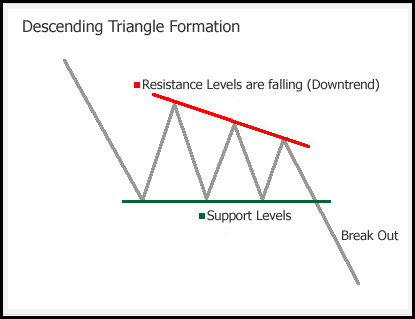
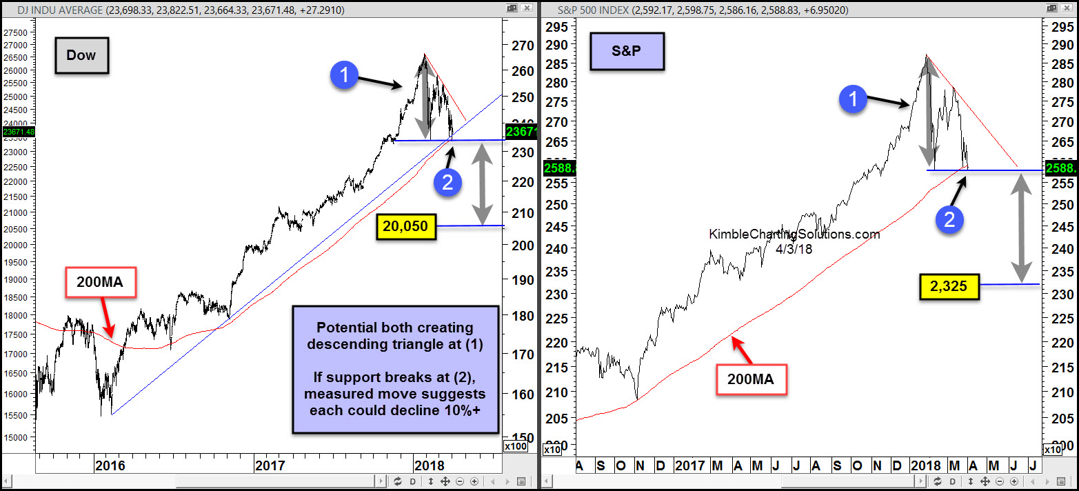
Below looks at much shorter-term patterns of the Dow and S&P 500-
CLICK ON CHART TO ENLARGE
Around two-thirds of the time, the descending triangle patterns result in lower prices. If the 200 day moving average lines and support breaks at each (2), the descending triangles suggest that the Dow and S&P end up falling an additional 10%.
With the Dow and 10-year yields testing support near the tops of 70-year and 25-year channels in the first chart and the Dow and S&P testing support at each (2) in the second chart, if these support lines would break to the downside, don’t be surprised if selling pressure picks up.
–
View our most recent webinar multi-decade patterns in play and how to take advantage

