
For the past three decades, one thing investors could count on was lower yields and rising bond prices (due to inverse relationship).
The Federal Reserve was dovish and a competitive market (due to the rise of technology) kept prices and inflation under control. And that equated to a multi-decade bond bull market.
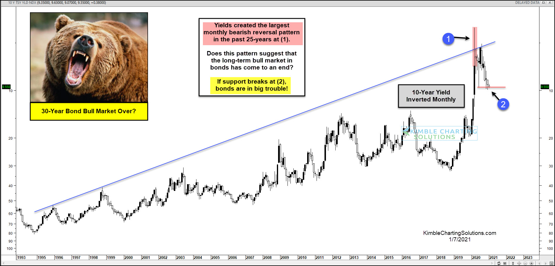
Today we look at a long-term “monthly” chart of the 10-year Treasury Bond Yield.…Inverted! We invert the price on the chart to eliminate bias by providing another way to analyze price action… And in this case, the chart also offers up a perspective from the bond side (due to the inverted relationship of yields vs price).
The Bond Bull Market Is Under Pressure
As we’ve pointed out several times this year, bond yields created the largest “monthly” bearish reversal pattern in the past 25-years at (1).
And understanding that the chart is inverted, we can think of it as the bond market… and price is currently testing the initial reaction low at (2).
Support is support until broken!
This support is critically important and needs to hold to keep bonds in a bullish formation.
The bond bull market is definitely on the ropes… stay tuned!
This article was first written for See It Markets.com. To see the original post CLICK HERE.
