by Chris Kimble | Jul 24, 2024 | Kimble Charting
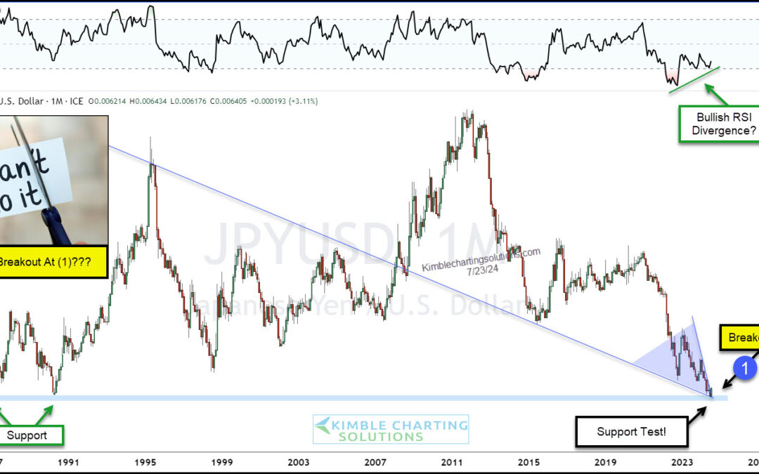
The Japanese Yen currency has been in a strong selloff for the past 12+ years. Today, we ask: Could the Yen finally be bottoming? As you can see on the long-term “monthly” chart of the Japanese Yen below, the currency needs some bulls. The latest selloff has the Yen...

by Chris Kimble | Jul 19, 2024 | Kimble Charting
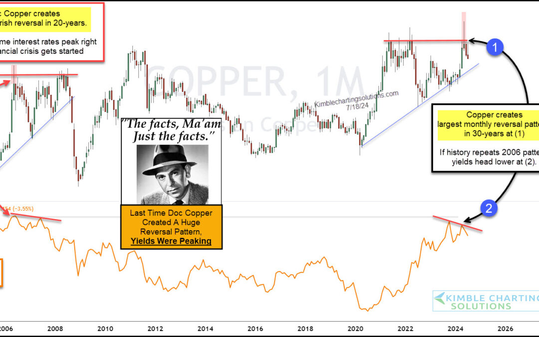
Investors have been watching the Federal Reserve and interest rates closely for the past several months. Well, actually more like the past several years. But maybe they should be watching copper prices for clues on where interest rates are headed. “The facts, Ma’am....

by Chris Kimble | Jul 16, 2024 | Kimble Charting
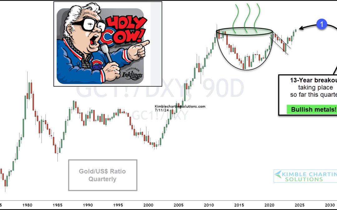
Precious metals continue to show strength this year with Gold breaking out to new all-time highs. Could things get even more bullish for Gold? Well, today’s chart highlights a key precious metals ratio that is working on a 13-year breakout. Below is a long-term chart...

by Chris Kimble | Jul 15, 2024 | Kimble Charting
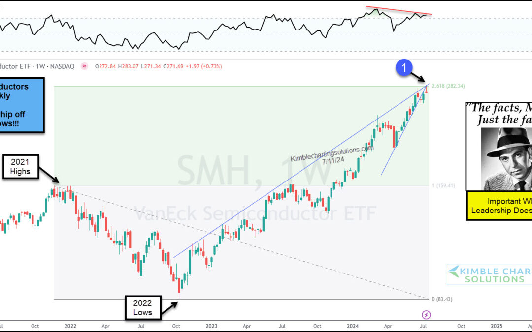
Technology stocks have been a bona fide leader, repelling sell off attempts and pushing higher. Same goes for the undisputed king of technology, the Semiconductors Sector (SMH). BUT, we are at a critical crossroads for SMH (and the broader market!). “The facts, Ma’am....
by Chris Kimble | Jun 25, 2024 | Kimble Charting
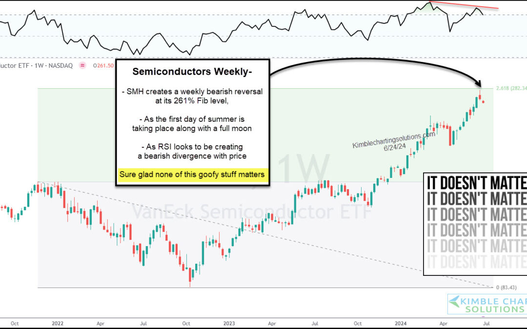
The stock market has been on an incredible run. As we have pointed out several times, the bull market’s run higher has been led by technology stocks, more precisely, semiconductor stocks. So, with the stock market indices taking a pause, it makes sense to...

by Chris Kimble | Jun 24, 2024 | Kimble Charting
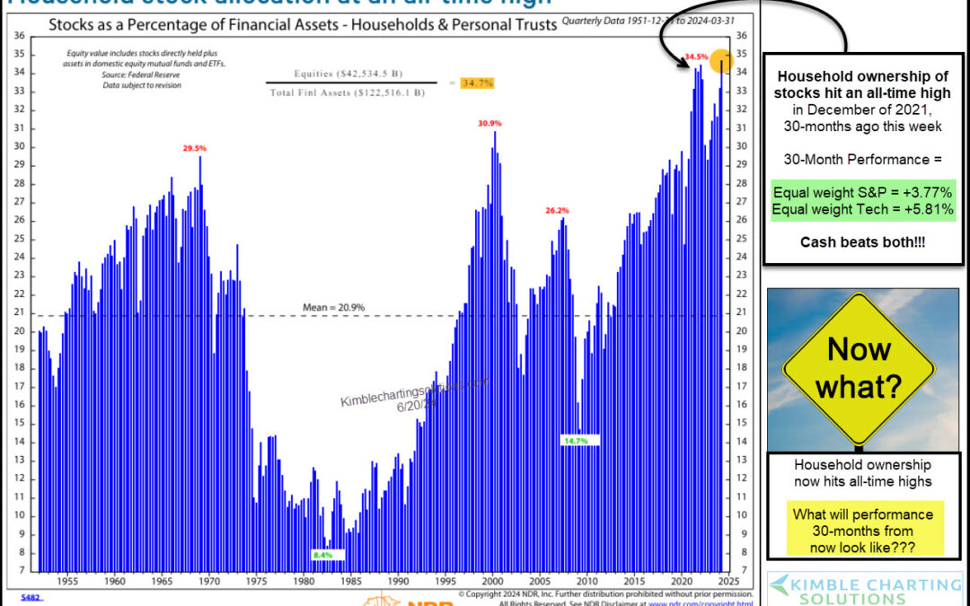
With the stock market trading at all-time highs and seemingly pressing higher and higher by the month in 2024, it should come as no surprise that households across America are upping their exposure to equities. More precisely, according to Ned Davis Research, stocks...

by Chris Kimble | Jun 21, 2024 | Kimble Charting
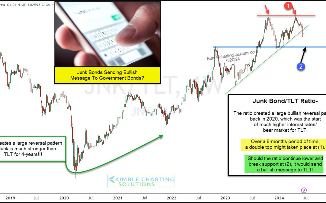
When stocks are in a bull market, we tend to see assets like growth stocks and junk bonds perform well as investors are in “risk-on” mode. And often times, these are the assets to start under-performing when the stock market goes through a sell-off or correction....

by Chris Kimble | Jun 20, 2024 | Kimble Charting
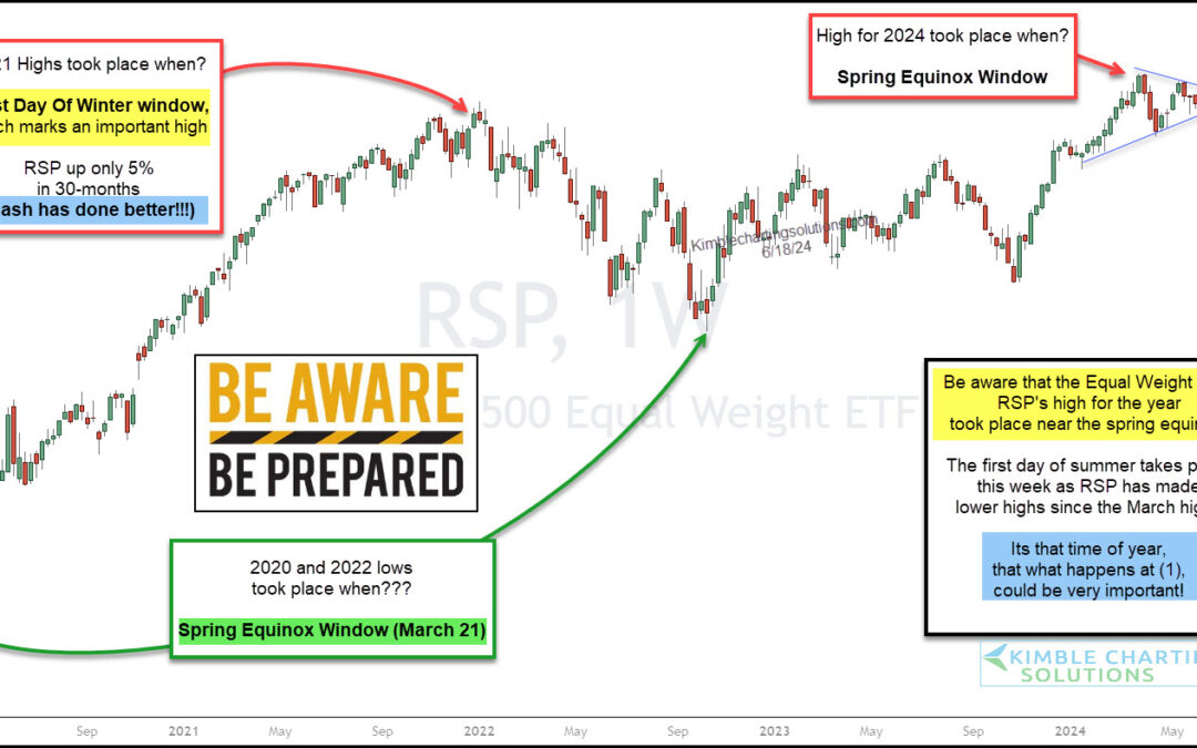
Whether the stock market is trending higher or lower, or even trading sideways, I’ve always found it helpful to watch the equal weight indices for insights about market breadth and market health. So today, with the S&P 500 Index trading near highs, I think it’s a...

by Chris Kimble | May 31, 2024 | Kimble Charting
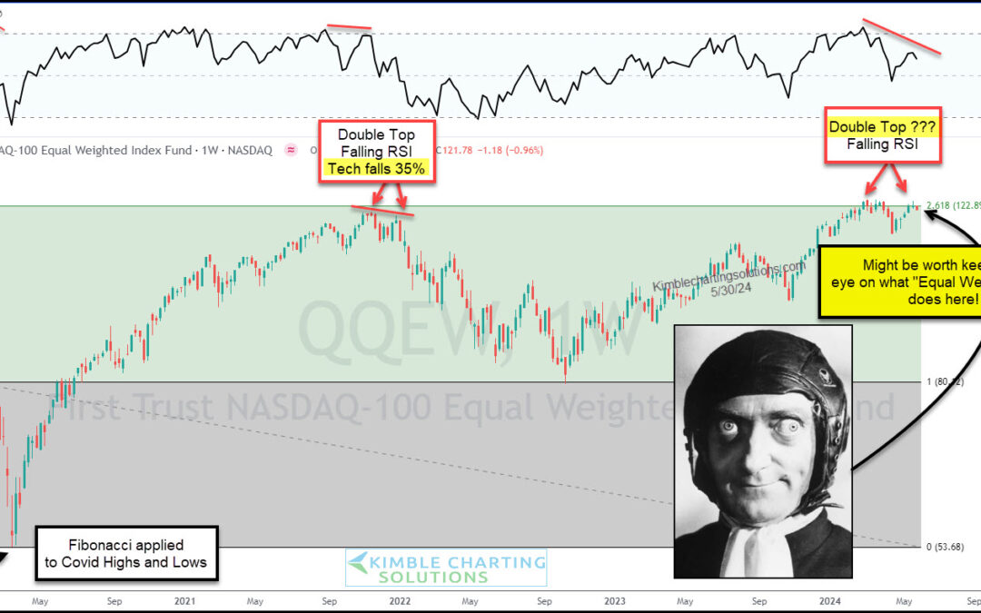
Technology stocks have continue to lead the broader market higher in 2024, posting new high after new high. At the same time, this is the very reason we watch the Nasdaq related indices very closely with each pause in the market. When leadership is strong, the market...
by Chris Kimble | May 28, 2024 | Kimble Charting
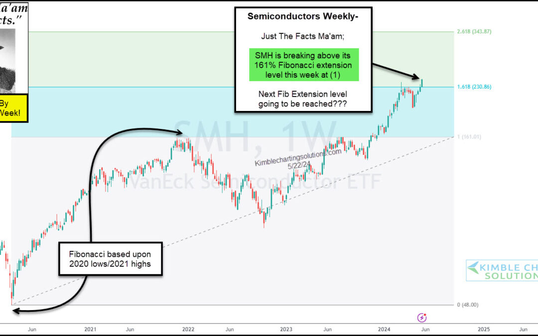
Technology stocks remain hot as semiconductor stocks like Nvidia (NVDA) continue to lead the way higher. In that light, we take another look at the red-hot Semiconductors Sector ETF (SMH) and highlight why it should be on your radar. Note that we have written...
