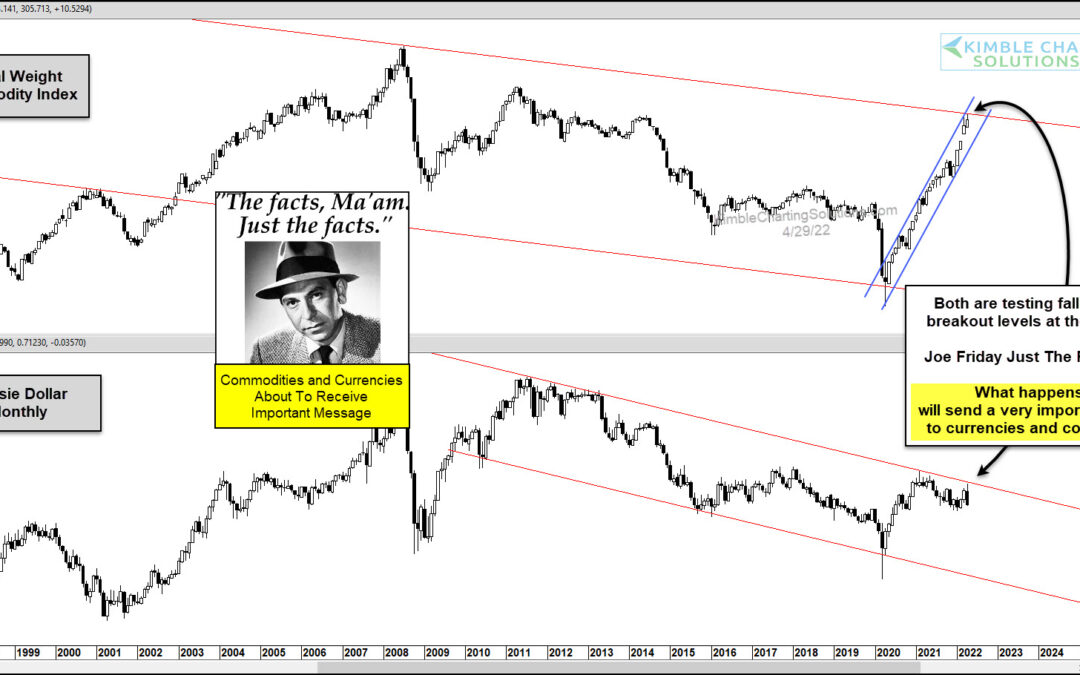
by Chris Kimble | Apr 29, 2022 | Kimble Charting
In the commodity-currency correlation department, commodity bulls know that a strong Australian Dollar is a tailwind for commodities. Today, we look at both – The Equal Weight Commodity Index and the Australian Dollar Currency – on “monthly” timeframes. And we turn to...
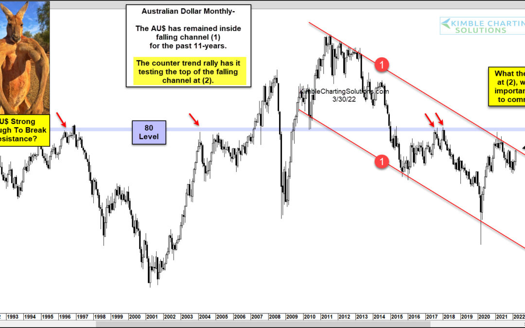
by Chris Kimble | Mar 31, 2022 | Kimble Charting
Over the past 11 years, the Australian Dollar has been in a downtrend. Today’s chart highlights its falling channel marked by each (1). Could we be nearing a change in trend? Everything changed after the covid bottom in 2022. Since then, the Australian Dollar ($AU)...
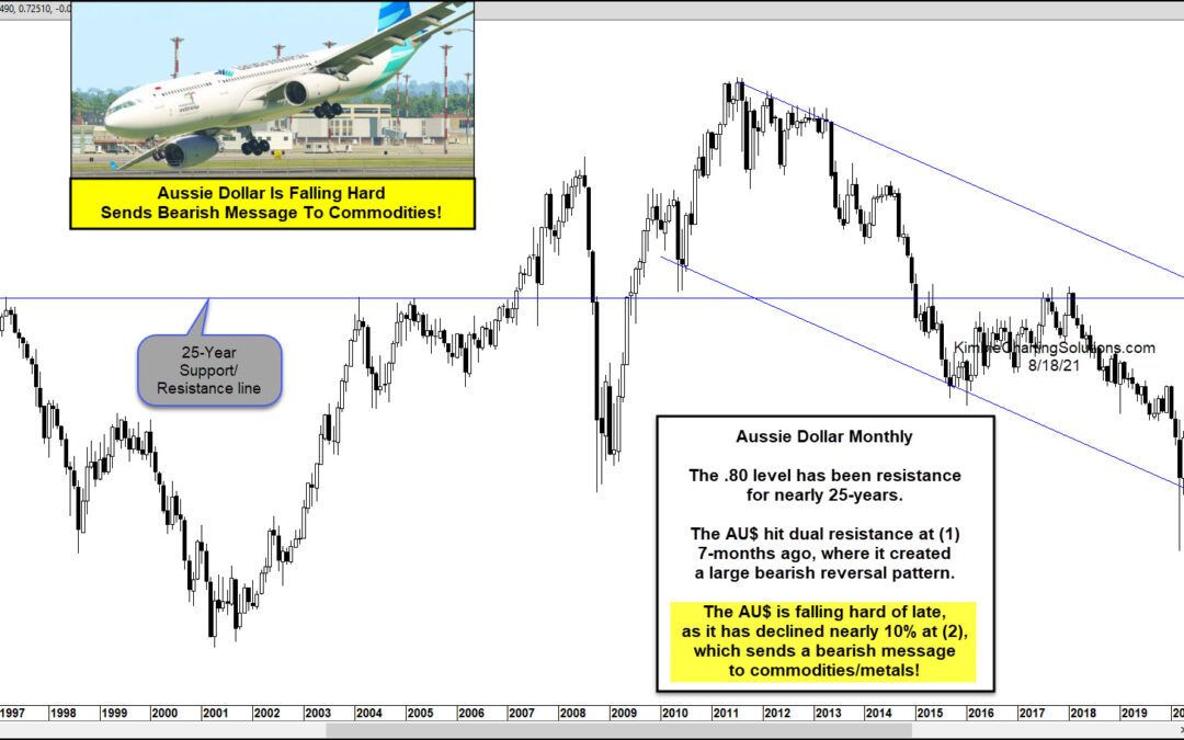
by Chris Kimble | Aug 19, 2021 | Kimble Charting
When the Australian Dollar “moves”, so do commodities. And this time the Australian Dollar “aussie” could be sending a bearish message to commodities. Today’s chart looks at the Aussie Dollar on a “monthly” basis. As you can see, the Aussie Dollar has fallen hard of...
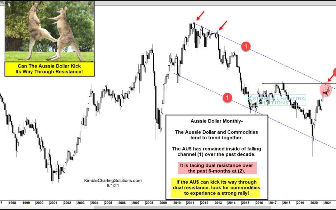
by Chris Kimble | Jun 2, 2021 | Kimble Charting
Early 2020 marked a 19 year low for the Australian Dollar (Aussie, AU$, etc…), but since that time the currency has been very strong. And, being that the Aussie Dollar and Commodities tend to trend together, this strength has carried over to the commodities market as...
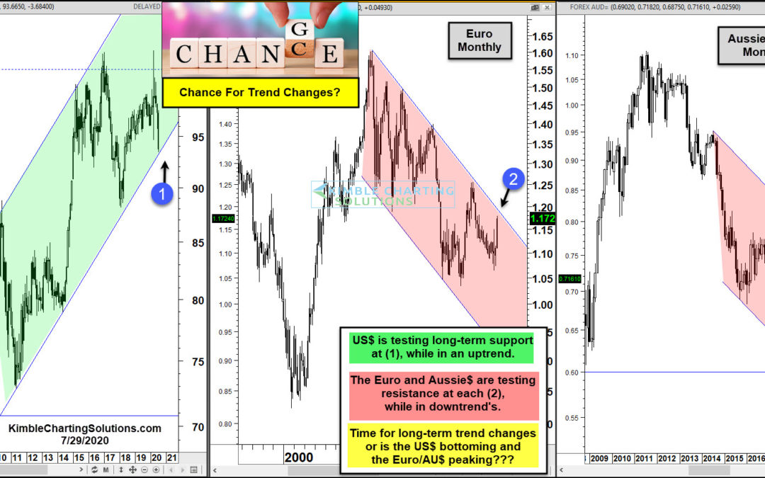
by Chris Kimble | Jul 30, 2020 | Kimble Charting
The past several weeks have seen the US Dollar decline sharply and the Euro and Aussie dollar rally. These swift moves have helped push gold to new highs. But they have also brought this trio of currencies to a critical juncture, reflected in the charts above. The US...
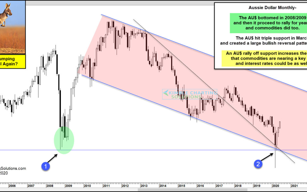
by Chris Kimble | Jun 2, 2020 | Kimble Charting
Is the Aussie Dollar about to jump higher and signal that Commodities and interest rates are about to do the same? Possible! This chart looks at the Aussie Dollar on a monthly basis over the past 16-years. The AU$ created a bottoming pattern over several months in...
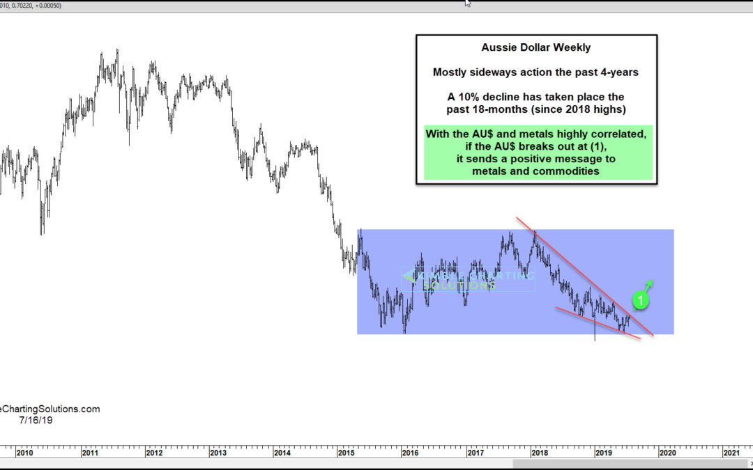
by Chris Kimble | Jul 17, 2019 | Kimble Charting
The Australian Dollar and its ETF (NYSEARCA: FXA) have traded sideways for much of the past 4 years (see blue shaded area on chart above). And since the Aussie Dollar and precious metals are highly correlated, this hasn’t helped gold and silver. But this setup may be...
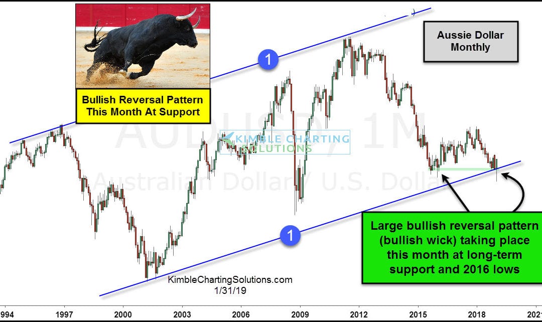
by Chris Kimble | Jan 31, 2019 | Kimble Charting
Is the Aussie Dollar signaling that a major commodity low is being established this month? Possible! The Aussie Dollar and commodities have been highly correlated for a couple of decades. The AU$ has spent the majority of the past couple of decades inside of rising...
